Layout Rules
This section provides an explanation of the correct methods for positioning visual components and layouts in your views.
Component Sizes
Components that implement com.vaadin.flow.component.HasSize (e.g. button, textField, dataGrid, vbox, etc.) have the following common attributes: width, minWidth, maxWidth, height, minHeight, maxHeight. These attributes map directly to the corresponding CSS properties.
The min/max size attributes can help in creating responsive designs, where elements need to adapt to different screen sizes. These attributes can also be used to prevent components from overflowing or becoming too large. See Tips and Tricks for a practical example.
|
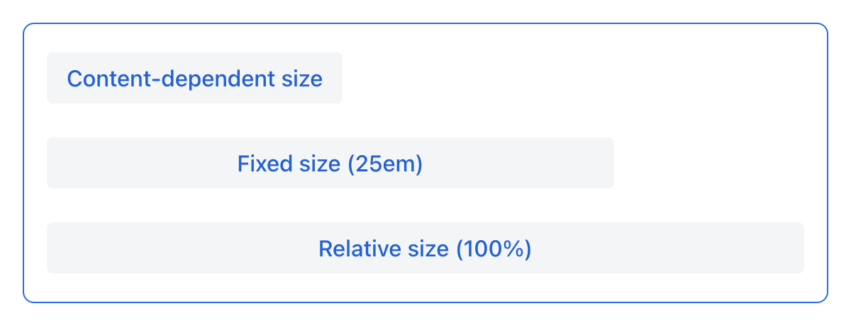
Component dimensions can be of the following types:
-
Content-based -
AUTO -
Fixed, e.g.
25em -
Relative (in percentage) to parent layout, e.g.
100%
| The size value must be a correct CSS size string. |
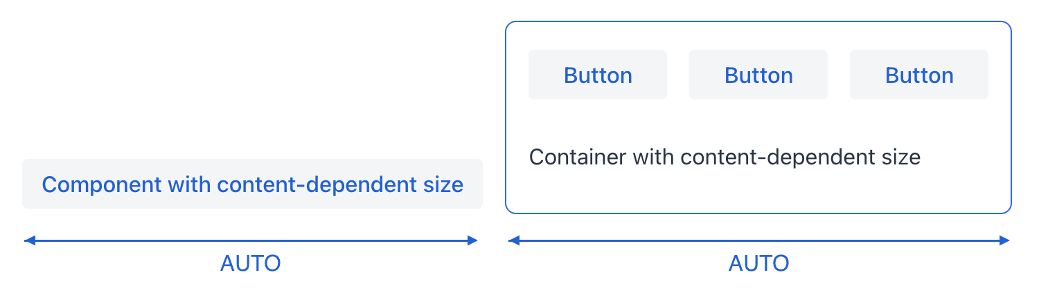
Content-Based Size
The component will take enough space to fit its content.
Examples:
-
For
button, the size is defined by thetextlength. -
For layouts, the size is defined by the sum of all component sizes inside the layout.
<button text="Button" width="AUTO"/>button.setWidth("AUTO");Components with content-based size will adjust their dimensions during screen layout initialization or when the content size is changed.
Fixed Size
Fixed size implies that the component dimensions will not change at runtime.
<vbox width="20em" height="15em"/>vBox.setWidth("20em");
vBox.setHeight("15em");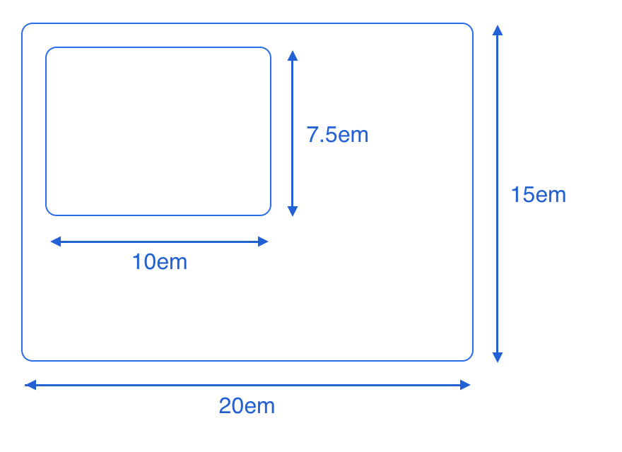
The size can be set using absolute length units (e.g. px) or relative length units (e.g. em). All platform views and components use relative length units such as em and rem so it is possible to change the entire application size.
em is the size unit that is relative to parent font size. By default, the font size is 16px. For more information on length units, see CSS values and units.
|
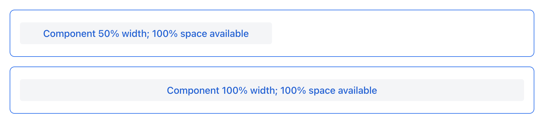
Relative Size
Relative size indicates the percentage of available space that will be occupied by the component.
<button text="Button" width="50%"/>button.setWidth("50%");Components with relative size will react to changes in the amount of the available space and adjust their actual size on the screen.
Layout Specifics
-
The root
layoutelement is a vertical layout (vbox), which by default has 100% width and height. -
scrollermust have fixed or relative (but notAUTO) width and height. Components insidescroller, positioned in the scrolling direction, should not have relative size.
Component Specifics
-
dataGriddoes not need to be explicitly assignedheight="100%"or expanded withinvboxor rootlayoutelements, because its flex-grow CSS property is set to1, which means that by default it is already expanded in the parent layout. However, it is recommended to set theminHeightattribute of thedataGridto prevent collapsing when there is insufficient vertical space.
Expanding Components
Components can be instructed to expand and take up any extra space that a layout may have.
<hbox expand="btn" padding="true" width="100%">
    <button text="Button"/>
    <button id="btn" text="Button"/>
    <button text="Button"/>
</hbox>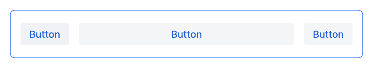
<vbox expand="btn" width="100%" minHeight="20em">
    <button text="Button"/>
    <button id="btn" text="Button"/>
    <button text="Button"/>
</vbox>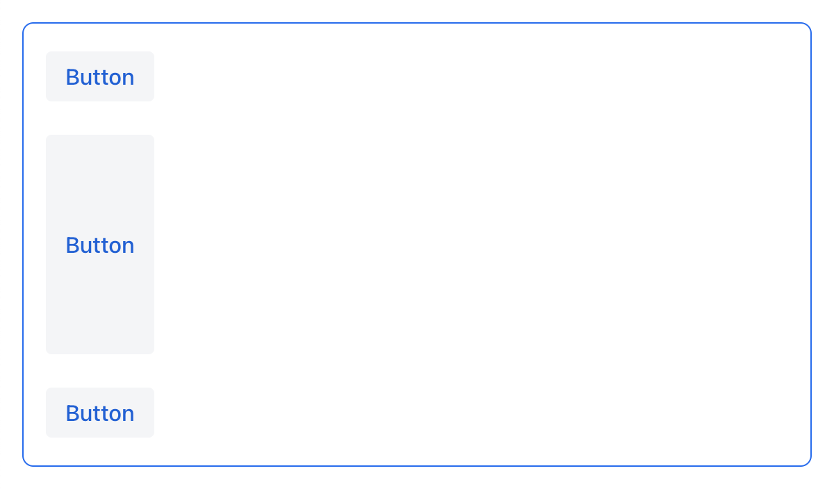
Expanding a component effectively means that its flex-grow CSS property is set to 1.
|
Spacing, Margin and Padding
With spacing, margin and padding you can define an empty space around components and inside them.
Spacing
The spacing attribute toggles spacing theme setting for the component. If a theme supports this attribute, it will apply or remove spacing for the component.
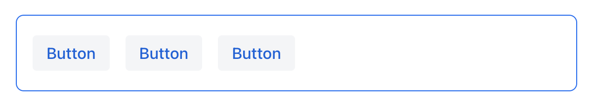
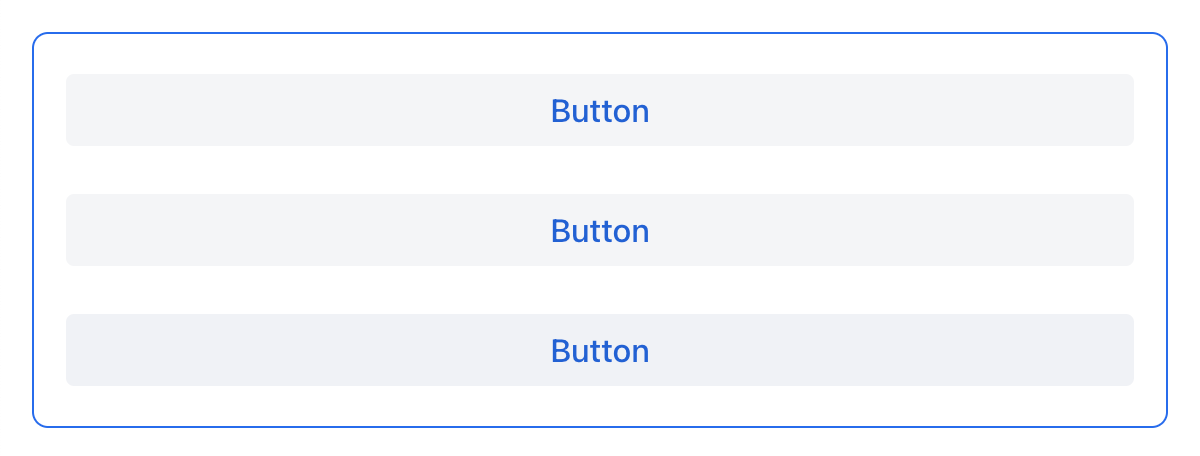
Spacing is on by default for vbox and hbox components.
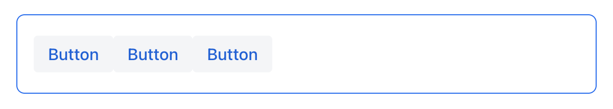
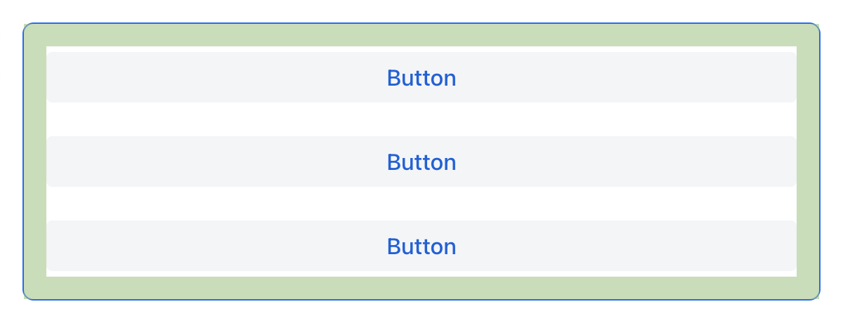
Spacing Variants
The spacing attribute implicitly adds medium spacing to the component theme, which is equivalent to defining themeNames="spacing". To set other options, use the themeNames attribute explicitly. Five different spacing theme variants are available:
| Theme Variant | Usage Recommendation |
|---|---|
|
Extra-small space between items |
|
Small space between items |
|
Medium space between items |
|
Large space between items |
|
Extra-large space between items |
Example of adding spacing-xl spacing variant:
<vbox themeNames="spacing-xl" alignItems="STRETCH">
    <button text="Button"/>
    <button text="Button"/>
    <button text="Button"/>
</vbox>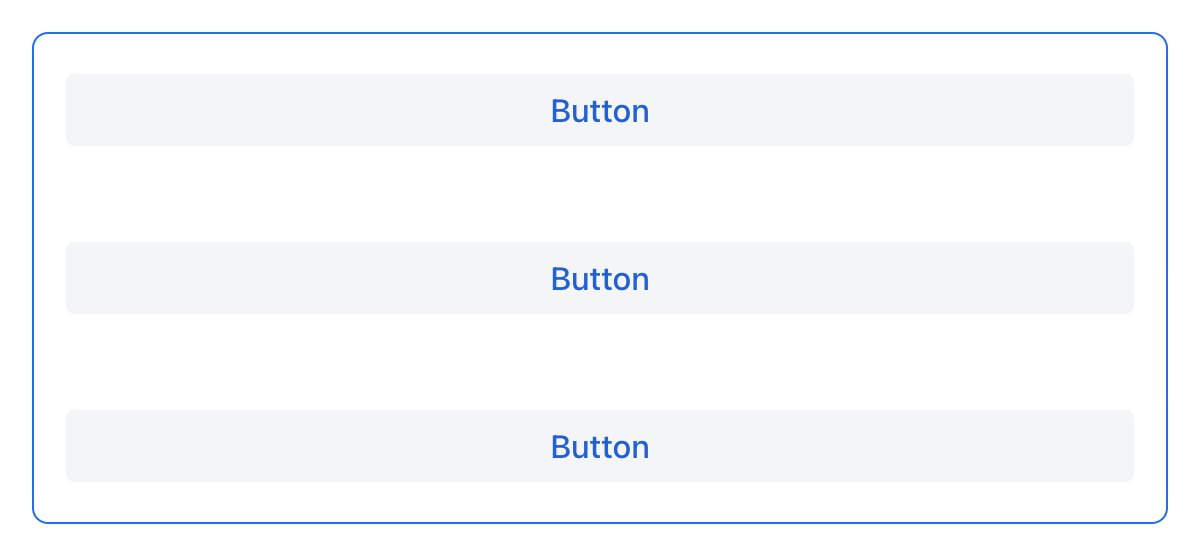
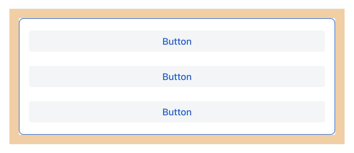
Padding
The padding attribute enables setting space between layout borders and nested components.
Padding is on by default for vbox. You can turn it off by setting the padding attribute to false. For hbox, padding is off by default and can be turned on by setting the padding attribute to true.
Alignment
JustifyContent Mode
The justifyContent attribute corresponds to the justify-content CSS property which defines how the browser distributes space between and around content items along the main axis of a flex container.
| Value | Descsription |
|---|---|
|
Items are positioned at the beginning of the container. |
|
Items are positioned at the center of the container. |
|
Items are positioned at the end of the container. |
|
Items are positioned with space between the lines; first item is on the start line, last item on the end line. |
|
Items are evenly positioned in the line with equal space around them. Note that start and end gaps are half the size of the space between each item. |
|
Items are positioned so that the spacing between any two items (and the space to the edges) is equal. |
For vbox and flexLayout with flexDirection="COLUMN" (that is when flex-direction: column) the justifyContent attribute works as follows:
<vbox justifyContent="START" minHeight="20em">
    <button text="Button"/>
    <button text="Button"/>
    <button text="Button"/>
</vbox>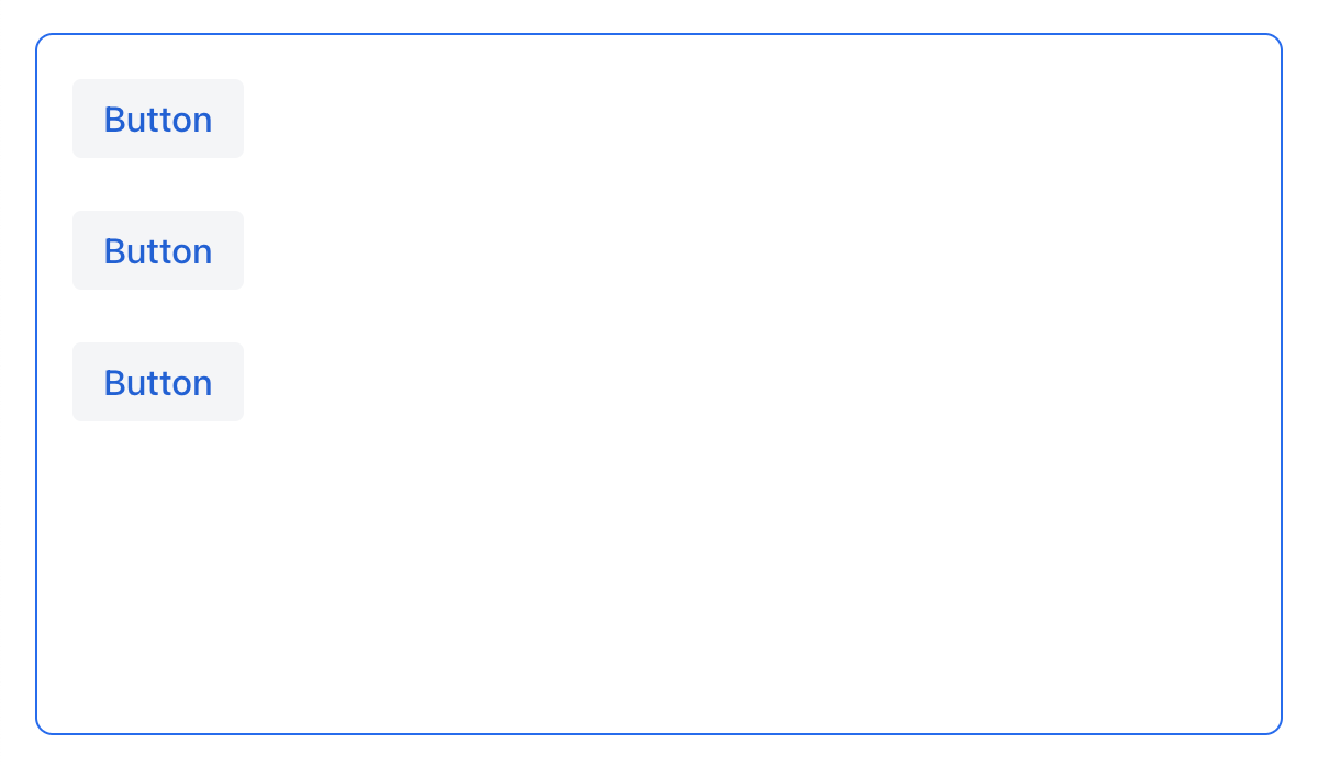
<vbox justifyContent="CENTER" minHeight="20em">
    <button text="Button"/>
    <button text="Button"/>
    <button text="Button"/>
</vbox>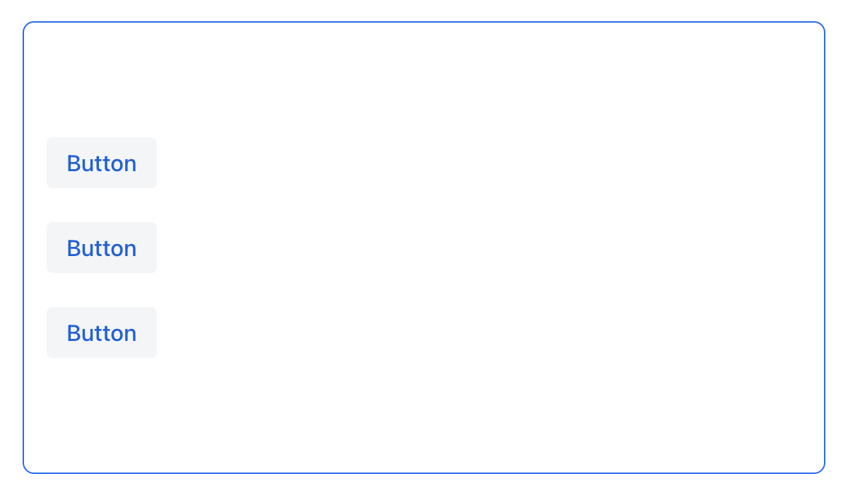
<vbox justifyContent="END" minHeight="20em">
    <button text="Button"/>
    <button text="Button"/>
    <button text="Button"/>
</vbox>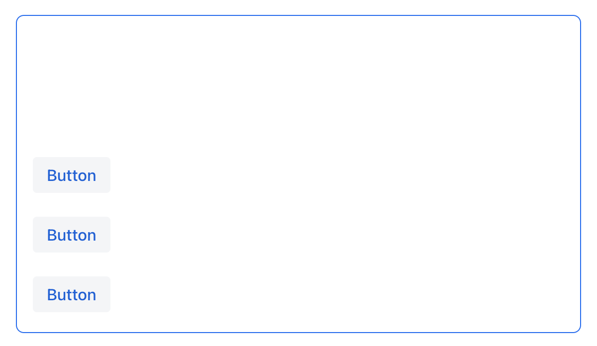
<vbox justifyContent="BETWEEN" minHeight="20em">
    <button text="Button"/>
    <button text="Button"/>
    <button text="Button"/>
</vbox>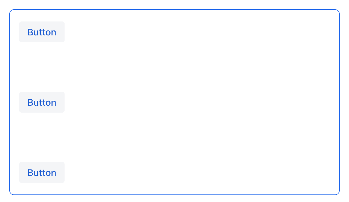
<vbox justifyContent="AROUND" minHeight="20em">
    <button text="Button"/>
    <button text="Button"/>
    <button text="Button"/>
</vbox>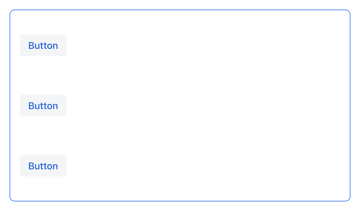
<vbox justifyContent="EVENLY" minHeight="20em">
    <button text="Button"/>
    <button text="Button"/>
    <button text="Button"/>
</vbox>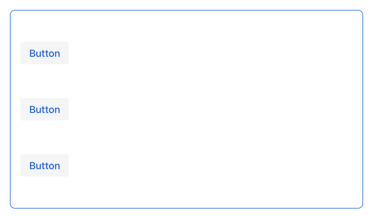
For hbox and flexLayout with flexDirection="ROW" (that is when flex-direction: row), the justifyContent attribute works as follows:
<hbox justifyContent="START" padding="true" width="100%">
    <button text="Button"/>
    <button text="Button"/>
    <button text="Button"/>
</hbox>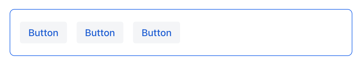
<hbox justifyContent="CENTER" padding="true" width="100%">
    <button text="Button"/>
    <button text="Button"/>
    <button text="Button"/>
</hbox>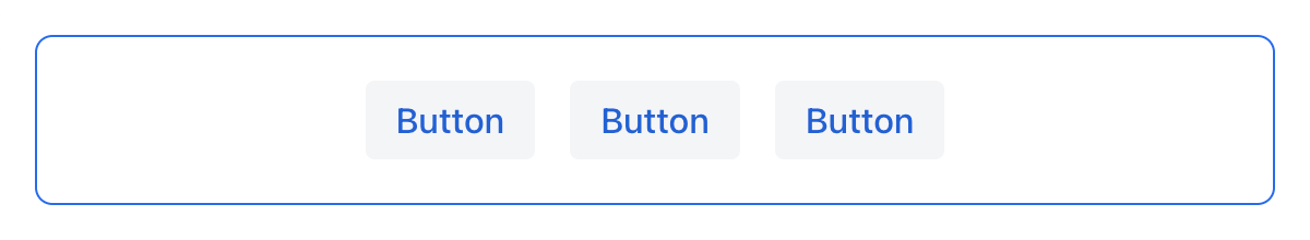
<hbox justifyContent="END" padding="true" width="100%">
    <button text="Button"/>
    <button text="Button"/>
    <button text="Button"/>
</hbox>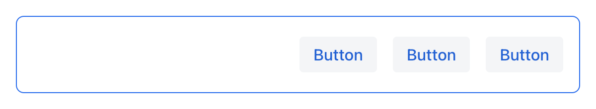
<hbox justifyContent="BETWEEN" padding="true" width="100%">
    <button text="Button"/>
    <button text="Button"/>
    <button text="Button"/>
</hbox>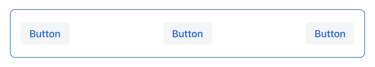
<hbox justifyContent="AROUND" padding="true" width="100%">
    <button text="Button"/>
    <button text="Button"/>
    <button text="Button"/>
</hbox>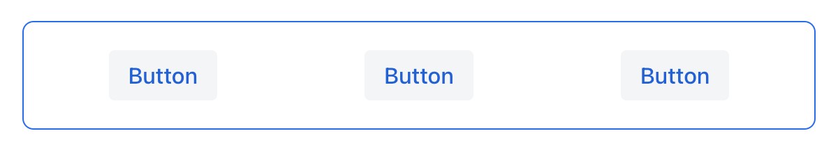
<hbox justifyContent="EVENLY" padding="true" width="100%">
    <button text="Button"/>
    <button text="Button"/>
    <button text="Button"/>
</hbox>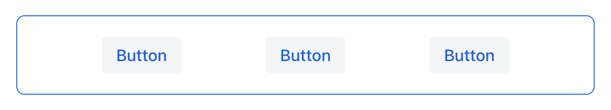
AlignItems
The alignItems attribute corresponds to the align-items CSS property which defines the default behavior for how flex items are placed out along the cross axis on the current line. Think of it as the justify-content version for the cross axis (perpendicular to the main axis).
| Value | Description |
|---|---|
|
Items are placed at the start of the cross axis. |
|
Items are centered in the cross axis. |
|
Items are placed at the end of the cross axis. |
|
Items with undefined size along the cross axis are stretched to fit the container. |
|
Items are positioned at the baseline of the container. Works for |
|
The element inherits its parent container’s align-items property, or "stretch" if it has no parent container. |
For vbox and flexLayout with flexDirection="COLUMN" (when flex-direction: column), the alignItems attribute works as follows:
<vbox alignItems="START">
    <button text="Button" width="6em"/>
    <button text="Button" width="7em"/>
    <button text="Button" width="5em"/>
</vbox>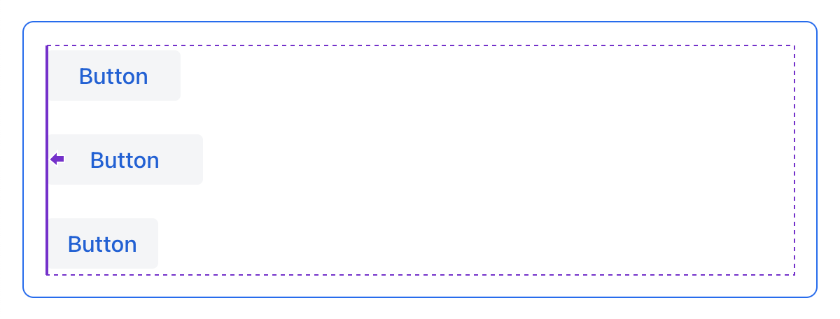
<vbox alignItems="CENTER">
    <button text="Button" width="6em"/>
    <button text="Button" width="7em"/>
    <button text="Button" width="5em"/>
</vbox>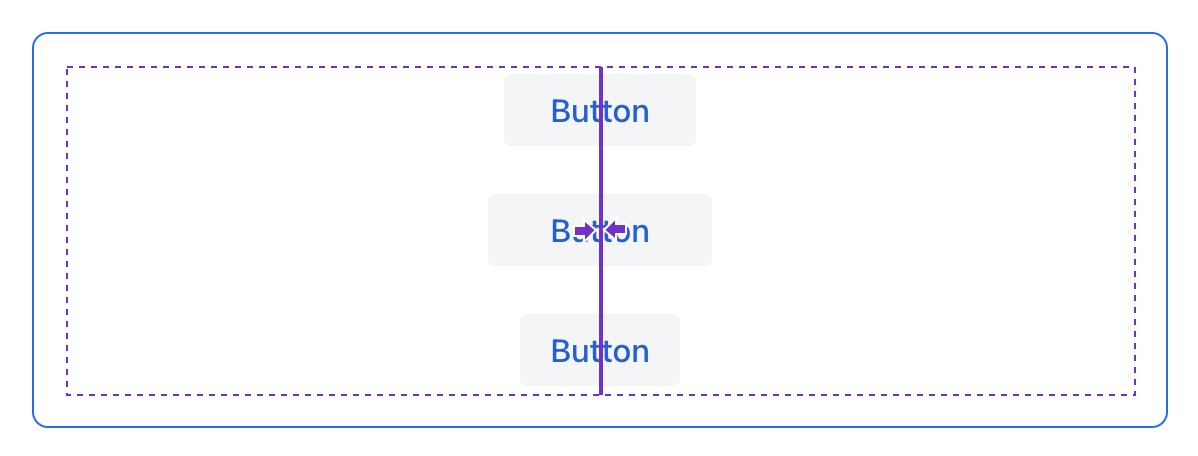
<vbox alignItems="END">
    <button text="Button" width="6em"/>
    <button text="Button" width="7em"/>
    <button text="Button" width="5em"/>
</vbox>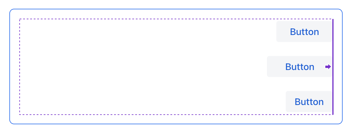
<vbox alignItems="STRETCH">
    <button text="Button" width="AUTO"/>
    <button text="Button" width="AUTO"/>
    <button text="Button" width="AUTO"/>
</vbox>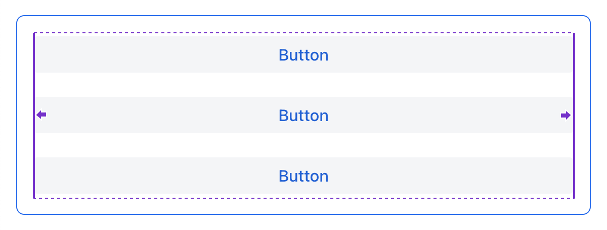
For hbox and flexLayout with flexDirection="ROW" (when flex-direction: row), the alignItems attribute works as follows:
<hbox alignItems="START" padding="true" width="100%" minHeight="10em">
    <button text="Button" height="2em"/>
    <button text="Button" height="3em"/>
    <button text="Button" height="1.5em"/>
</hbox>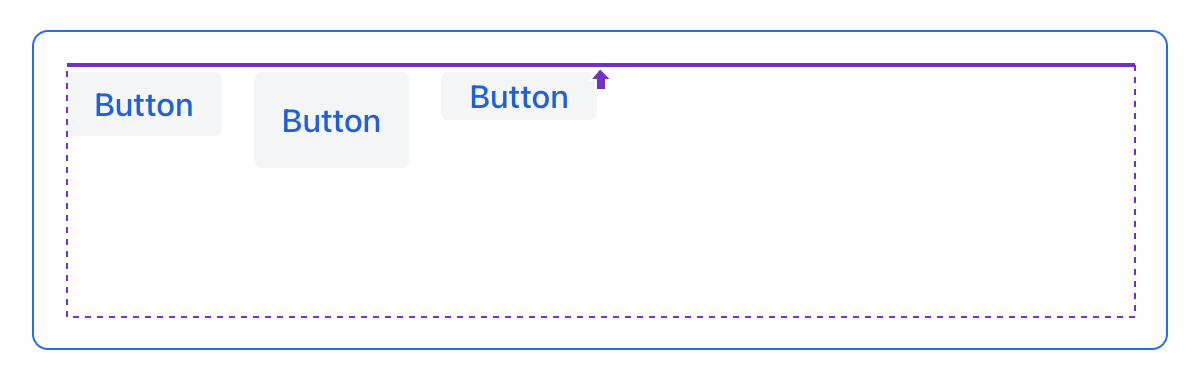
<hbox alignItems="CENTER" padding="true" width="100%" minHeight="10em">
    <button text="Button" height="2em"/>
    <button text="Button" height="3em"/>
    <button text="Button" height="1.5em"/>
</hbox>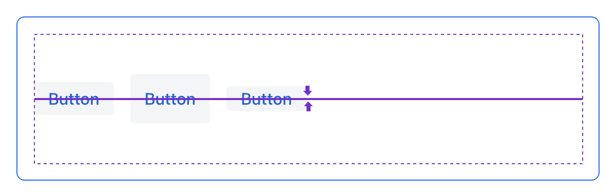
<hbox alignItems="END" padding="true" width="100%" minHeight="10em">
    <button text="Button" height="2em"/>
    <button text="Button" height="3em"/>
    <button text="Button" height="1.5em"/>
</hbox>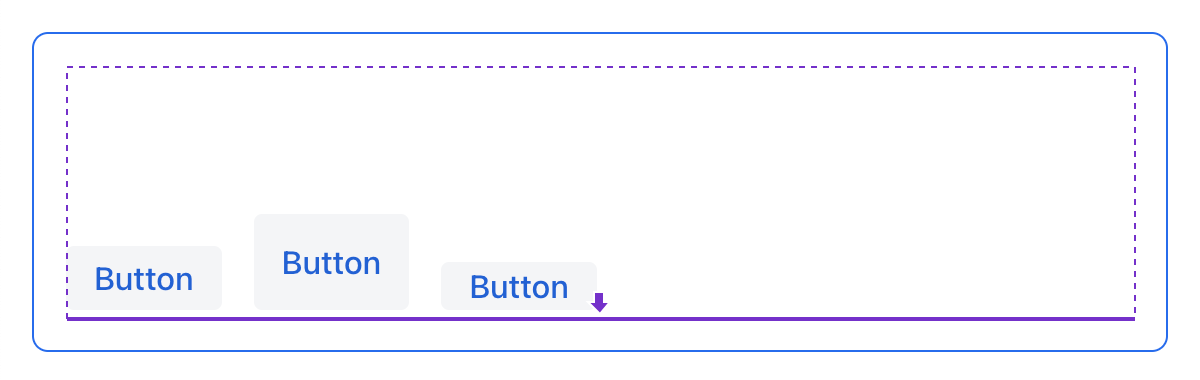
<hbox alignItems="STRETCH" padding="true" width="100%" minHeight="10em">
    <button text="Button" height="AUTO"/>
    <button text="Button" height="AUTO"/>
    <button text="Button" height="AUTO"/>
</hbox>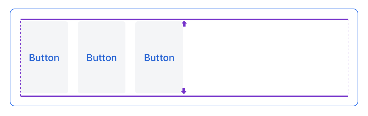
<hbox alignItems="BASELINE" padding="true" width="100%" minHeight="10em">
    <button text="Button" height="2em"/>
    <button text="Button" height="3em"/>
    <button text="Button" height="1.5em"/>
</hbox>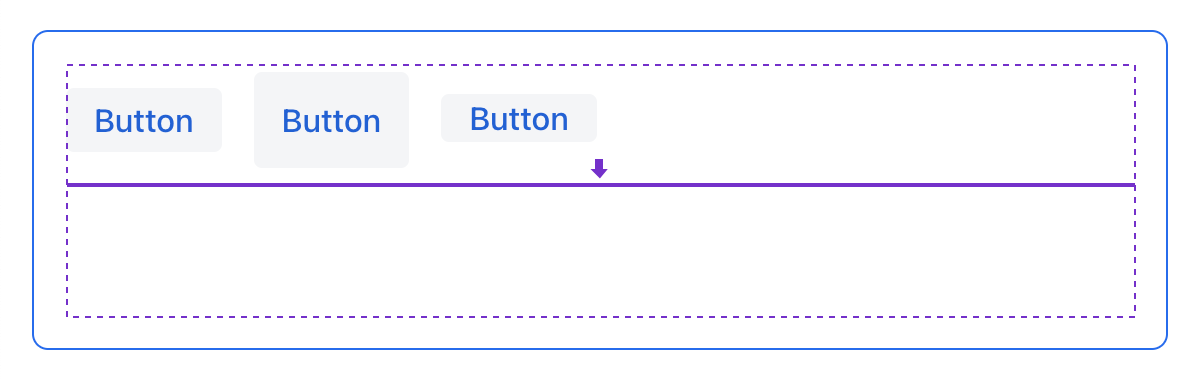
AlignSelf
The alignSelf attribute corresponds to the align-self CSS property which defines an alignment for individual components inside the container. This individual alignment for the component overrides any alignment set by alignItems.
<vbox alignItems="START">
    <button text="alignSelf=END" alignSelf="END"/>
    <button text="alignSelf=CENTER" alignSelf="CENTER"/>
    <button text="alignSelf=AUTO" alignSelf="AUTO"/>
</vbox>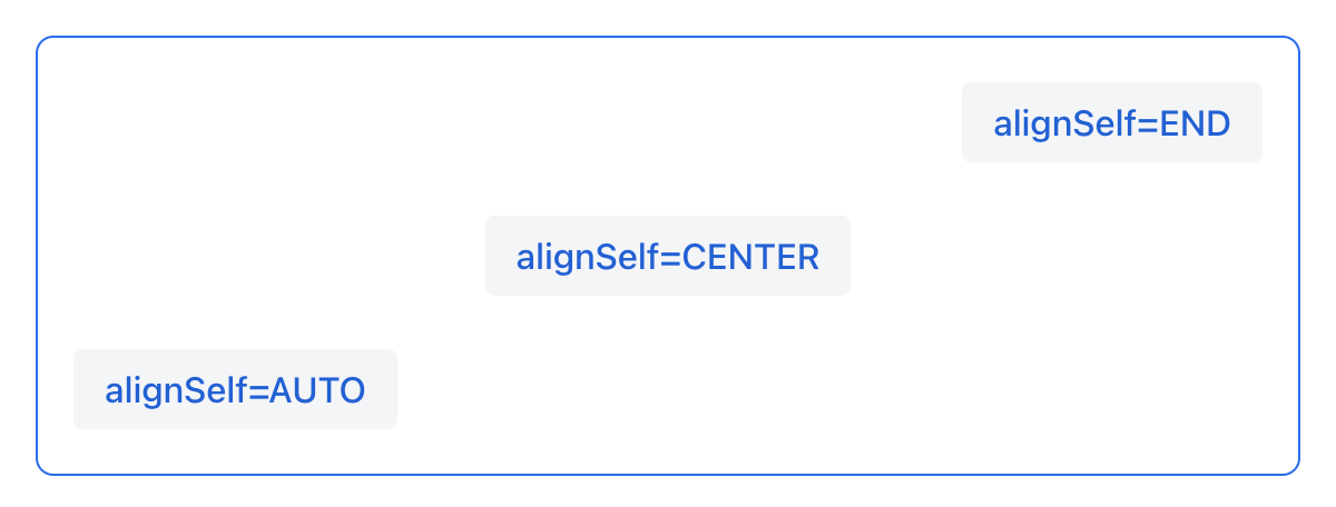
<hbox alignItems="START" justifyContent="BETWEEN" padding="true" width="100%" minHeight="10em">
    <button text="alignSelf=END" alignSelf="END"/>
    <button text="alignSelf=CENTER" alignSelf="CENTER"/>
    <button text="alignSelf=AUTO" alignSelf="AUTO"/>
</hbox>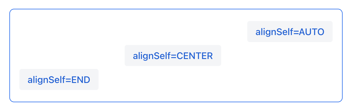
Common Layout Mistakes
Common mistake 1. Setting relative size for a component within a container with content-based size
<vbox>
    <dataGrid id="usersDataGrid" dataContainer="usersDc"
              width="100%" height="100%">
        <actions/>
        <columns>
            <column property="firstName"/>
            <column property="lastName"/>
            <column property="username"/>
        </columns>
    </dataGrid>
</vbox>
In this example, dataGrid has 100% height, while the default height for vbox is AUTO, i.e. content-based. As a result, dataGrid is collapsed.
Common mistake 2. Not disabling padding for nested vbox containers
<layout>
    <genericFilter ...>
        ...
    </genericFilter>

    <vbox width="100%">
        <hbox id="buttonsPanel" classNames="buttons-panel">
            ...
        </hbox>
        <dataGrid id="usersDataGrid" ...>
            ...
        </dataGrid>
    </vbox>
    <hbox>
        ...
    </hbox>
</layout>
In this example, dataGrid and hbox are placed inside a vbox which by default has padding enabled. As a result, components inside vbox are not aligned with the ones outside.
Common mistake 3. Aligning components with relative size
<hbox alignItems="CENTER" padding="true" width="100%" minHeight="10em">
    <span text="Span" height="100%"/>
</hbox>
In this example, span has 100% height within hbox container which defines alignItems="CENTER". As a result, text is placed in the top left corner.
Common mistake 4. Stretching components with fixed size
<hbox alignItems="STRETCH" padding="true" width="100%" minHeight="10em">
    <button text="Button"/>
    <button text="Button"/>
    <button text="Button"/>
</hbox>
In this example, buttons have default height defined in styles. As a result, buttons are not stretched vertically.
Common mistake 5. Setting size without size unit
<textField width="400"/>In this example, textField has no size unit specified. As a result, the size value is ignored, because there is no default size unit.
Tips and Tricks
Adapting to Different Screen Size
An example of defining a responsive text field that has fixed size on big screens and 100% width on small ones:
<hbox width="100%">
    <textField width="100%" maxWidth="40em"/>
    <button text="Button"/>
</hbox>
An example of defining a form layout with a single column that has fixed size on big screens and 100% width on small ones:
<formLayout id="form"
            dataContainer="taskTypeDc"
            classNames="mx-m"
            maxWidth="40em"> (2)
    <responsiveSteps>
        <responsiveStep minWidth="0" columns="1"/> (1)
    </responsiveSteps>

    <textField id="nameField" property="name"/>
    <textArea id="descriptionField" property="description"
              height="9.5em"/>
</formLayout>| 1 | Defining that the form layout must have a single column for all layout sizes |
| 2 | Setting the maximum width |
Using Lumo Utility Classes
For simple styling, you can use Lumo Utility Classes provided by Vaadin. Lumo Utility Classes are predefined CSS class names and stylesheets. They can be used to style HTML elements and layouts without having to write CSS.
Each utility class applies a particular style to the element, such as background color, borders, fonts, sizing, or spacing. Classes for applying CSS flexbox and grid layout features are also available.
The LumoUtility Java class contains String constants for all utility classes. They’re divided into nested category classes, such as LumoUtility.Margin.
An example of using Lumo utility classes to add a border with roundness to a container:
<vbox id="imageWrapper"
      classNames="border                (1)
                  rounded-m             (2)
                  border-contrast-20"   (3)
      alignItems="CENTER"
width="100%" maxWidth="30em">| 1 | Adds border with default border color |
| 2 | Sets border radius equal to var(--lumo-border-radius-m) |
| 3 | Sets border color equal to var(--lumo-contrast-20pct) |
An example of aligning a component to the end of horizontal container:
<header id="header" classNames="jmix-main-view-header">
    <drawerToggle id="drawerToggle"
                  classNames="jmix-main-view-drawer-toggle"
                  themeNames="contrast"
                  ariaLabel="msg://drawerToggle.ariaLabel"/>
    <h1 id="viewTitle" classNames="jmix-main-view-title"/>

    <button id="logoutButton" icon="SIGN_OUT" classNames="ms-auto me-s"/> (1)
</header>| 1 | ms-auto effectively means margin-inline-start: auto, i.e. defines the logical inline start margin of an element, which maps to a physical margin depending on flex-direction; me-s effectively means margin-inline-end: var(--lumo-space-s), i.e. defines the logical inline end margin of an element. |

