Charts
In Apache Superset, a chart refers to a visual representation of data from a dataset. It can be of different types, such as Bar Chart, Pie Chart, Treemap, Table, etc.
Charts can be combined into dashboards, which provide a comprehensive view of data across multiple charts.
In this section, you will create three charts for visualizing employees' salaries data:
-
Bar Chart
-
Table
-
Big Number
Bar Chart
The Bar Chart will show the salary of each employee. To create a new chart navigate to Charts in the top menu and create click on + CHART button.
In the opened screen:
-
Select
Employees' salariesdataset. -
Select
Bar Chart. -
Click on CREATE NEW CHART button.
In the chart configuration:
-
Drop the
full_namecolumn to the X-AXIS field. -
Drop
salarycolumn to the METRICS field withSUMaggregation:
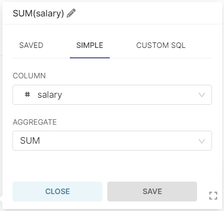
-
click on CREATE CHART button, and you will see the following result:
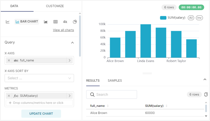
Set the name for this chart - Salary by employee and save without adding to a dashboard.
Table
The Table chart will show an average salary by department. Navigate to Charts in the top menu and create a new chart by clicking on + CHART button.
In the opened screen:
-
Select
Employees' salariesdataset. -
Select
Tablechart. -
Click on CREATE NEW CHART button.
In the chart configuration:
-
Drop the department_name column to the DIMENSIONS field.
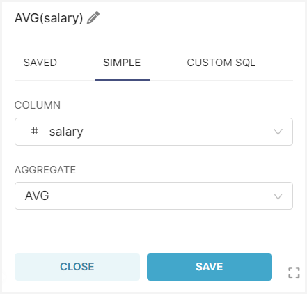
Then create an aggregation by the salary column:
-
Click on METRICS field.
-
Select SIMPLE tab, choose AVG aggregation for the
salarycolumn and save changes.
-
Click on CREATE CHART, and you will see the following result:
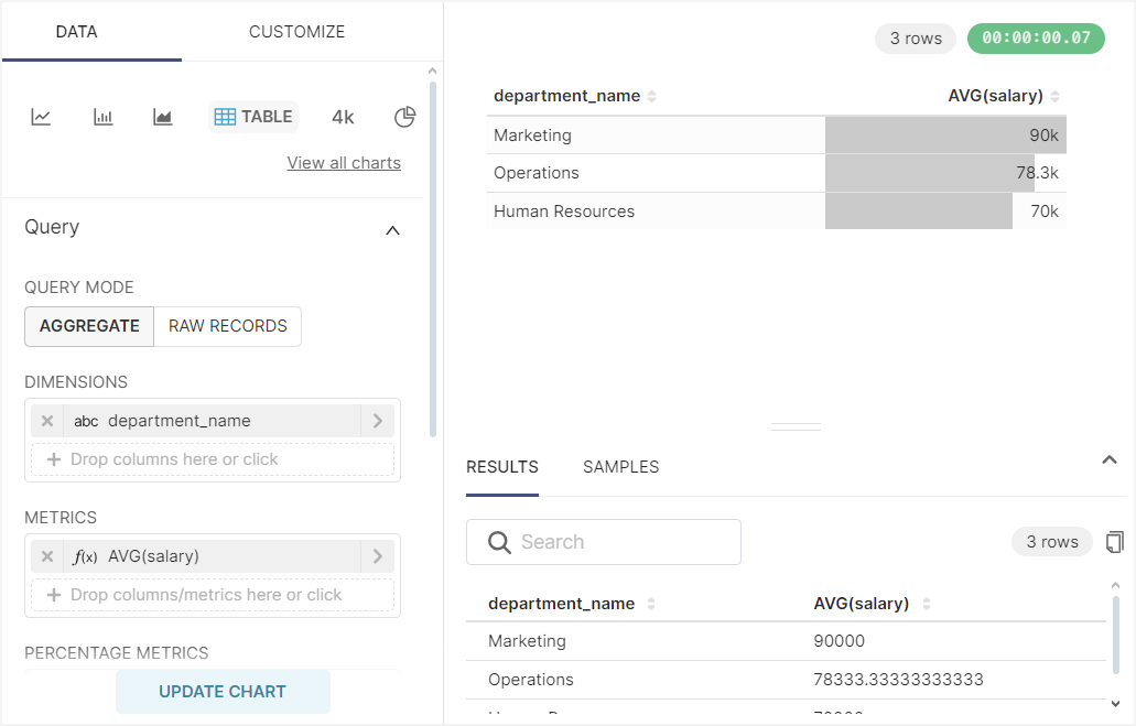
Set the name for this chart - Salary by department and save without adding to a dashboard.
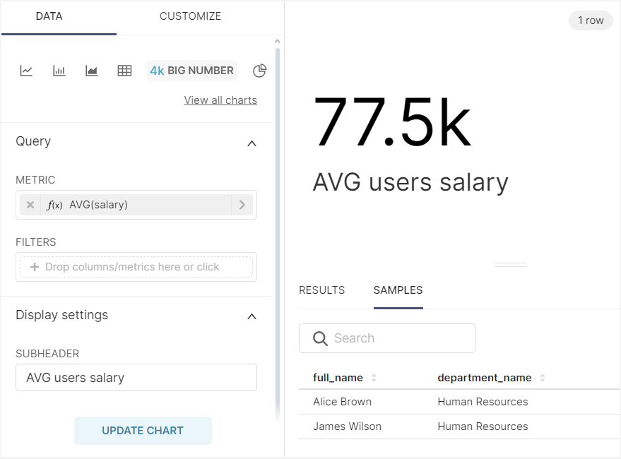
Big Number
The Big Number chart type is used to display a single, prominent metric or value. In your dashboard, it will show the average salary of all employees.
Navigate to Charts in the top menu and create a new chart by clicking on + CHART button.
In the opened screen:
-
Select
Employees' salariesdataset. -
Select
Big Numberchart type. -
Click on CREATE NEW CHART button.
In the chart configuration:
-
Drop the
salarycolumn to the METRICS field. -
Select AVG aggregation and save it.
-
In the SUBHEADER field enter
Employees' AVG salary. -
Click on CREATE CHART and you will see the following result:
Set the name for this chart - Employees' AVG salary and save without adding to a dashboard.
