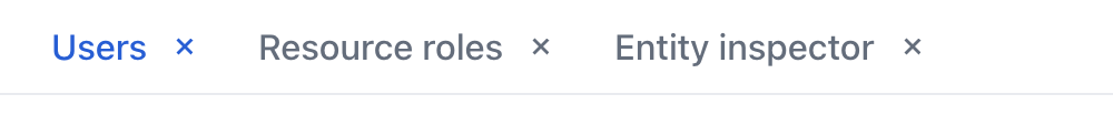
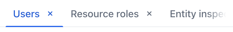
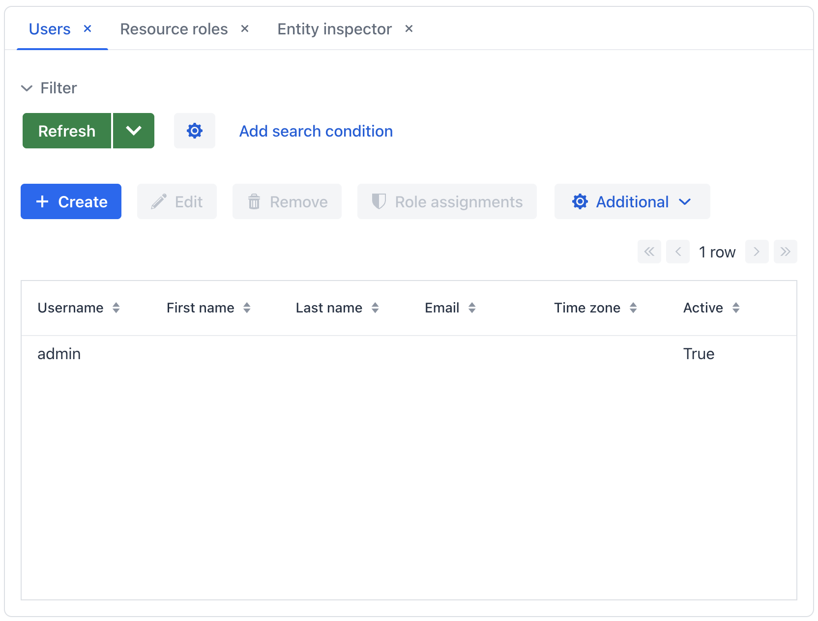
MainTabSheet Component
A container that is intended to display open views in tabs. Only the content of the selected tab is visible at a time.
XML Element |
|
|---|---|
Java Class |
|
Attributes |
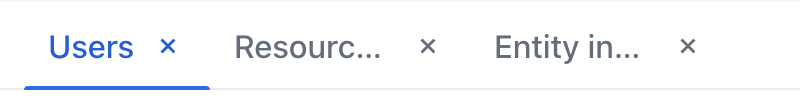
id - alignSelf - classNames - colspan - css - height - width - maxHeight - maxWidth - minHeight - minWidth - visible - themeNames - tabsDraggable |
Handlers |
AttachEvent - DetachEvent - SelectedChangeEvent - TabsCollectionChangeEvent |
Elements |
Basics
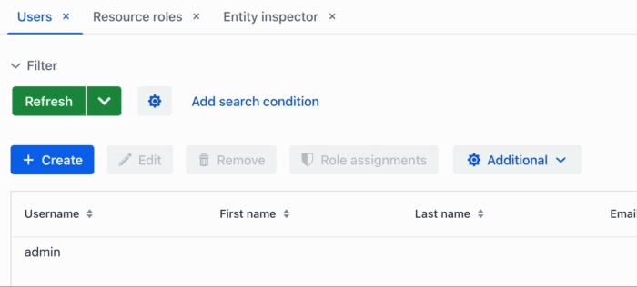
To create the component, use the mainTabSheet XML element inside the workArea element. Both workArea and mainTabSheet are available only in the main view descriptor.
The following example demonstrates how a basic mainTabSheet is created:
<mainTabSheet id="mainTabSheet"
              classNames="jmix-main-tabsheet"
              tabsDraggable="true"
              width="100%" height="100%">
    <actions>
        <action id="closeThisTabAction" type="tabmod_closeThisTab"/>
        <action id="closeOthersTabsAction" type="tabmod_closeOtherTabs"/>
        <action id="closeAllTabsAction" type="tabmod_closeAllTabs"/>
    </actions>
</mainTabSheet>
Actions
The mainTabSheet component implements the HasActions interface and can contain both standard and custom actions. Actions are invoked from the context menu that appears on the right click on the tabs area.
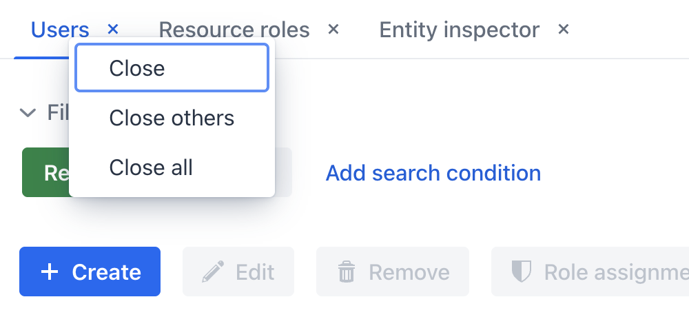
The standard actions are the following:
Drag and Drop
mainTabSheet supports dragging and dropping tabs. This feature can be used, for example, to rearrange tabs.
By changing the tabsDraggable attribute value, you can set whether the tabs are draggable by the user. Default value is false.
Events and Handlers
SelectedChangeEvent
Whenever the user switches between tabs, the io.jmix.tabbedmode.component.workarea.TabbedViewsContainer.SelectedChangeEvent is fired. Create an event handler to execute custom code in response to the tab switch.
The following code will send a notification on every tab switch:
@Autowired
private Notifications notifications;

@Subscribe("mainTabSheet")
public void onMainTabSheetSelectedChange(final SelectedChangeEvent<MainTabSheet> event) {
    notifications.create(event.getSelectedTab() + " is now selected")
            .show();
}| To generate handler method stubs in the Studio, use the Generate Handler button in the top panel of the screen controller code. Or you can select the component in the screen descriptor layout and use the Handlers tab of the Component Inspector panel. |
TabsCollectionChangeEvent
Whenever the user opens or closes views, which leads to the creation of a new tab or the removal of an existing one, the io.jmix.tabbedmode.component.workarea.TabbedViewsContainer.TabsCollectionChangeEvent is fired. Create an event handler to execute custom code in response to the tabs collection change.
The following code will send a notification on every tabs collection change:
@Autowired
private Notifications notifications;

@Subscribe("mainTabSheet")
public void onMainTabSheetTabsCollectionChange(final TabsCollectionChangeEvent<MainTabSheet> event) {
    notifications.create("Tabs collection changed", "Change type: " + event.getChangeType())
            .show();
}| To generate handler method stubs in the Studio, use the Generate Handler button in the top panel of the screen controller code. Or you can select the component in the screen descriptor layout and use the Handlers tab of the Component Inspector panel. |
Theme Variants
centered
Positions the tabs at the center of the main view, instead of their default left-aligned position:

small
Makes the tabs smaller:
minimal
Reduces visual style to only show tab labels without any additional visual elements:
hide-scroll-buttons
Hides the scroll buttons that assist in navigating overflown tabs:
bordered
Adds a border around the tabs themselves, as well as the content area.
Tab Text Max Width
You can limit the width of the main tab text by setting the value of the CSS variable in the application theme:
html {
  --jmix-tabmod-main-tab-text-max-width: 5em;
}