switch
switch allows users to toggle between two states: on/off or true/false, making it ideal for enabling/disabling settings, preferences, or binary options. Its visual design mimics a physical toggle switch with a sliding handle.
XML Element |
|
|---|---|
Java Class |
|
Attributes |
id - alignSelf - ariaLabel - ariaLabelledBy - autofocus - classNames - clickShortcut - colspan - css - dataContainer - enabled - errorMessage - focusShortcut - height - helperText - label - maxHeight - maxWidth - minHeight - minWidth - property - readOnly - required - requiredMessage - tabIndex - value - visible - width |
Handlers |
AttachEvent - BlurEvent - ClickEvent - ComponentValueChangeEvent - DetachEvent - FocusEvent |
Elements |
Basics
switch is an alternative to the checkbox component, designed to represent binary states clearly and intuitively. Switches are best for:
-
Toggling between two mutually exclusive options (for example, on/off).
-
Providing immediate visual feedback.
-
Enabling or disabling settings that take effect right away.
The checkbox and checkboxGroup components, on the other hand, are better suited for:
-
Selecting one or more options from a list.
-
Allowing multiple, non-exclusive choices.
-
Scenarios where changes do not take immediate effect.
An example of switch:
<switch label="Enable Dark Mode"
        value="true"/>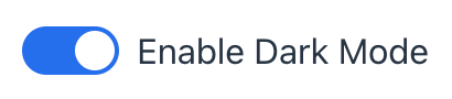
Data Binding
Data binding refers to linking a visual component to a data container. Changes in the visual component or corresponding data container can trigger updates to one another. See Using Data Components for more details.
The following example produces a data-aware switch. The entity attribute must be of Boolean type.
<data>
    <instance id="userDc"
              class="com.company.onboarding.entity.User"> (1)
        <fetchPlan extends="_base"/> (2)
        <loader/>
    </instance>
</data>
<layout>
    <switch label="Active"
            dataContainer="userDc"
            property="active"/> (3)
</layout>| 1 | InstanceContainer for the User entity. |
| 2 | Inline fetch plan of the entity instance located in the container. |
| 3 | Binding the component to a data container and property. The dataContainer attribute contains a link to the userDc data container, and the property attribute refers to the active entity attribute. |
States
switch can exist in several states that define its visual appearance and functionality.
Enabled
-
Disabled:
switchis inactive and cannot be interacted with by the user. Visually, it is often grayed out to indicate its inactive state. -
Enabled:
switchis interactive and responsive to user input. Users can click on it to change its state.
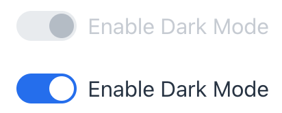
XML code
<switch label="Enable Dark Mode"
        value="true"
        enabled="false"/>
<switch label="Enable Dark Mode"
        value="true"
        enabled="true"/>
Read-only
The readOnly attribute controls whether the switch component can be interacted with by the user. If set to true, switch becomes read-only, meaning the user cannot change its state.
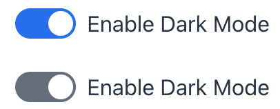
XML code
<switch label="Enable Dark Mode"
        value="true"
        readOnly="false"/>
<switch label="Enable Dark Mode"
        value="true"
        readOnly="true"/>
Required
switch can be configured as required using its required attribute or by binding it to a mandatory attribute with @NotNull validation.
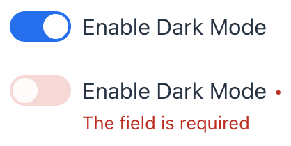
When the field is marked as required, a visual indicator appears next to the label to inform the user. If switch is initially turned on (selected) and then turned off (deselected), the field will be marked as invalid until the required condition is met again.
Like input fields, switch will only pass @NotNull validation if it is not empty (i.e., if it is checked). The default behavior can be modified using the jmix.ui.component.checkbox-required-state-initialization-enabled property, which allows the unchecked state to be treated as false.
|
Attributes
In Jmix there are many common attributes that serve the same purpose for all components.
The following are attributes specific to switch:
Name |
Description |
Default |
|---|---|---|
Sets the component explicitly disabled or enabled. See Enabled State. |
|
|
Specifies whether the |
|
|
Set the required state of |
|
