RadioButtonGroup
RadioButtonGroup allows you to select a single value from a list of options using radio buttons. If you need to choose several values from the list, you should use the CheckBoxGroup component.
Component’s XML-name: RadioButtonGroup.
Basics
The simplest case of using RadioButtonGroup is to select an enumeration value for an entity attribute.
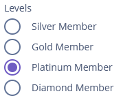
<radioButtonGroup optionsEnum="ui.ex1.entity.Level"
                  property="level"
                  caption="Levels"/>
In the example above, the Customer entity has the level attribute of the Level type, which is an enumeration.
Functionality
RadioButtonGroup has identical functionality as CheckBoxGroup:
But note that you will only be able to select one of the suggested values.
Events and Handlers
|
To generate a handler stub in Jmix Studio, select the component in the screen descriptor XML or in the Jmix UI hierarchy panel and use the Handlers tab of the Jmix UI inspector panel. Alternatively, you can use the Generate Handler button in the top panel of the screen controller. |
OptionIconProvider
See OptionIconProvider.
Validator
See Validator.
ValueChangeEvent
See ValueChangeEvent.
RadioButtonGroup XML Attributes
|
You can view and edit attributes applicable to the component using the Jmix UI inspector panel of the Studio’s Screen Designer. |
align - caption - captionAsHtml - captionProperty - colspan - contextHelpText - contextHelpTextHtmlEnabled - css - dataContainer - description - descriptionAsHtml - editable - enable - box.expandRatio - height - htmlSanitizerEnabled - icon - id - optionsContainer - optionsEnum - orientation - property - required - requiredMessage - responsive - rowspan - stylename - tabIndex - visible - width
