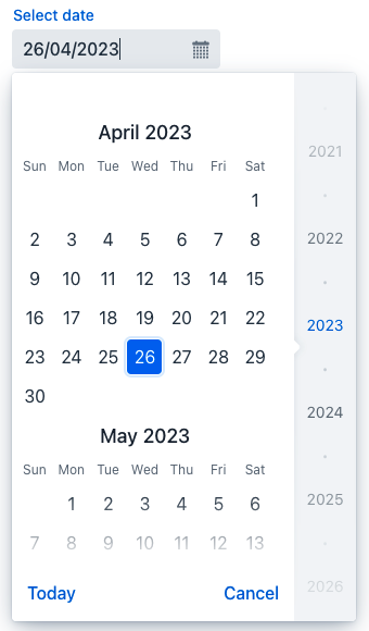
datePicker
datePicker lets users enter a date by typing or select it using a calendar overlay.
-
XML element:
datePicker -
Java class:
TypedDatePicker
Basics
Unlike a regular input field, datePicker has a calendar button and a calendar overlay. The calendar opens when the user clicks the button or the field itself, or starts entering a date.

The calendar is scrollable and allows selecting a year in the right pane. Click Today at the bottom to navigate back to the current date.
The following example defines a datePicker with a label:
<datePicker id="datePicker" label="Select date"/>Data Types
datePicker is a typed component which supports common data types for storing a date:
-
date -
dateTime -
localDateTime -
offsetDateTime -
localDate
To change the type, use the datatype attribute.
Date Format
The default date and time format in the application is defined by the localized data format strings. To use a different format, add your own format strings to the message bundle.
To change the date format for a particular component, set its locale to one that uses the desired format.
@ViewComponent
private TypedDatePicker<Comparable> datePicker;

public void onInit(final InitEvent event) {
    datePicker.setLocale(Locale.US);
}
Attributes
id - autoOpen - classNames - clearButtonVisible - colspan - dataContainer - datatype - enabled - errorMessage - height - invalid - label - maxHeight - maxWidth - minHeight - minWidth - name - opened - placeholder - property - readOnly - required - requiredIndicatorVisible - requiredMessage - tabIndex - themeNames - visible - width
Handlers
AttachEvent - BlurEvent - ChangeEvent - ClientValidatedEvent - ComponentValueChangeEvent - DetachEvent - FocusEvent - InvalidChangeEvent - OpenedChangeEvent - TypedValueChangeEvent - statusChangeHandler - validator
|
To generate a handler stub in Jmix Studio, use the Handlers tab of the Jmix UI inspector panel or the Generate Handler action available in the top panel of the view class and through the Code → Generate menu (Alt+Insert / Cmd+N). |
ChangeEvent
com.vaadin.flow.component.datepicker.GeneratedVaadinDatePicker.ChangeEvent corresponds to the change DOM event.
ClientValidatedEvent
ClientValidatedEvent is sent by the web component whenever it is validated on the client-side.
InvalidChangeEvent
com.vaadin.flow.component.datepicker.DatePicker.InvalidChangeEvent is sent when the value of the invalid attribute of the component changes.
OpenedChangeEvent
OpenedChangeEvent is sent every time the opened attribute of the component changes. That is, when the calendar is opened or closed.
validator
Adds a validator instance to the component. The validator must throw ValidationException if the value is not valid. For example:
@Install(to = "birthDatePicker", subject = "validator")
private void birthDatePickerValidator(Date date) {
        Date now = timeSource.currentTimestamp();
        if (date != null && DateUtils.addYears(now,-18).compareTo(date) < 0) {
            throw new ValidationException("The age must be over 18 years");
        }
}See Also
See Vaadin Docs for more information.
