Elements
Basics
Component’s XML name: pivotTable
An example of component definition in an XML descriptor of a screen:
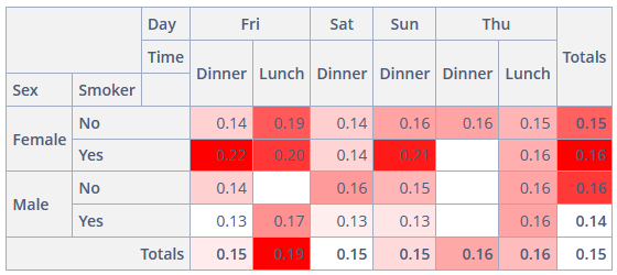
<pivot:pivotTable id="pivotTable"
                  dataContainer="tipsDc"
                  height="100%"
                  width="100%"
                  renderer="HEATMAP">
    <pivot:renderers>
        <pivot:renderer type="AREA_CHART"/>
    </pivot:renderers>
    <pivot:properties>
        <pivot:property name="totalBill"/>
        <pivot:property name="tip"/>
        <pivot:property name="sex"/>
        <pivot:property name="smoker"/>
        <pivot:property name="day"/>
        <pivot:property name="time"/>
        <pivot:property name="size"/>
    </pivot:properties>
    <pivot:aggregation mode="SUM_OVER_SUM">
        <pivot:property name="tip"/>
        <pivot:property name="totalBill"/>
    </pivot:aggregation>
    <pivot:columns>
        <pivot:column value="day"/>
        <pivot:column value="time"/>
    </pivot:columns>
    <pivot:rows>
        <pivot:row value="sex"/>
        <pivot:row value="smoker"/>
    </pivot:rows>
    <pivot:sortersFunction>
        function(attr){
            if(attr=="Day"){
                return $.pivotUtilities.sortAs(["Mon","Tue","Wed","Thu","Fri","Sat","Sun"]);
            }
        }
    </pivot:sortersFunction>
</pivot:pivotTable>
pivotTable Attributes
-
dataContainer- sets a data container defined in thedatasection of the screen XML descriptor. TheCollectionContainertype is required. -
editable- iftrue, the elements for manipulation with data will be displayed in the UI. Otherwise, only the data will be displayed. -
menuLimit- maximum number of values displayed in the double-click menu. If the number of records is exceeded, the corresponding message appears. This element is applicable for an editablepivotTableonly. -
renderer- enables setting one of the predefined data renderers. This element is applicable for non-editablepivotTableonly. -
showColTotals- defines whether the column totals should be displayed. The default value istrue. Works only for table renderers. -
showRowTotals- defines whether the row totals should be displayed. The default value istrue. Works only for table renderers. -
showUI- hides or shows the UI elements in the editable pivot table. The default value istrue. -
autoSortUnusedProperties- defines if unused attributes should be sorted in the UI. This element is applicable for an editablepivotTableonly. -
unusedPropertiesVertical- defines if unused attributes should be displayed vertically (iftrue) or horizontally (iffalse, or by default). If set to a number, then if the attributes names' combined length in characters exceeds this number, the attributes will be shown vertically.
pivotTable Elements
properties
A key-value map with a set of properties to be used in the pivotTable, where the key is the attribute’s name from the data container, and the value is its localized caption.
derivedProperties
It can be used to add new attributes to the original data container derived from the existing ones. This element is a key-value map, where the key is the name of the generated attribute, and the value is the JavaScript function that generates this attribute.
-
The enclosed
derivedPropertyelements should have thecaptionattribute defined, as the caption’s value will be used as the key. -
The
functionelement is used as the value for thederivedProperty.
hiddenProperties
A list of attributes that should not be displayed in the UI. Its value can be either a properties key or a generated attribute’s name, for instance, the derivedProperties key.
This element is applicable for an editable pivotTable only.
hiddenFromAggregations
An array of attributes to omit from the aggregation arguments dropdowns.
columns
A list of attributes to be used as table columns. Its value can be either a properties key or a generated attribute’s name.
columnOrder
An order in which column data is provided to the renderer.
rows
A list of attributes to be used as table rows. Its value can be either a properties key or a generated attribute’s name.
rowOrder
An order in which row data is provided to the renderer.
exclusions
A key-value map where the key is the names of attributes (either a properties key or a generated attribute’s name), and the value is the list of these attributes' values to be excluded from rendering.
This element is applicable for an editable pivotTable only.
inclusions
A key-value map where the key is the names of attributes (either a properties key or a generated attribute’s name), and the value is the list of these attributes' values to be rendered.
This element is applicable for an editable pivotTable only.
renderers
Defines the collection of rendering functions that should be displayed in the list of available renderers in the UI.
-
defaultattribute enables setting one of the predefined renderers. The selected renderer will be used as a default when the component is loaded. -
enclosed
rendererelement enables setting one of the predefined renderers using itstypeattribute:AREA_CHART,BAR_CHART,COL_HEATMAP,HEATMAP,HORIZONTAL_BAR_CHART,HORIZONTAL_STACKED_BAR_CHART,LINE_CHART,ROW_HEATMAP,SCATTER_CHART,STACKED_BAR_CHART,TABLE_BAR_CHART,TABLE,TREEMAP,TSV_EXPORT.
This element is applicable for an editable pivotTable only.
pivotTable Aggregation Elements
aggregation
This element sets up a function which will aggregate results per cell.
Agregation Attributes:
-
mode- enables setting one of the predefined aggregation functions. -
caption- is a localized value to be displayed in the UI. -
custom- iftrue, themodevalue is ignored in favor of the javaScript code from the enclosedfunctionelement.
Aggregation Elements:
-
function- contains JavaScript code of an aggregation function. -
property- the list of attributes to be used as input parameters of the aggregation function. Its value can be either apropertieskey or a generated attribute’s name. This element is applicable for non-editablepivotTableonly.<pivot:aggregation mode="SUM_OVER_SUM" custom="true"> <pivot:property name="tip"/> <pivot:property name="totalBill"/> </pivot:aggregation>
aggregationProperties
Defines the list of attributes that should be displayed in the dropdown lists of aggregators. Its value can be either a properties key or a generated attribute’s name. This element is applicable for an editable pivotTable only.
<pivot:aggregationProperties>
    <pivot:property name="tip"/>
    <pivot:property name="totalBill"/>
</pivot:aggregationProperties>
aggregations
Defines the collection of aggregators that should be displayed in the dropdown list of available aggregators in the UI.
aggregations Attributes:
-
defaultattribute enables setting one of the predefined aggregation functions. The selected function will be used as default when the component is loaded. -
enclosed
aggregationelement is used in the same way as aggregation except for the enclosedpropertyelement. This element is applicable for an editablepivotTableonly.
<pivot:aggregations default="SUM_OVER_SUM">
    <pivot:aggregation caption="Count"/>
    <pivot:aggregation mode="SUM_OVER_SUM"/>
</pivot:aggregations>
Listeners
CellClickListener
addCellClickListener adds a listener to the PivotTable cell click events. The CellClickEvent is fired only for table renderers (TABLE, HEATMAP, TABLE_BAR_CHART, COL_HEATMAP, ROW_HEATMAP).
@Autowired
private PivotTable pivotTable;

@Autowired
private Notifications notifications;

@Subscribe
public void onInit(InitEvent initEvent) {
    pivotTable.addCellClickListener(event -> {
        notifications.create().withCaption("Value: " + event.getValue() + ",\n"
                + "Filters applied: " + event.getFilters())
                .show();
    });
}
RefreshListener
addRefreshListener adds a listener to the PivotTable refresh events. The RefreshEvent is fired only for editable PivotTable.
@Autowired
private PivotTable pivotTable;

@Autowired
private Notifications notifications;

@Subscribe
public void onInit(InitEvent initEvent) {
    pivotTable.addRefreshListener(event -> {
        notifications.create().withCaption("Row order :" + event.getRowOrder() + ",\n"
                + "Inclusions: " + event.getInclusions())
                .show();
    });
}
The following values are available from the RefreshEvent: aggregation, aggregationProperties, columns, columnOrder, exclusions, inclusions, renderer, rowOrder, rows.
