Creating GWT Component
Creating Custom WidgetSet
Jmix framework provides a ready-compiled widgetset in the jmix-ui-widgets-compiled artifact.
To create a custom widgetset in the project, you need to:
-
Remove
implementation 'io.jmix.ui:jmix-ui-widgets-compiled'dependency. -
Add dependencies to your
build.gradle:implementation 'io.jmix.ui:jmix-ui-widgets' (1) widgets 'io.jmix.ui:jmix-ui-widgets'1 Required only for developing custom client-side components. -
Add the
compileWidgetstask (change paths according to your application base package):compileWidgets { generate "ui.ex1.widgets.CustomWidgetSet" includePaths('**/io/jmix/**/widget/**', '**/ui/ex1/widgets/**') }The
excludePathsandincludePathsparameters for thecompileWidgetstask are useful if you don’t want to compile a widgetset in case, for example, some screen is changed.The
excludePathsparameter is used to exclude some paths or files from the widgetset compilation. See the example:compileWidgets { generate 'com.company.demo.widgets.CustomWidgetSet' excludePaths('**/com/company/demo/**') }Thus, changes in the
com.company.demopackage do not trigger the widgetset compilation.The
includePathsparameter is used to include some paths or files to the widgetset compilation.See the example:
compileWidgets {
    generate 'com.company.demo.widgets.CustomWidgetSet'
    includePaths('**/io/jmix/**/widget/**', '**/com/company/demo/widgets/**')
}
Thus, changes in the
com.company.demo.widgetspackage and in anywidgetpackage (including sub-packages) under theio.jmixpackage trigger the widgetset compilation. Other changes, for example, in screen controllers or XML descriptors do not trigger such compilation. If you see unexpected re-compilation, check the particular reason (executecompileWidgetswith the--infoparameter).The
excludePathsandincludePathsparameters accept the list of string patterns.Patterns may include:
-
*to match any number of characters. -
?to match any single character. -
**to match any number of directories or files.
Either
'/'or'\'may be used in a pattern to separate directories.For example,
includePaths('**/com/company/demo/widgets/**')includes all files in thecom/company/demo/widgetsdirectory including subdirectories.More information is available at https://docs.gradle.org/current/javadoc/org/gradle/api/tasks/util/PatternFilterable.html.
-
-
Add the
jmix.ui.widget-setproperty to yourapplication.propertiesfile (adjust location according to thecompileWidgetstask above):jmix.ui.widget-set=ui.ex1.widgets.CustomWidgetSet
Widgetsets are compiled by the WidgetsCompile task named compileWidgets. It is automatically created when using the Jmix plugin.
The compiled widgetset is placed in the build/widgets directory and will be included in the JAR/WAR artifact of the project.
Creating ColorButton GWT Component
In this section, we will create a custom ColorButton component. This component is directly inherited from the JmixButton component.
Custom UI components (that is, components directly inherited from Vaadin components) should be placed in the widgets subpackage, for example, com.company.sample.widgets. Clients-side components (connectors and widgets), as well as classes used for server-side and client-side communication, such as RPC and State, should be placed in the widgets.client subpackage, for example com.company.sample.widgets.client. More information about client-server integration can be found in the Vaadin documentation.
Creating Component State Class
Create ColorButtonState.java within the widgets.client package.
The ColorButtonState state class defines what data is sent between the client and the server. It contains public fields that are automatically serialized on the server-side and deserialized on the client.
public class ColorButtonState extends JmixButtonState {

    public String color = "";
}
Creating Vaadin Component Class
ColorButton is a Vaadin component class. It can define an API for the server code, accessor methods, event listeners, and data sources connection. Developers use the methods of this class in the application code.
Create ColorButton.java within the widgets package:
public class ColorButton extends JmixButton {

    @Override
    protected ColorButtonState getState() {
        return (ColorButtonState) super.getState();
    }

    @Override
    protected ColorButtonState getState(boolean markAsDirty) {
        return (ColorButtonState) super.getState(markAsDirty);
    }

    public String getColor() {
        return getState(false).color;
    }

    public void setColor(String color) {
        if (!Objects.equals(getState(false).color, color)) {
            getState().color = color;
        }
    }
}
Creating Connector
Create ColorButtonConnector.java within the widgets.client package.
The ColorButtonConnector connector links client code with the server.
@Connect(ColorButton.class) (1)
public class ColorButtonConnector extends JmixButtonConnector {

    @Override
    public ColorButtonState getState() {
        return (ColorButtonState) super.getState(); (2)
    }

    @Override
    public void onStateChanged(StateChangeEvent event) { (3)
        super.onStateChanged(event);

        if (event.hasPropertyChanged("color")) { (4)
            Style style = getWidget().getElement().getStyle();
            style.setBackgroundColor(getState().color);
            style.setBackgroundImage("none");
        }
    }
}| 1 | With this annotation the ColorButtonConnector connector is marked to have a server-side counterpart. The value of the annotation is ColorButton - the class of server-side implementation . |
| 2 | Returns the ColorButtonState object for this connector. |
| 3 | Reacts on server state change. |
| 4 | Refreshes the widget’s style if the value on server has changed. |
Using ColorButton
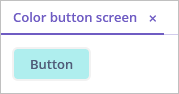
To demonstrate how the component works, let’s create a new color-button-screen screen.
Open the ColorButtonScreen.java screen controller and add the code that puts the component to the screen:
@UiController("sample_ColorButtonScreen")
@UiDescriptor("color-button-screen.xml")
public class ColorButtonScreen extends Screen {
    @Subscribe
    protected void onInit(InitEvent event) {
        ColorButton button = new ColorButton(); (1)
        button.setCaption("Button");
        button.setColor("#AFEEEE");
        getWindow().unwrap(Layout.class).addComponent(button); (2)
    }
}| 1 | Initializes a color button component instance. |
| 2 | Retrieves a link to the Vaadin container using the unwrap() method, and adds the new component to it. |
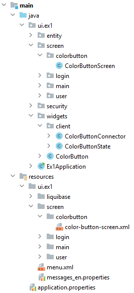
The picture below shows the project structure:
Start the application and see the result: