ScrollBoxLayout
ScrollBoxLayout is a container that allows you to scroll the content.
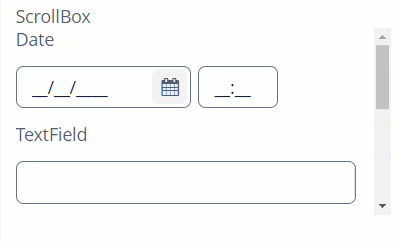
Component’s XML-name: scrollBox.
Basics
Usage example:
<scrollBox height="150px"
           width="300px"
           spacing="true"
           caption="ScrollBox">
    <label value="Date"/>
    <dateField/>
    <label value="TextField"/>
    <textField/>
    <label value="TextArea"/>
    <textArea height="130px"/>
    <hbox spacing="true">
        <button caption="Button"/>
        <button caption="Button"/>
    </hbox>
</scrollBox>
Attributes
scrollBars
scrollBars attribute enables configuring scroll bars. There are following possible values:
-
vertical- enables vertical scrolling, by default. -
horizontal- enables horizontal scrolling. -
both- enables scrolling in both directions -
none- forbids scrolling in any direction.
If the size of the components inside the container exceeds the size of the container, the corresponding scrollbar will appear automatically.
Content Size
-
contentHeight- sets content height.
-
contentWidth- sets content width.
-
contentMaxWidth- sets maximum width for content. The width of the container’s contents can’t get any wider, even if the screen size allows it.
-
contentMinWidth- sets minimum width for content.<scrollBox height="150px" width="100%" contentMinWidth="300px"> <label value="Date"/> <dateField/> <label value="TextField"/> <textField/> <label value="TextArea"/> <textArea height="130px"/> <hbox spacing="true"> <button caption="Button"/> <button caption="Button"/> </hbox> </scrollBox>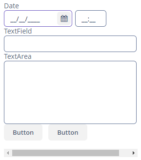
-
contentMinHeight- sets minimum height for content.<scrollBox height="100%" width="300px" contentMinHeight="300px"> <label value="Date"/> <dateField/> <label value="TextField"/> <textField/> <label value="TextArea"/> <textArea height="130px"/> <hbox spacing="true"> <button caption="Button"/> <button caption="Button"/> </hbox> </scrollBox>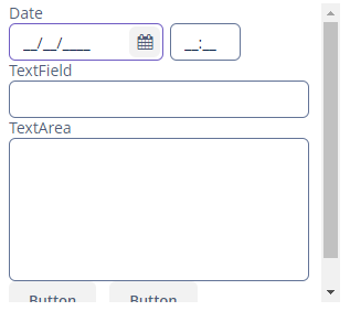
The ScrollBox content can reduce its size down to the values set in the contentMinWidth or contentMinHeight attributes.
|
It is recommended to set the content width and height. Otherwise, the components placed in the |
All XML Attributes
align - box.expandRatio - caption - captionAsHtml - colspan - contentHeight - contentMaxHeight - contentMaxWidth - contentMinHeight - contentMinWidth - contentWidth - contextHelpText - contextHelpTextHtmlEnabled - css - description - descriptionAsHtml - enable - height - htmlSanitizerEnabled - icon - id - margin - orientation - requiredIndicatorVisible - responsive - rowspan - scrollBars - spacing - stylename - visible - width
