Declarative Actions
You can specify a set of actions in an XML screen descriptor for any component that implements the ActionsHolder interface, including the entire window or fragment. You can do it in the actions element, which contains nested action elements.
Action Attributes
The action element can have the following attributes:
-
id- identifier, which should be unique within theActionsHoldercomponent. -
type- defines a specific action type. If this attribute is set, the framework finds the class having the@ActionTypeannotation with the specified value, and uses it to instantiate the action. If the type is not defined, the framework creates an instance of the BaseAction class. See Standard Actions for how to use action types provided by the framework and Custom Action Types for how to create your own types. -
caption- action name. -
description- action description. -
enable- accessibility flag. Possible values:true,false. -
icon- action icon.
-
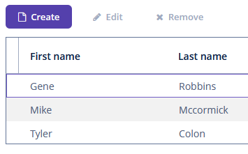
primary- attribute that indicates if a button representing this action should be highlighted with a special visual style. Possible values:true,false.The highlighting is available by default in the
hoverandheliumthemes; to enable this feature in thehalotheme, settruefor the$jmix-highlight-primary-actionstyle variable.The
createstandard list action and thelookupSelectActionin the lookup screen are primary by default. Figure 1. The Create button with the
createprimary action -
shortcut- a keyboard shortcut.Shortcut values can be hard-coded in the XML descriptor. Possible modifiers, ALT, CTRL, SHIFT, are separated by the "-" character. For example:
<action id="create" shortcut="ALT-N"/>To avoid the hard-coded values, you can use the predefined shortcut aliases from the list below, for example:
<action id="edit" shortcut="${TABLE_EDIT_SHORTCUT}"/>The following predefined shortcut aliases are supported:
-
TABLE_EDIT_SHORTCUT -
TABLE_INSERT_SHORTCUT -
TABLE_ADD_SHORTCUT -
TABLE_REMOVE_SHORTCUT -
COMMIT_SHORTCUT -
CLOSE_SHORTCUT -
NEXT_TAB_SHORTCUT -
PREVIOUS_TAB_SHORTCUT -
PICKER_LOOKUP_SHORTCUT -
PICKER_OPEN_SHORTCUT -
PICKER_CLEAR_SHORTCUTAnother option is to use the fully qualified name of the
UiComponentPropertiesclass and method which returns shortcut:<action id="remove" shortcut="${io.jmix.ui.UiComponentProperties#getTableRemoveShortcut}"/>
-
-
visible- visibility flag. Possible values:true,false.
Examples
The examples of action declaration and handling are provided below.
Screen Actions
In the example below, we declare an action with the sayHello identifier and a caption from the screen’s message pack. This action is bound to a button, which caption will be taken from the action’s caption.
<window xmlns="http://jmix.io/schema/ui/window"
        caption="msg://ui.ex1.screen.actions/actionScreen.caption">
    <actions>
        <action id="sayHello" caption="msg://sayHello" shortcut="ALT-T"/>
    </actions>
    <layout>
        <vbox spacing="true">
            <button action="sayHello"/>
        </vbox>
    </layout>
</window>
The screen controller subscribes to the action’s ActionPerformedEvent, so the onSayHello() method will be invoked when the user clicks the button or presses the ALT-T keyboard shortcut.
@Autowired
private Notifications notifications;

@Subscribe("sayHello") (1)
public void onSayHello(Action.ActionPerformedEvent event) {
    notifications.create()
            .withCaption("Hello")
            .withType(Notifications.NotificationType.HUMANIZED)
            .show();
}| 1 | The @Subscribe annotation contains the action id. |
|
Note that actions declared for the whole screen do not refresh their state. It means that if an action has a specific |
|
You can generate the |
PopupButton Actions
In the example below, we declare a popupButton with actions in the XML-descriptor:
<popupButton id="sayBtn" caption="Say">
    <actions>
        <action id="hello" caption="Say Hello"/>
        <action id="goodbye" caption="Say Goodbye"/>
    </actions>
</popupButton>
Subscribe to the action’s ActionPerformedEvent in the screen controller:
@Autowired
private Notifications notifications;

private void showNotification(String message) {
    notifications.create()
            .withCaption(message)
            .withType(Notifications.NotificationType.HUMANIZED)
            .show();
}

@Subscribe("sayBtn.hello") (1)
public void onSayBtnHello(Action.ActionPerformedEvent event) {
    showNotification(event.getSource().getCaption());
}

@Subscribe("sayBtn.goodbye")
public void onSayBtnGoodbye(Action.ActionPerformedEvent event) {
    showNotification(event.getSource().getCaption());
}| 1 | The @Subscribe annotation contains the PopupButton id and the id of the action separated by a dot. |
Table Actions
In the example below, we declare a groupTable with actions in the XML-descriptor:
<groupTable id="customersTable"
            width="100%"
            dataContainer="customersDc">
    <actions>
        <action id="create" type="create"/>
        <action id="edit" type="edit"/>
        <action id="remove" type="remove"/>
        <action id="copy" caption="Copy"
                icon="COPY" trackSelection="true"/>
    </actions>
    <columns>
        <column id="firstName"/>
        <column id="lastName"/>
    </columns>
    <buttonsPanel alwaysVisible="true">
        <button action="customersTable.create"/>
        <button action="customersTable.edit"/>
        <button action="customersTable.remove"/>
        <button action="customersTable.copy"/>
    </buttonsPanel>
</groupTable>
In this example, the copy action is declared in addition to create, edit and remove standard actions of the table. The trackSelection="true" attribute means that the action and corresponding button become disabled if no row is selected in the table. It is useful if the action is intended to be executed for a currently selected table row.
Subscribe to the action’s ActionPerformedEvent in the screen controller:
@Subscribe("customersTable.copy")
public void onCustomersTableCopy(Action.ActionPerformedEvent event) {
    // ...
}
EntityPicker Actions
In the example below, we declare the standard entity_lookup action and an additional points action for the EntityPicker component. The description attribute allows you to display a tooltip when hovering over the action button.
<entityPicker id="customerEntityPicker"
              property="customer"
              dataContainer="orderDc">
    <actions>
        <action id="lookup" type="entity_lookup"/>
        <action id="points"
                icon="QUESTION"
                description="msg://knowPoints"/>
    </actions>
</entityPicker>
Then implement custom logic in the screen controller by subscribing to Action.ActionPerformedEvent:
@Autowired
private EntityPicker<Customer> customerEntityPicker;
@Autowired
private Notifications notifications;

@Subscribe("customerEntityPicker.points")  (1)
public void onCustomerEntityPickerPoints(Action.ActionPerformedEvent event) {
    Customer customer = customerEntityPicker.getValue();
    if (customer != null) {
        notifications.create()
                .withCaption(customer.getFirstName() +
                        " has " + customer.getRewardPoints() +
                        " reward points")
                .show();
    } else {
        notifications.create()
                .withCaption("Choose a customer")
                .show();
    }
}| 1 | The @Subscribe annotation contains the EntityPicker id and the id of the action separated by a dot. |
Obtaining Reference to Action
You can obtain a reference to any declared action in the screen controller either directly by injection or from a component that implements the ActionsHolder interface. It can be useful to set action properties programmatically. For example:
@Named("sayBtn.hello")
private Action sayBtnHello;
@Autowired
private PopupButton sayBtn;

@Subscribe
public void onBeforeShow(BeforeShowEvent event) {
    sayBtnHello.setEnabled(false);
    sayBtn.getActionNN("goodbye").setEnabled(false);
}