HTML Editor UI
You can add, set, and delete elements from the canvas. In addition, you can import and export HTML and CSS code. Here is a description of the setting panels of the editor.
The Blocks Tab
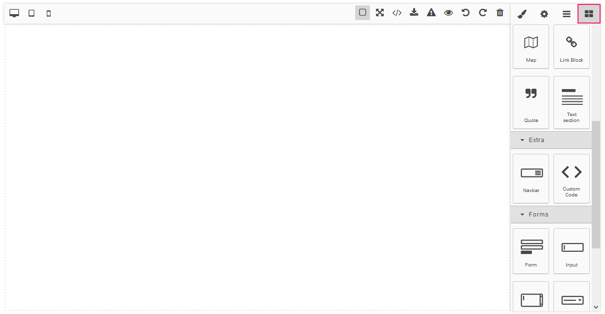
After opening the editor in the launched application, you can see the Blocks tab.
The block in GrapesJS is a reusable piece of HTML that you can drop on the canvas.
The set of elements depends on the added UI components. The following elements can be enabled for adding:
-
in the Basic section:
Columns,Text,Image,Video,Map,Link,Text Section,Link Block. -
in the Extra section:
Navbar,Tabs,Custom Code. -
in the Forms section:
Form,Input,Textarea,Select,Button,Label,Checkbox,Radio.
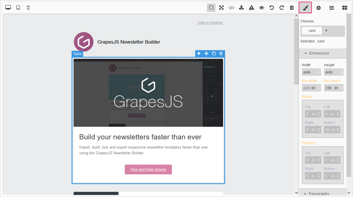
The Style Manager Tab
You can set the properties of the elements. Select the element and go to the Style Manager tab.
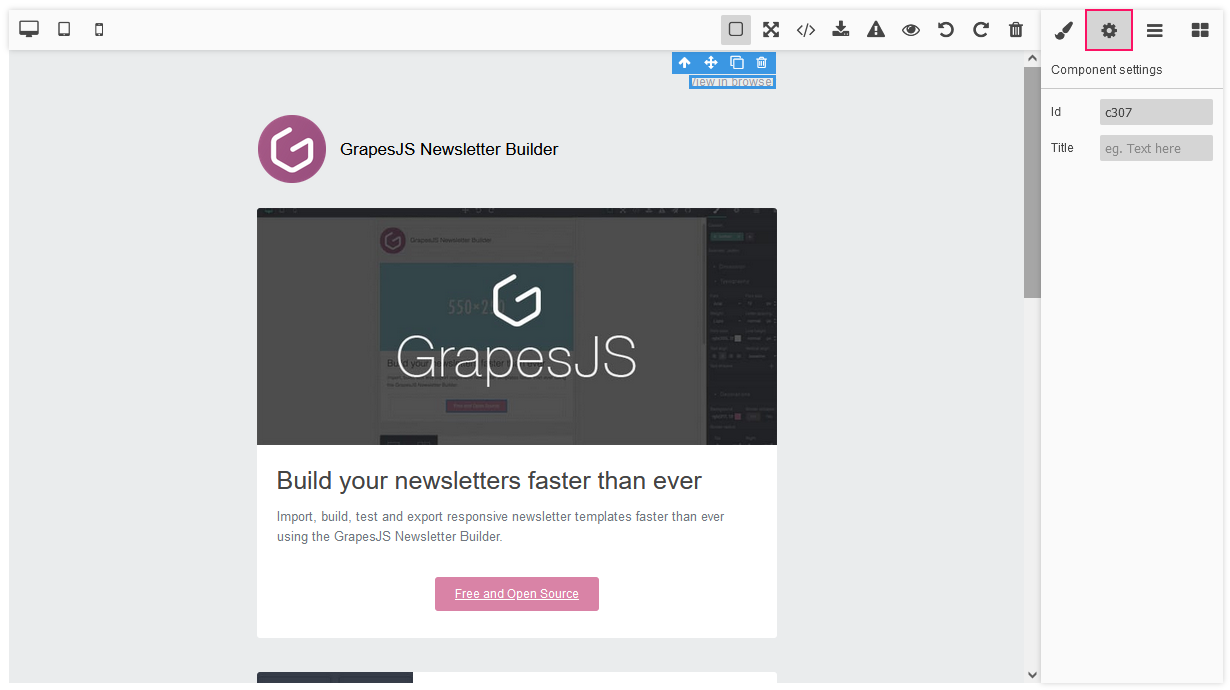
The Trait Manager Tab
You can define the parameters of the element. Select the element and go to the Trait Manager tab.
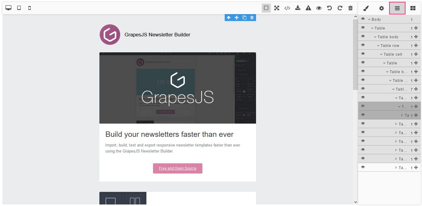
The Layers Tab
To watch the list of elements on the canvas, go to the Layers tab. You can hide elements on the canvas while editing.
The Top Panel Buttons
The following buttons on the Top Panel are available:
-
the Show borders button
-
the Preview button
-
the Full-screen button
-
the Export button
-
the Undo button
-
the Redo button
-
the Import button
-
the Clear canvas button
-
buttons for changing the screen width

