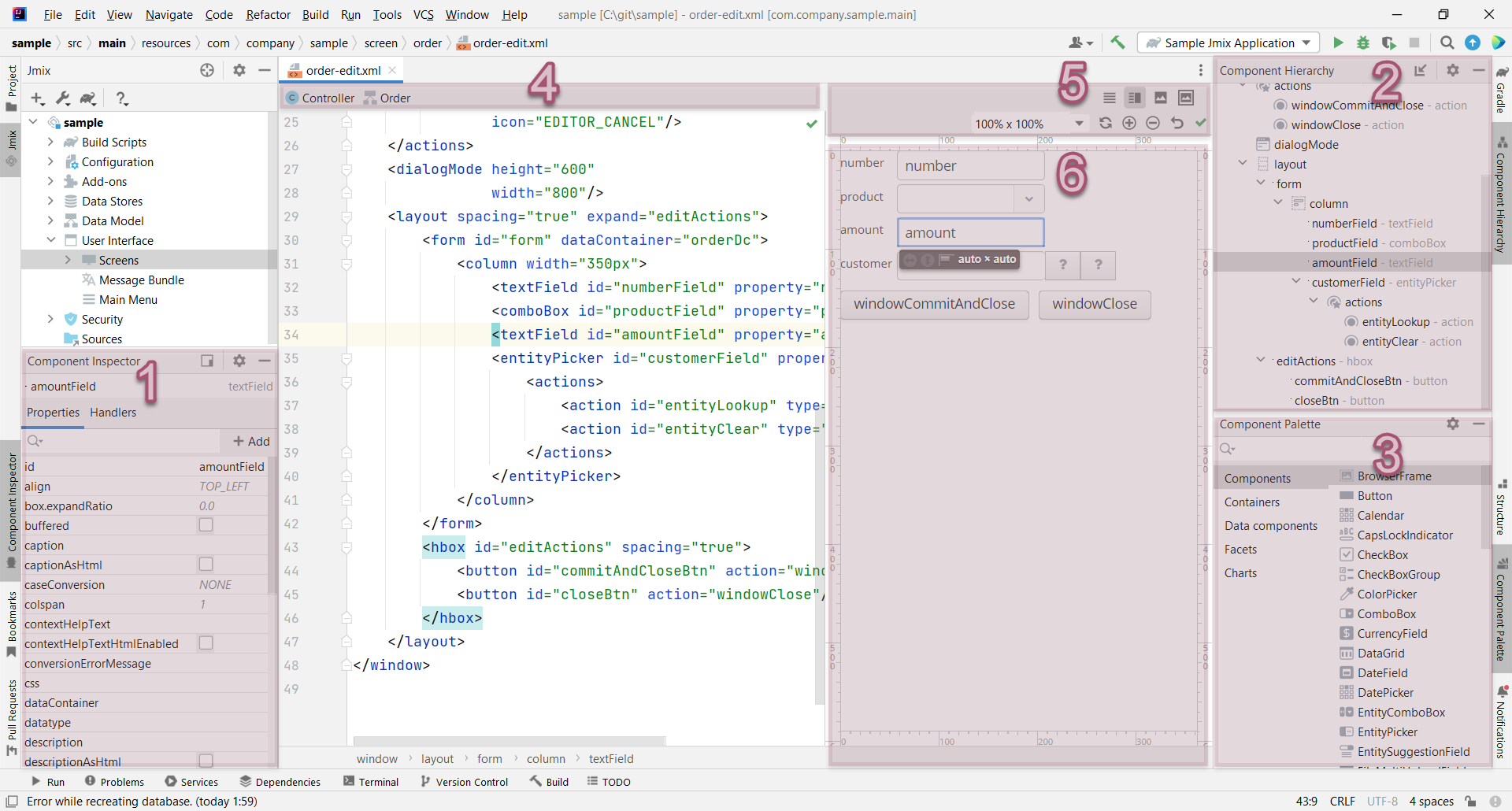
Screen Designer
Screen Designer represents a number of panels and tool windows that allow you to develop a layout of the screen and set UI components properties in WYSIWYG style. The screen XML descriptor editor is integrated with the Screen Designer, so you can edit the XML file directly or use the designer’s panels to generate code.
|
This feature requires a RAD or Enterprise subscription. If you don’t have the subscription, see how to get the trial version. |
The Component Hierarchy, Component Palette and Component Inspector panels are implemented as independent IDE tool windows and appear automatically when you open the screen descriptor in the editor.
-
Component Inspector
-
Component Hierarchy
-
Component Palette
-
Top Actions Panel
-
Layout Preview Panel
-
Layout Preview
Layout Preview Panel
The Layout Preview panel is used to display an interactive schematic presentation of the screen layout. It shares editor space with the source code of the screen descriptor.
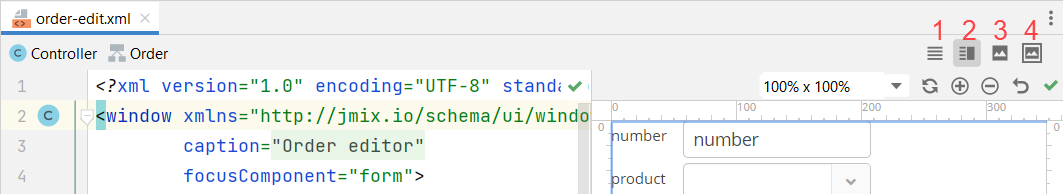
Use the buttons in the top right corner of the screen layout editor.
-
Editor only - only source code is displayed in the editor.
-
Editor and Preview - editor space is split to contain both source code and preview.
-
Preview only - only preview is displayed in the editor.
-
Preview in Window - source code is displayed in the editor while preview is displayed in the separate window.
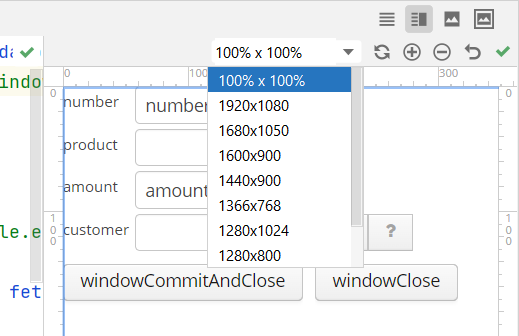
The panel has several controls located in the top right corner:
-
The 100% x 100% drop-down list allows you to select fixed canvas size. The canvas size can be larger than the size of the preview panel, in this case additional scroll bars are added. For example, if you are developing a complex screen containing a lot of controls and want to see the preview, you can choose 1920 x 1080 canvas size and observe how a layout looks like in a big screen.
-
The Refresh button reloads the content of the preview page.
-
The Zoom In, Zoom Out and Zoom Reset buttons change zoom of the preview page.
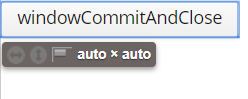
Also, you can use controls to resize and align components in the layout:
Component Palette
The Component Palette tool window displays a set of available screen elements: components, containers, data components - containers and loaders, facets that include actions and dialog mode settings.
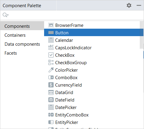
Use the search box to find the component you need.
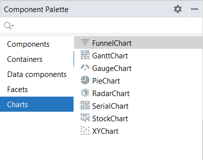
If the add-ons installed to the application have their own components, they will be shown in the palette, for example, in case of the Charts add-on:
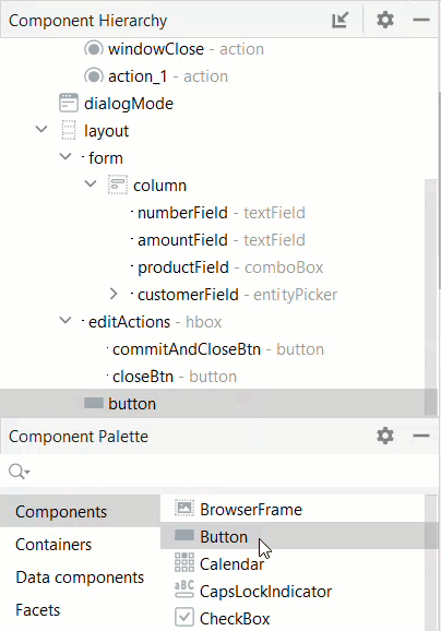
In order to add a component to the layout, drag it from the palette to the appropriate place in the XML source code or into the Component Hierarchy panel.
Right-click the component in the palette to open the context menu with the following actions:
-
Add to Design - adds the selected component to the screen inside the selected element in the hierarchy.
-
Jmix Documentation - opens the component’s documentation page.
Component Hierarchy
The Component Hierarchy tool window displays a tree of the components added to the layout.
You can move elements from the Component Palette window or rearrange the elements in the tree. When the element is selected, the Component Inspector window displays its properties.
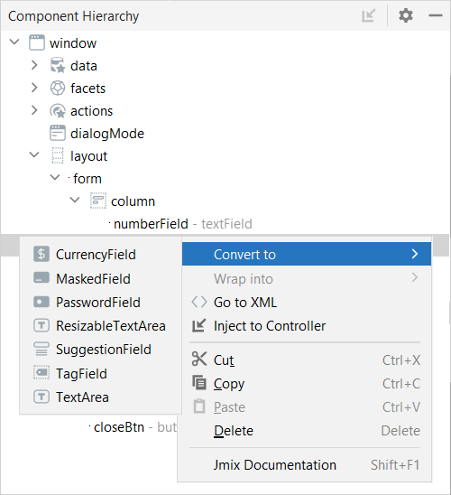
Right-click the element to open its context menu with the following actions:
-
Convert the component to one of similar alternative components.
-
Wrap the component into one of the suggested containers.
-
Go to XML navigates to the XML tag in the source code.
-
Inject the element to the screen controller or navigate to the existing injection declaration.
-
Delete, Copy, Cut or Paste the element.
-
Open the Jmix Documentation page for the selected component.
Component Inspector
The Component Inspector tool window displays the Properties and Handlers tabs.
For some types of selected elements, the + Add button is shown that allows you to add the related sub-element, such as table action, column, formatter, validator, and so on.
Properties Tab
The Properties tab shows attributes of the selected screen element and allows you to edit them.
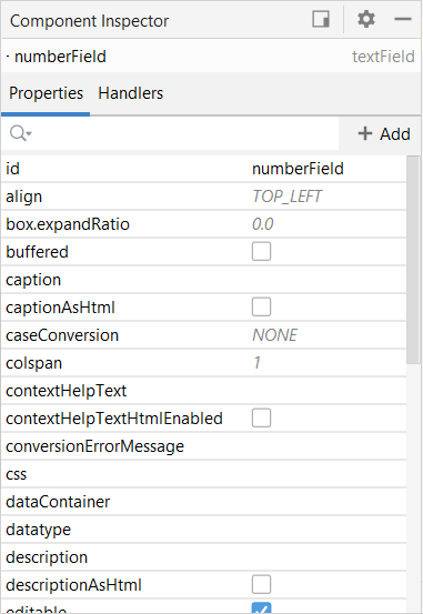
Some properties have default values that are grayed out.
Use the search field to find the necessary attribute.
Attributes come by default arranged by name. The first column lists the names of the attributes for the selected component. The second column on the Properties tab displays the property values as follows:
-
When the property is selected, the value changes to an edit field where you can type a new value.

-
If the value is a list, a
 drop-down button appears when the property is selected.
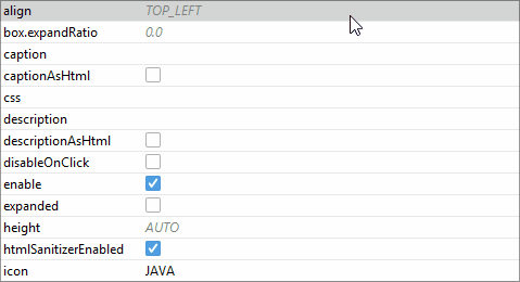
-
If the value is boolean, you can change it using the checkbox:
-
Such properties as caption, description, contextHelpText, have the ability to set localized names. Click the
 button to display a dialog where you can set the localized message for the attribute.
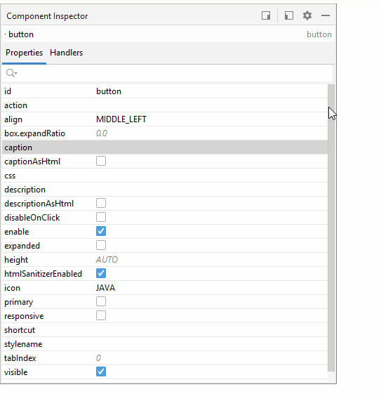
-
Click the
 button for the stylename property to open the Style Name Editor dialog:
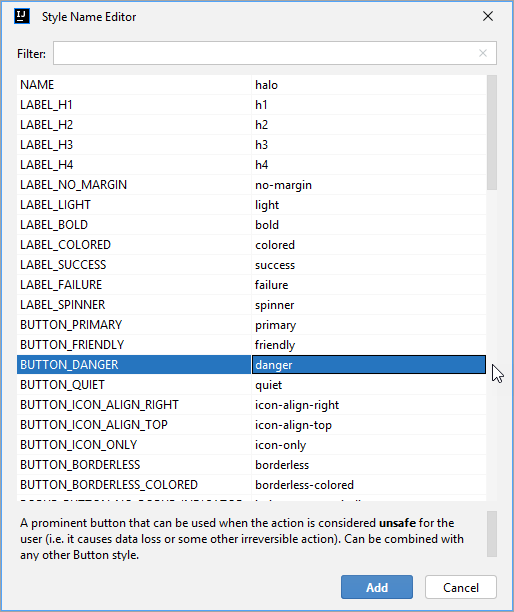
Style names come by default arranged by the component or container name.
-
Click the
 button for the icon property to open the Choose icon dialog:
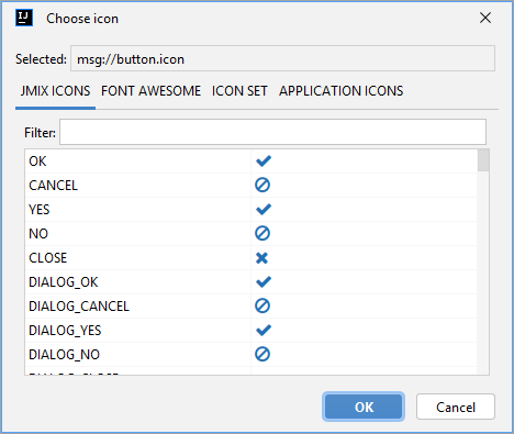
-
The JMIX ICONS tab contains icons from the default
JmixIconicon set. It includes an almost fullFontAwesomeicon set and Jmix-specific icons. -
The FONT AWESOME tab contains icons from the
FontAwesomeset of font icons. -
The ICON SET tab contains icons from the custom icon sets.
-
The APPLICATION ICONS tab contains icons from the theme sources.
-
Handlers Tab
The Handlers tab displays event listeners and component delegates that can be associated with the selected component. In order to generate the necessary handler method, just double-click the corresponding row.
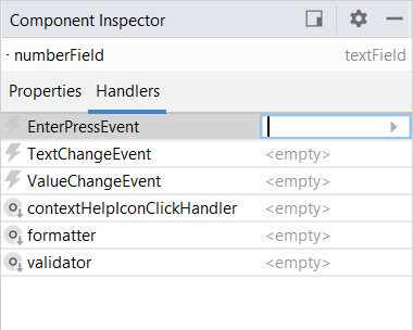
You will be redirected to the screen controller with the code snippet.
Top Actions Panel
The actions panel is located on the top of the source code editor. It provides access to the following actions:
-
Controller - navigates to the screen controller.
-
<entity class name>- displayed if the screen represents an entity browser or editor and allows you to navigate to the entity associated with the current screen.
Also, you can switch between the screen descriptor and controller using the marker on the gutter.
