Administration UI
Dashboards add-on provides administration screens for configuring dashboards.
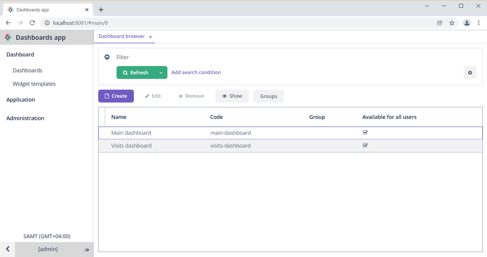
After the add-on is added to your application, the main menu contains the Dashboard item. The Dashboard browser provides the list of created dashboards and buttons for managing them.
Dashboard Editor
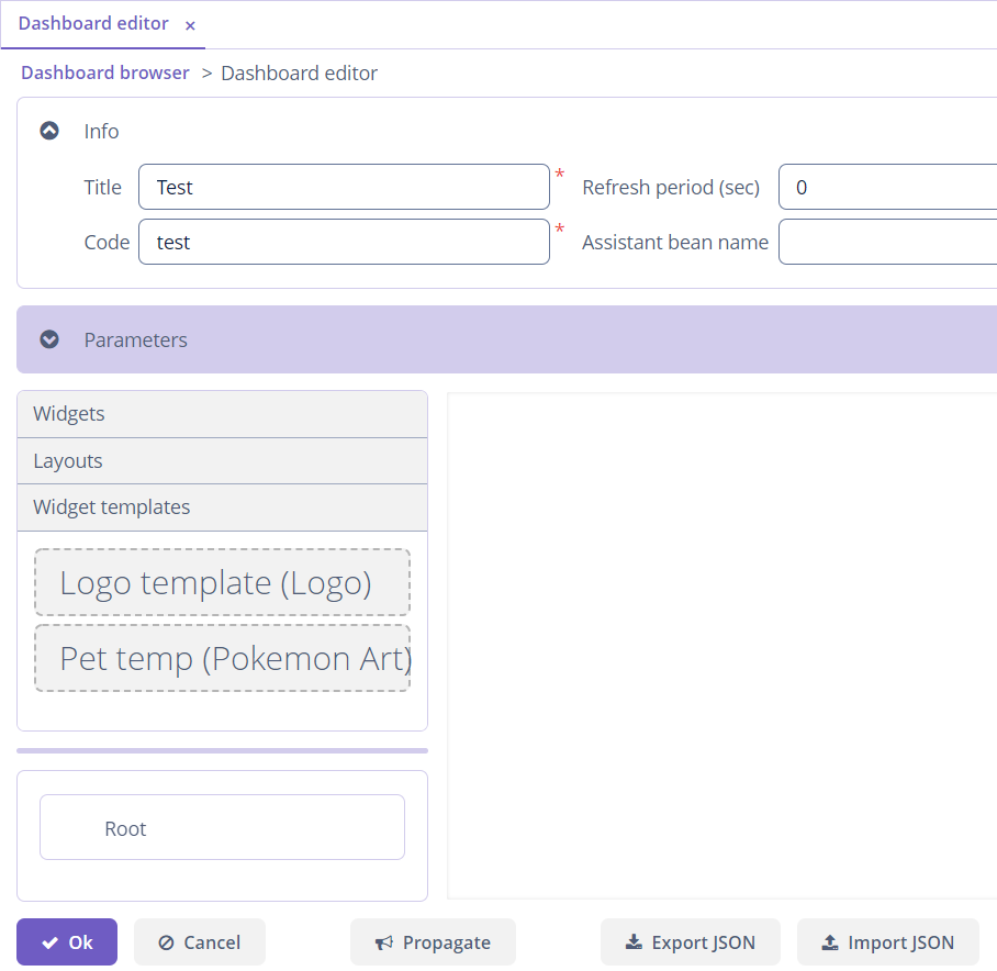
The Dashboard editor screen appears after clicking the Create button in the Dashboards screen and allows editing dashboards and widgets. The editor contains several panels described below.
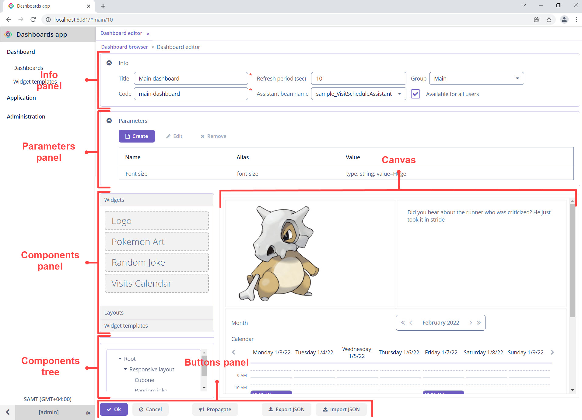
Info Panel
The Info panel contains the required fields:
-
Title - a name of the dashboard.
-
Code - a unique identifier that is used in JSON files or for searching in the database. Also, it is needed to add a dashboard into a screen.
The following fields can be set:
-
Refresh period - a time period in seconds to refresh a dashboard UI.
-
Assistant bean name - a reference to a Spring bean class that should be used for adding business logic to the dashboard.
-
Group - a dashboard group. Configuring groups is available from the Dashboard browser screen.
-
Available for all users - a flag that defines the user access to the dashboard. If set to
false, only the user who created the dashboard can view and edit it. Otherwise, all users can view and edit the dashboard.
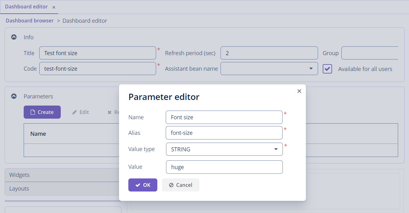
Dashboard Parameters
You can set dashboard parameters that can be passed as input parameters for any widget in the dashboard.
Let’s look at the example with the dashboard parameter that sets the size of the text in the widget.
This parameter will be passed to all widgets in the dashboard, so you can inject it to widgets using the @WindowParam and @WidgetParam annotations.
@Autowired
private TextArea<String> randomJoke;

@WindowParam(name = "font-size")
@WidgetParam
private String fontSize;

@Subscribe
private void onAfterInit(AfterInitEvent event) {
    if(fontSize!=null) {
        randomJoke.addStyleName(fontSize);
    }
    randomJoke.setValue(getNewJoke());
}
Also, dashboard parameters can be passed to a dashboard by using the dashboard:parameter tag.
Components Panel
Components Panel has three collapsible tabs with components that can be added to the canvas. Configuring components after moving from the panel to the canvas is described in the Configuring Layout, Configuring Widget, and Widget Templates. They are described in the corresponding sections below.
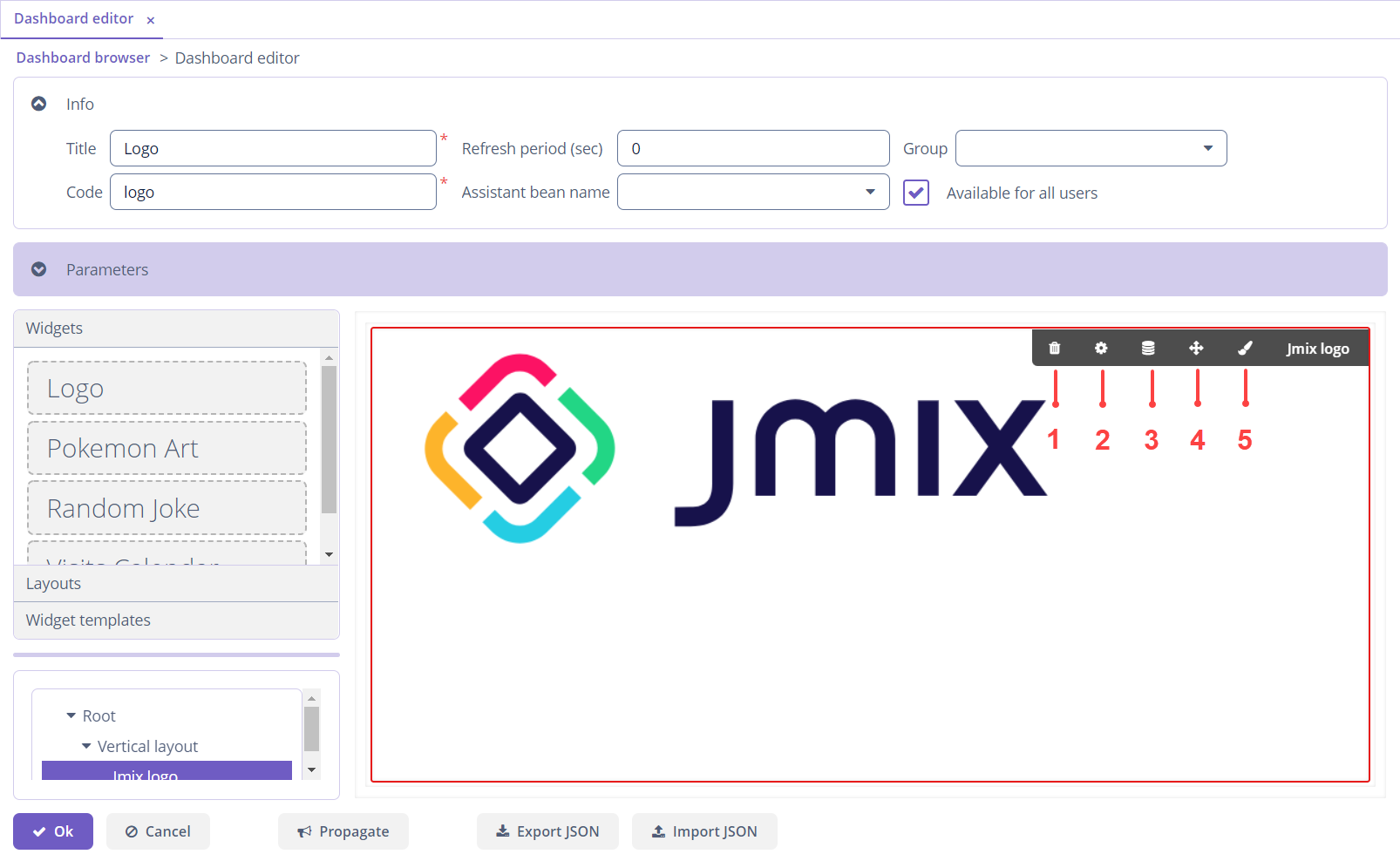
Canvas
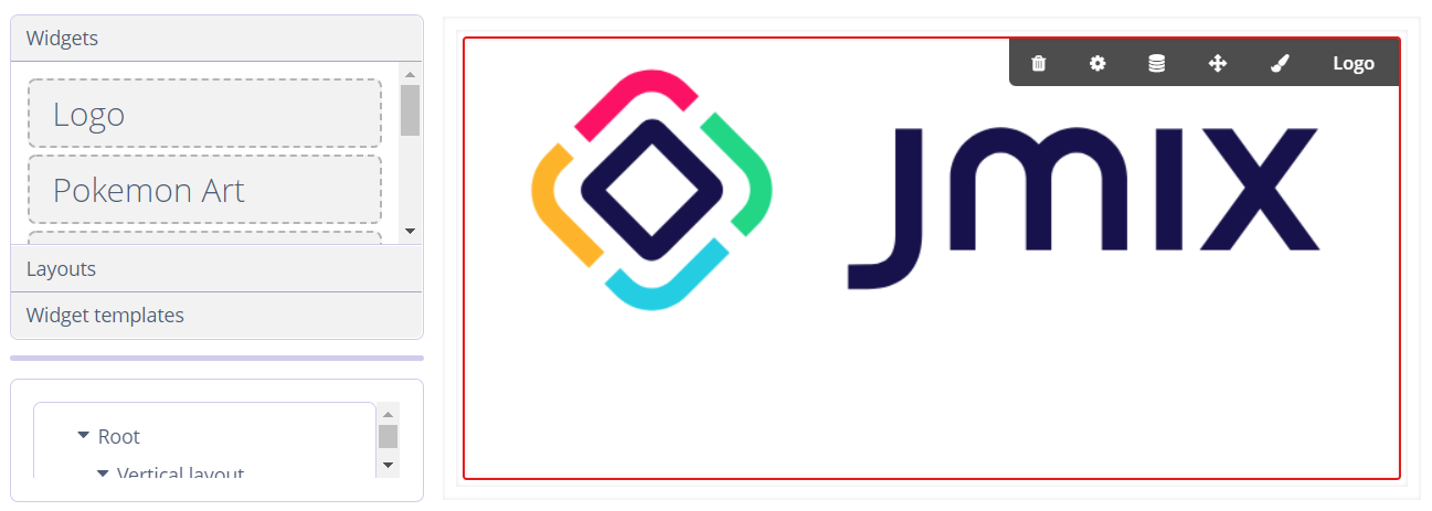
Canvas is a container for placing widgets and layouts. Drag an element from the palette for adding it on the canvas. When a widget or layout is on the canvas and selected, a panel with buttons is available.
Configuring widgets and layouts on the canvas is described in the Layout Settings and Widget Settings sections.
Structure Tree
In this panel, the current dashboard structure is represented as a tree. The Root element is available by default and cannot be removed.
The actions from the context menu duplicate the actions available from the buttons panel on the canvas. See the Layout Settings and Widget Settings sections
Buttons Panel
This panel, in addition to the standard buttons OK and Cancel, contains the following buttons:
-
Propagate - publishes the
io.jmix.dashboardsui.event.DashboardUpdatedEventevent. -
Export JSON - exports a dashboard to a JSON file.
-
Import JSON - imports a dashboard from a JSON file and refreshes the editor.
Adding dashboards into a screen as a JSON file is described in the Using dashboard in screen section.
Configuring Layout
Layouts allow you to place widgets on a dashboard in a specific way. You should add the required layout before adding widgets on the canvas.
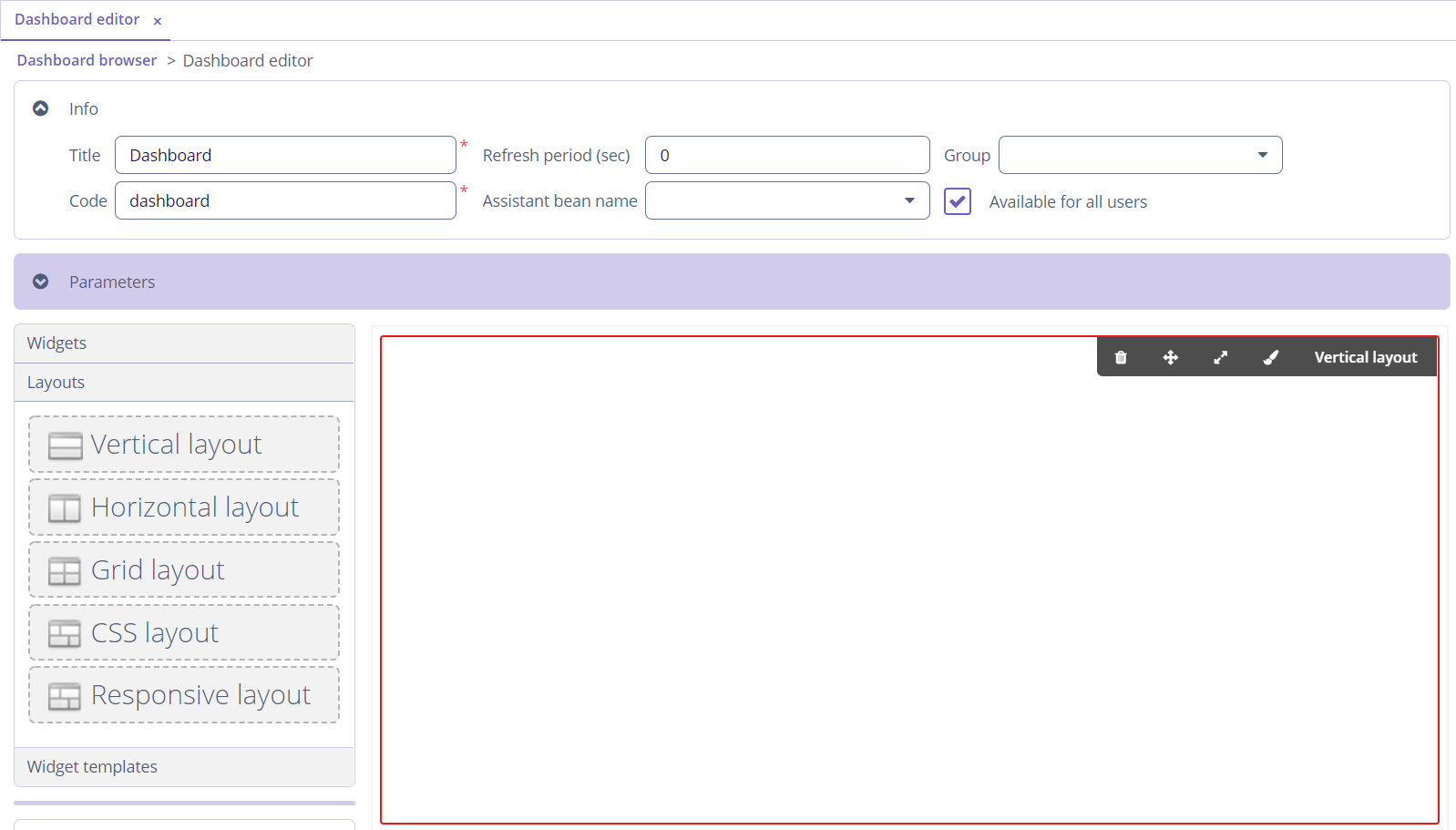
The following layouts are available:
-
Vertical - widgets are placed vertically, one after another.
-
Horizontal - widgets are placed horizontally, one after another.
-
Grid - widgets are placed inside a grid with a specified number of rows and columns.
-
CSS - enables full control over placement and styling of enclosed components using CSS.
-
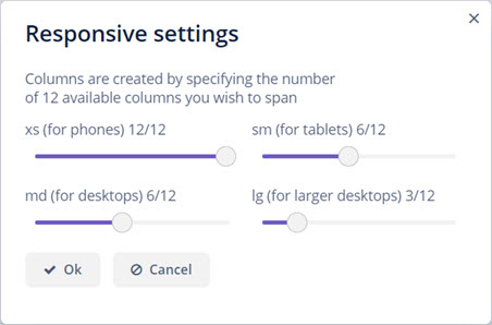
Responsive - widgets are placed vertically, but the number of columns changes depending on the screen width. A responsive layout is convenient for viewing dashboards on a desktop, tablet or, smartphone. After adding this layout on the canvas, the setting form will appear. The slider shows which part of the screen will be occupied by one widget when opening the dashboard on a particular device.
Layout Settings
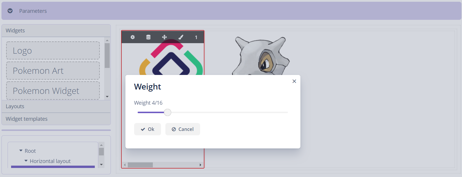
After adding a layout on the canvas, the following actions that help to set a layout are available:
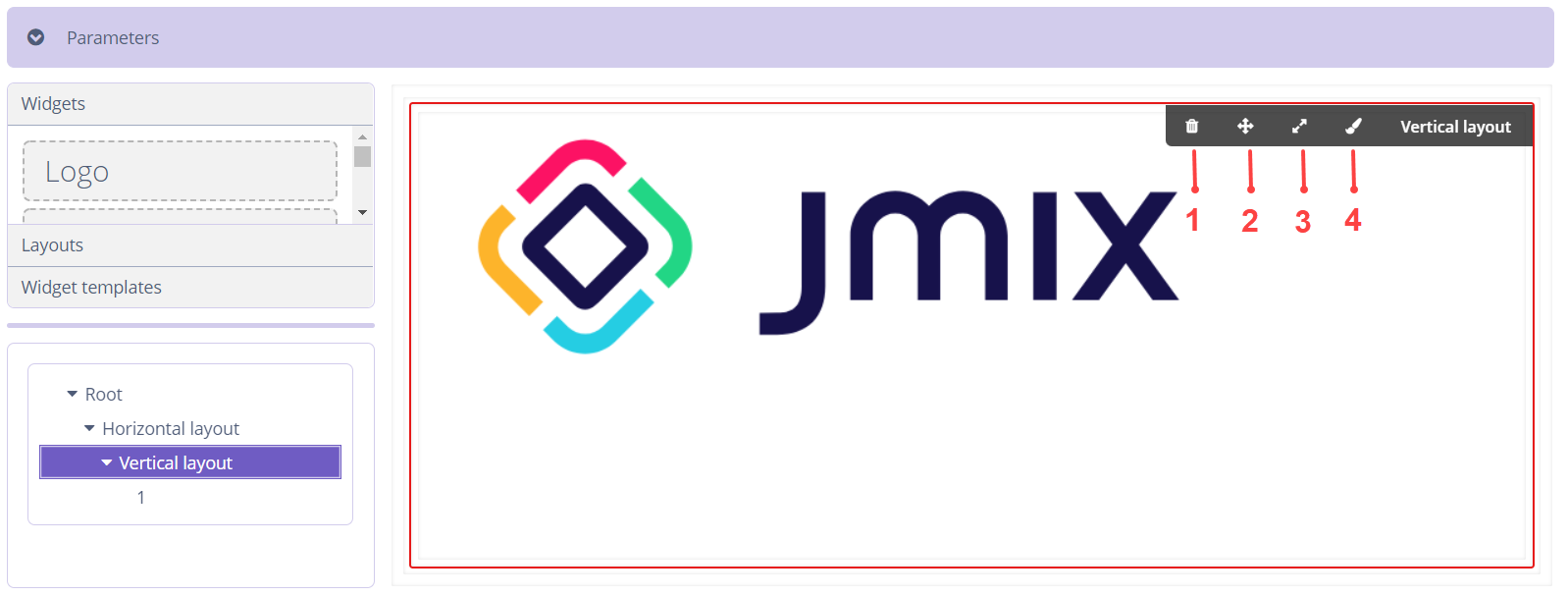
-
Remove - removes a component from the canvas.
-
Weight - changes the weight of a component in the parent container.
-
Expand - defines a component within a container that should be expanded to use all available space in the direction of component placement. For a container with vertical placement, this attribute sets 100% height to a component; for the containers with horizontal placement - 100% width. Additionally, resizing a container will resize the expanded component.
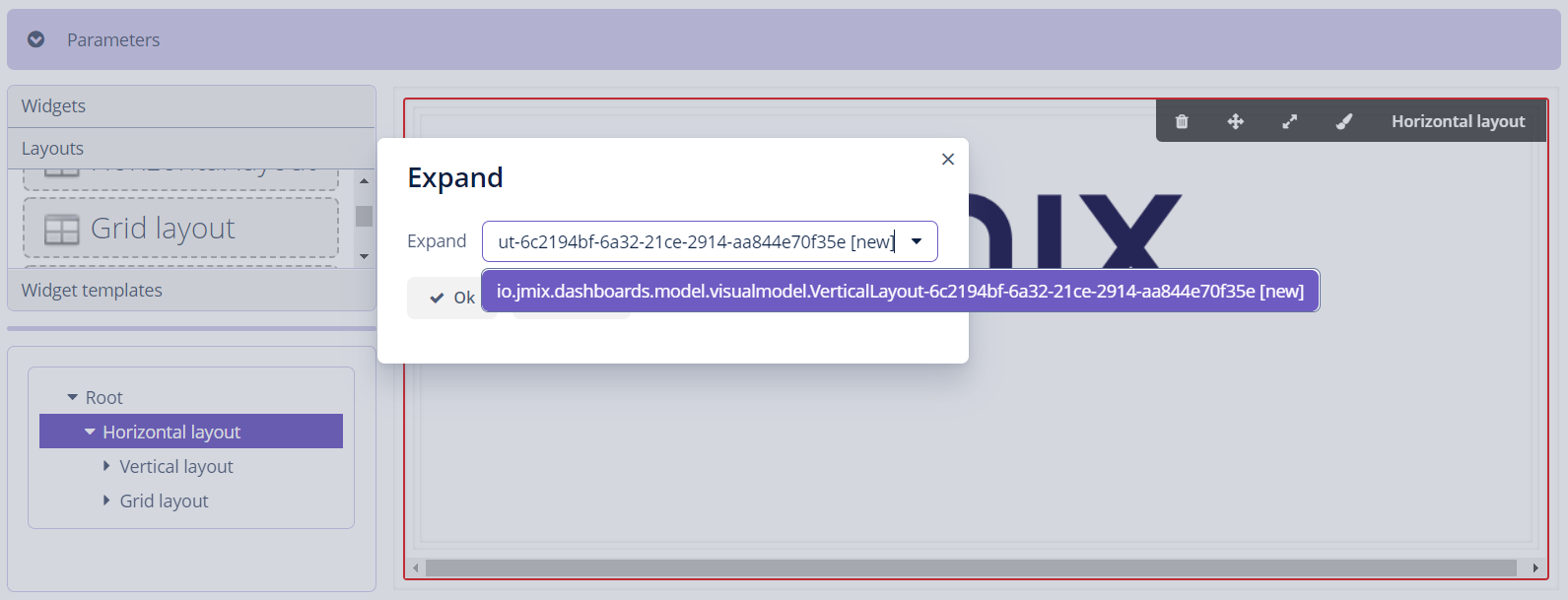
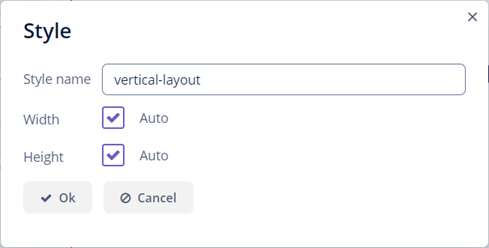
-
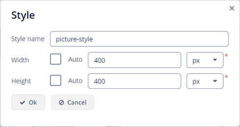
Style - enables setting a style name and modifying the component’s height and width.
Also, the actions above are available from the context menu in the structure tree.
Configuring Widget
By default, there are no widgets in the application. You can add widgets as described in the Adding Widget section.
After moving a widget on the canvas, the Widget editor dialog will be opened.
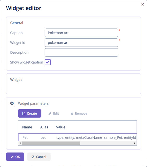
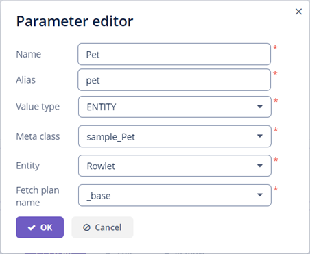
You can set widget parameters and then access them in the controller using the alias property.
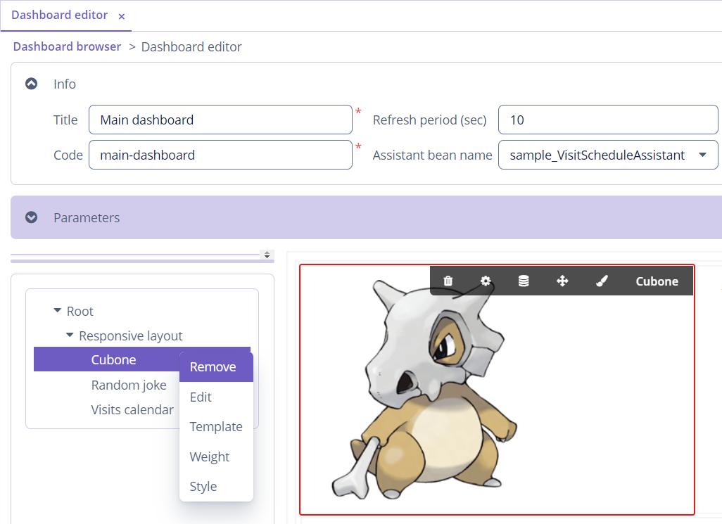
Widget Settings
After configuring widget information and parameters in the Widget editor, the widget appears on the canvas. The following actions that help to set a widget are available:
-
Remove - removes a component from the canvas.
-
Edit - opens the Widget editor dialog.
-
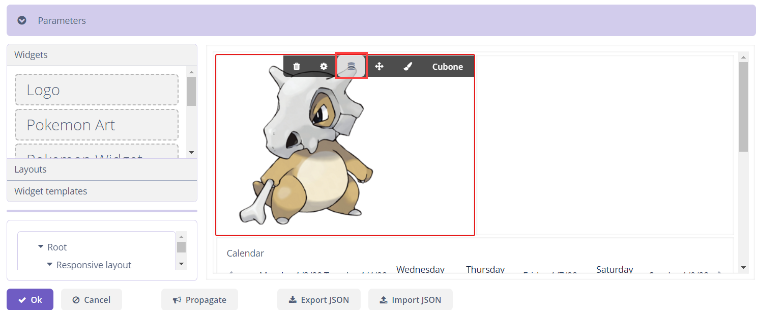
Template - opens the Widget template editor.
-
Weight - changes the weight of a component in the parent container.
-
Style - enables setting a style name and modifying the component’s height and width.
Also, the actions above are available from the context menu in the structure tree.
Widget Templates
Widget template browser is available from the main menu. By clicking the Create button, the Widget template editor dialog is opened. The Customize button opens the Widget editor dialog.
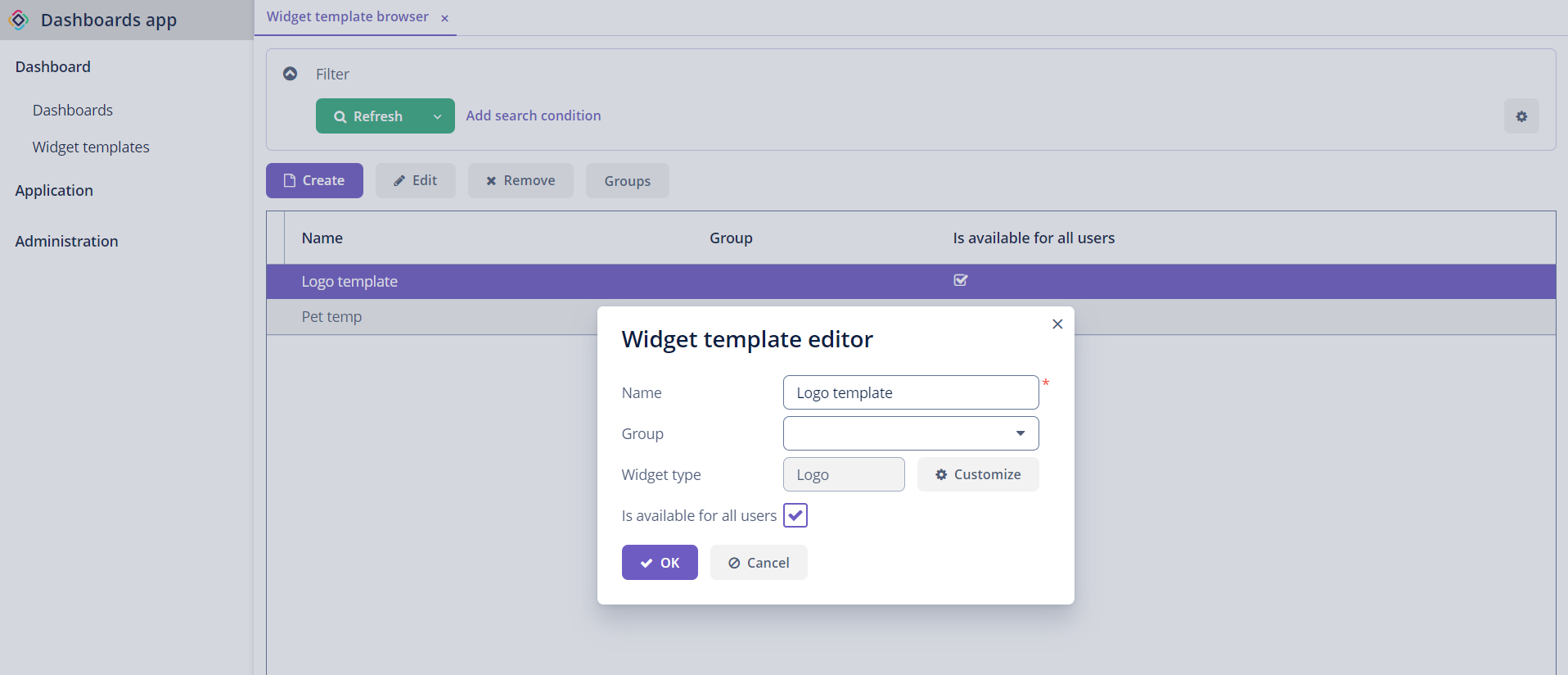
Created templates are displayed in the Dashboard editor screen.
Also, you can save a widget from the dashboard as a template using the corresponding button on the canvas.