Table
The Table component presents information in a table view, sorts data, manages table columns and headers, and invokes actions for selected rows.
Component’s XML-name: table.
Basics
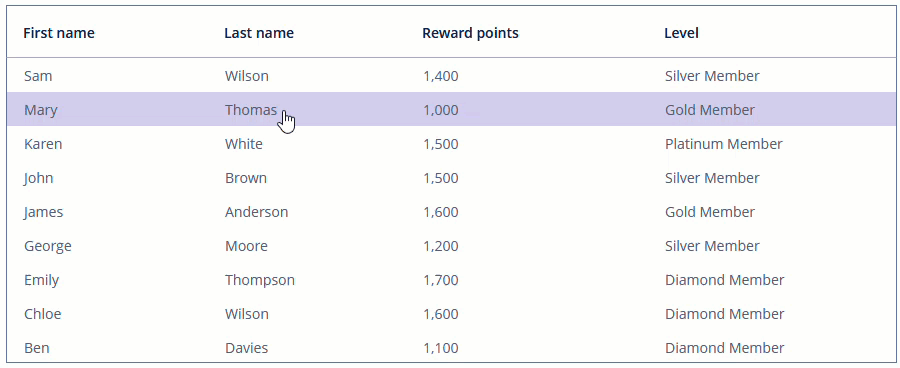
A typical table is shown below:
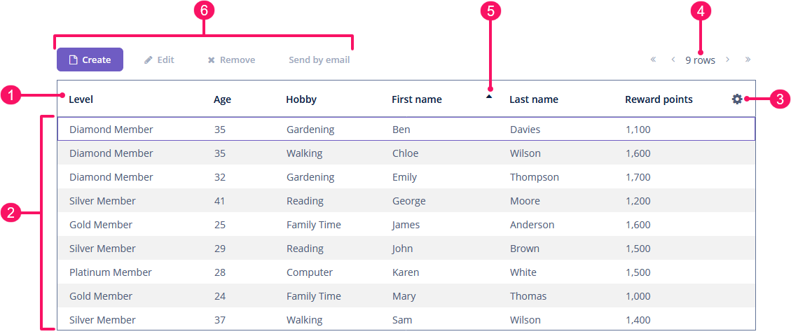
-
Header row
-
Rows
-
Column control button
-
Pagination
-
Sort button
-
Buttons panel
An example of table declaration in the XML screen descriptor is shown below:
<data>
    <collection id="customersDc" class="ui.ex1.entity.Customer">
        <fetchPlan extends="_base"/>
        <loader id="customersDl">
            <query>
                <![CDATA[select e from uiex1_Customer e]]>
            </query>
        </loader>
    </collection>
</data>
<layout>
    <table id="customersTable"
           width="100%"
           dataContainer="customersDc">
        <actions>
            <action id="create" type="create"/>
            <action id="edit" type="edit"/>
            <action id="remove" type="remove"/>
            <action id="sendByEmail" type="sendByEmail">
                <properties>
                    <property name="recipientAddress" value="peter@example.com"/>
                </properties>
            </action>
        </actions>
        <columns>
            <column id="level"/>
            <column id="age"/>
            <column id="hobby"/>
            <column id="firstName"/>
            <column id="lastName"/>
            <column id="rewardPoints"/>
        </columns>
        <simplePagination/>
        <buttonsPanel id="buttonsPanel" alwaysVisible="true">
            <button id="createBtn" action="customersTable.create"/>
            <button id="editBtn" action="customersTable.edit"/>
            <button id="removeBtn" action="customersTable.remove"/>
            <button id="sendBtn" action="customersTable.sendByEmail"/>
        </buttonsPanel>
    </table>
</layout>
In the example, there is a collection container for the Customer entity. The table is bound to the container using the dataContainer attribute, while its columns element defines which entity attributes are shown in the table columns.
Data Binding
Declarative Binding
Usually, you bind the table component to data declaratively in the screen XML descriptor using the dataContainer attribute. It should refer to a collection container.
Using Key-Value Containers
You can bind the table to a key-value container to display the results of a query that returns scalar values and/or aggregates. For example:
<data>
    <keyValueCollection id="salesDc">
        <loader id="salesLoader">
            <query>
                <![CDATA[select o.customer, o.customer.firstName,
                sum(o.amount) from uiex1_Order o group by o.customer]]>
            </query>
        </loader>
        <properties>
            <property class="ui.ex1.entity.Customer" name="customerEntity"/>
            <property datatype="string" name="customerName"/>
            <property datatype="decimal" name="sum"/>
        </properties>
    </keyValueCollection>
</data>
<layout>
    <table id="keyValueTable" width="100%" dataContainer="salesDc">
        <columns>
            <column id="customerName" caption="Customer"/>
            <column id="sum" caption="Summary amount" align="RIGHT"/>
        </columns>
    </table>
</layout>
Programmatic Binding
If you need to define a data container programmatically in the screen controller, set the metaClass attribute instead of dataContainer in XML descriptor:
<table id="customersTable1" width="100%" metaClass="uiex1_Customer">
    <columns>
        <column id="firstName"/>
        <column id="lastName"/>
    </columns>
</table>
In the screen controller, use ContainerTableItems class to bind the table to a data container:
customersTable1.setItems(new ContainerTableItems<>(customersDc));Columns
The set of columns for a table is defined in the columns element. If it is not specified, columns will be automatically determined by the fetch plan defined in dataContainer.
The columns element can have the following attributes:
-
includeAllincludes all the attributes fromfetchPlanthat is defined indataContainer.In the example below, we will show all the attributes from the fetch plan used in
customersDc:<table id="customersTableIncludeAll" width="100%" dataContainer="customersDc"> <columns includeAll="true"/> </table>If the entity fetch plan contains a reference attribute, this attribute will be displayed according to its instance name. If you want to show a specific nested attribute, define it in the fetch plan as well as in the
columnelement:<data> <collection id="customersDc1" class="ui.ex1.entity.Customer"> <fetchPlan extends="_base"> <property name="city" fetchPlan="_base"> <property name="country" fetchPlan="_base"/> </property> </fetchPlan> <loader id="customersDl1"> <query> <![CDATA[select e from uiex1_Customer e]]> </query> </loader> </collection> </data> <layout> <table id="tableIncludeAllReference" width="100%" dataContainer="customersDc1"> <columns includeAll="true"> <column id="city.country.name"/> </columns> </table> </layout>
-
excludecontains a comma-separated list of attributes that should not be loaded to the table.In the example below, we will show all the attributes excluding
id,maritalStatus, andemail:<table id="tableExclude" width="100%" dataContainer="customersDc1"> <columns includeAll="true" exclude="id,maritalStatus,email"/> </table>
Column
Each column is described in a nested column element.
id is a mandatory attribute that specifies the name of an entity attribute displayed in the column. It can be either an attribute of the entity from the data container or a linked entity (use dot notation to traverse the object graph). For example:
<columns>
    <column id="firstName"/>
    <column id="lastName"/>
    <column id="city.name"/>
    <column id="city.country.name"/>
</columns>
Column Alignment
Three different column alignments are supported: LEFT (default), CENTER, and RIGHT.
Usually, it makes sense to right-align numbers and left-align all the other content. For example:
<table id="keyValueTable" width="100%" dataContainer="salesDc">
    <columns>
        <column id="customerName" caption="Customer"/>
        <column id="sum" caption="Summary amount" align="RIGHT"/>
    </columns>
</table>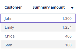
Column Caption
caption - an optional attribute containing the column caption. If not specified, a localized name of the entity attribute is used.
captionAsHtml - an optional attribute defining whether HTML tags can be used in the column caption. The default value is false.
<column id="firstName"
        captionAsHtml="true"
        caption="msg://firstName"/> (1)
<column id="lastName"/> (2)| 1 | Column’s caption has HTML tags:
|
| 2 | A column with the default caption |
Column Visibility
collapsed - an optional attribute; hides the column by default when set to true. Users can control the column’s visibility using the menu available via the  button in the top right part of the table when the table’s
 columnControlVisible attribute is not false. By default, collapsed is false.
The visible attribute sets the visibility of the column. Possible values - true, false. By default, all columns are visible.
Let’s consider the difference between the collapsed and visible attributes in the following example.
<columns>
    <column id="firstName"
            collapsed="true"/>
    <column id="lastName"
            visible="false"/>
    <column id="city"/>
</columns>
As you can see, the firstName column is collapsed by default, but users can expand it from the drop-down menu of the button.
At the same time, the lastName column cannot be made visible using user actions.
Column Width
width - an optional attribute, controlling default column width. It may contain only numeric values in pixels.
<columns>
    <column id="firstName" width="100"/>
    <column id="lastName" width="150"/>
    <column id="city" width="100"/>
</columns>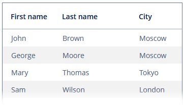
expandRatio - an optional attribute that specifies the expand ratio for each column. The ratio must be greater than or equal to 0. If some value is set for at least one column, all implicit values are ignored, and only explicitly assigned values are considered. If you set width and expandRatio attributes simultaneously, it will cause an error in the application.
<columns>
    <column id="firstName" expandRatio="1"/>
    <column id="lastName" expandRatio="1.5"/>
    <column id="city" expandRatio="1"/>
</columns>
Users can resize table columns:
The column width remains fixed only when the enable attribute is set to false for the entire table.
Column Reordering
Table provides the drag-and-drop functionality allowing users to change the order in which columns are displayed within the table.
The column reordering functionality is enabled by default. To disable it, set the reorderingAllowed attribute to false.
Link To Edit Screen
If the link attribute is set to true, the column’s content is displayed as a link to an entity editor screen. This approach may be used to simplify navigation: the users will be able to open entity editors by a single click on some key attribute, for example, on the customer’s name.
The linkScreenId attribute contains the identifier of the screen that is must be opened by clicking the link. If it’s not set, the framework opens a screen with {entity_name}.edit id.
The linkScreenOpenMode attribute sets the screen opening mode (THIS_TAB, NEW_TAB, NEW_WINDOW, or DIALOG).
<column id="firstName"
        link="true"
        linkScreenOpenMode="DIALOG"/>
<column id="lastName"/>
<column id="city"/>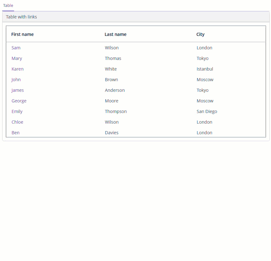
Maximum Text Length
maxTextLength - an optional attribute, allowing to limit the number of characters in a cell. Extra characters are replaced by an ellipsis. To see the entire record, users need to click on its visible part.
If the difference between the actual and the maximum allowed number of characters does not exceed the 10 character threshold, the "extra" characters remain visible.
In the example below, some cells contain values longer than maxTextLength+10 and become trimmed.
<columns>
    <column id="firstName"/>
    <column id="lastName"/>
    <column id="email" maxTextLength="15"/>
    <column id="city"/>
</columns>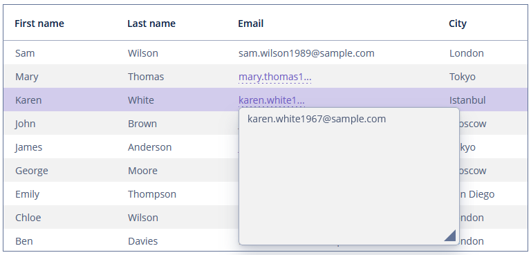
Text Formatting
The column element may contain a nested formatter element that allows you to represent the attribute value in a format different from the standard for this Datatype:
<table id="tableColumnFormatter"
       width="100%"
       dataContainer="ordersDc">
    <columns>
        <column id="customer"/>
        <column id="amount"/>
        <column id="deliveryTime">
            <formatter>
                <date format="h:mm a"/>
            </formatter>
        </column>
    </columns>
</table>
CaptionProperty
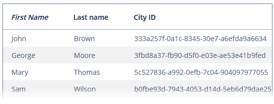
The captionProperty attribute can be used to show in the column the value of an entity attribute different from the one specified by id. For example, if you have a reference to the City entity with the name and id attributes, you can define the following column:
<column id="city"
        caption="City ID"
        captionProperty="id"/>
The column will display the city id, but the sorting of the column will be done by the city name.
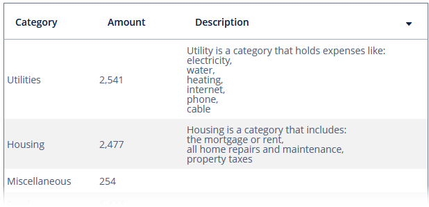
Multi-Line Cells
Setting the multiLineCells table attribute to true enables a multi-line display for cells containing several lines of text. In this mode, the web browser will load all the rows of the current table page at once instead of lazy-loading the visible part of the table. It is required for proper scrolling and may affect performance. The default value is false.
Selection
The Table component allows users to select single or multiple rows.
Single Selection Mode
In a single selection mode, the user can select exactly one row. Single selection mode is enabled by default.
Placeholder
The table allows you to set a placeholder message and/or link, which are shown when the data container is empty or not set at all.
The placeholder message is defined using the emptyStateMessage attribute. It should contain information about why the table is empty.
The placeholder link is defined using the emptyStateLinkMessage attribute. It should describe the action that needs to be performed to fill the table.
For example:
<table id="tablePlaceholder"
       width="100%"
       height="200"
       metaClass="uiex1_Customer"
       emptyStateMessage="No customers added."
       emptyStateLinkMessage="Add customer">
    <columns>
        <column id="firstName"/>
        <column id="lastName"/>
    </columns>
</table>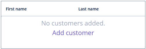
Generate emptyStateLinkClickHandler to handle clicks on the link:
@Install(to = "tablePlaceholder", subject = "emptyStateLinkClickHandler")
private void tablePlaceholderEmptyStateLinkClickHandler(
        Table.EmptyStateClickEvent<Customer> emptyStateClickEvent) {
    screenBuilders.editor(emptyStateClickEvent.getSource())
            .newEntity()
            .show();
}
To register the click handler programmatically, use the setEmptyStateLinkClickHandler() component method.
Both emptyStateMessage and emptyStateLinkMessage can load messages from the message bundle.
Header Visibility
The columnHeaderVisible attribute sets whether the table header is displayed. By default, the header is visible.
Column Control Visibility
Users can select which columns are visible using the column control button in the right part of the table header.
Currently displayed columns are marked in the menu. There are additional menu items:
-
Select all- shows all table columns; -
Deselect all- hides all columns that are possible except the first one. The first column always remains visible to display the table correctly.
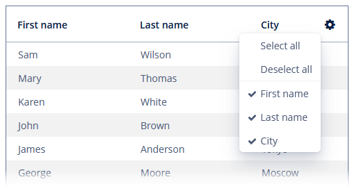
If the columnControlVisible attribute is set to false, users cannot hide columns.
Aggregating
Table supports aggregation of values in rows.
The following operations are supported:
-
SUM- calculate the sum; -
AVG- calculate the average value; -
COUNT- calculate the total number; -
MIN- find the minimum value; -
MAX- find the maximum value.
To enable aggregation for a table, you should:
-
Set the
aggregatableattribute totrue. -
Set the
aggregationelement for aggregated table columns. -
Set the
typeattribute for theaggregationelement, which defines the aggregation function.
The aggregated values are shown in an additional row.
The aggregationStyle attribute allows you to specify the location of the aggregation row: TOP or BOTTOM. TOP is used by default.
|
By default, only numeric data types are supported in aggregated columns, such as |
An example of an aggregated table description:
<table id="tableAggregation"
       width="100%"
       aggregatable="true"
       dataContainer="customersDc1">
    <columns>
        <column id="firstName"/>
        <column id="lastName"/>
        <column id="rewardPoints"/>
        <column id="age">
            <aggregation type="AVG"/>
        </column>
    </columns>
</table>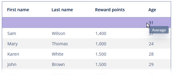
The valueDescription attribute defines a hint displayed in a popup when a user hovers the mouse cursor on the aggregated value. For the operations listed above (SUM, AVG, COUNT, MIN, MAX), popup hints are already available by default.
The aggregation element can contain the editable attribute. Setting the attribute to true in conjunction with using the AggregationDistributionProvider allows developers to implement algorithms to distribute data between the rows of the table.
You can specify formatter to display the aggregated value in the format other than the standard for this Datatype:
<column id="amount">
    <aggregation type="SUM">
        <formatter>
            <number format="#,##0.00"/>
        </formatter>
    </aggregation>
</column>
The aggregation element can also contain the strategyClass attribute specifying a class implementing the AggregationStrategy interface.
public class TableCustomerHobbyAggregation implements AggregationStrategy<Hobby, String> {
    @Override
    public String aggregate(Collection<Hobby> propertyValues) {
        Hobby mostFrequent = null;
        long max = 0;
        if (CollectionUtils.isNotEmpty(propertyValues)) {
            for (Hobby hobby : Hobby.values()) {
                long current = propertyValues.stream()
                        .filter(customerHobby -> customerHobby.equals(hobby))
                        .count();

                if (current > max) {
                    mostFrequent = hobby;
                    max = current;
                }
            }
        }

        if (mostFrequent != null) {
            return String.format("%s: %d/%d", mostFrequent.name(), max, propertyValues.size());
        }

        return null;
    }

    @Override
    public Class<String> getResultClass() {
        return String.class;
    }
}
<table id="tableAggregationStrategy"
width="100%"
aggregatable="true"
dataContainer="customersDc">
<columns>
<column id="firstName"/>
<column id="lastName"/>
<column id="hobby">
<aggregation
strategyClass="ui.ex1.screen.component.table.TableCustomerHobbyAggregation"/>
</column>
</columns>
</table>Sorting
Table allows users to sort column data. Sorting functionality is enabled by default.
The sortable attribute enables sorting data in the table. By default, it is set to true. If sorting is allowed, clicking a column header will show a  /
/ icon to the right of the column name.
You can disable sorting for a particular column by using its sortable attribute.
In the example below, we disable sorting by the lastName column:
<columns>
    <column id="firstName"/>
    <column id="lastName" sortable="false"/>
    <column id="city"/>
</columns>
The sort attribute of the column element allows you to set the initial sorting direction of the table by this column. Possible values:
-
ASCENDING- ascending order (0 → 9 → A → Z). -
DESCENDING- descending order (Z → A → 9 → 0).
For example:
<columns>
    <column id="firstName" sort="DESCENDING"/>
    <column id="lastName"/>
    <column id="city"/>
</columns>|
The table can be sorted only by one column at a time. If you set the |
Paging
The SimplePagination component can be used inside table to provide pagination:
<table id="tablePaging"
       width="100%"
       dataContainer="customersDc">
    <columns>
        <column id="firstName"/>
        <column id="lastName"/>
        <column id="hobby"/>
        <column id="age"/>
    </columns>
    <simplePagination
            itemsPerPageVisible="true"
            itemsPerPageOptions="2, 4, 6"/>
</table>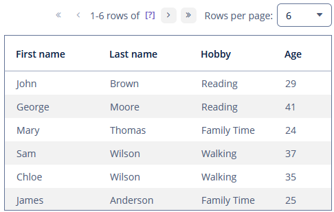
Alternatively, you can use the standalone Pagination component.
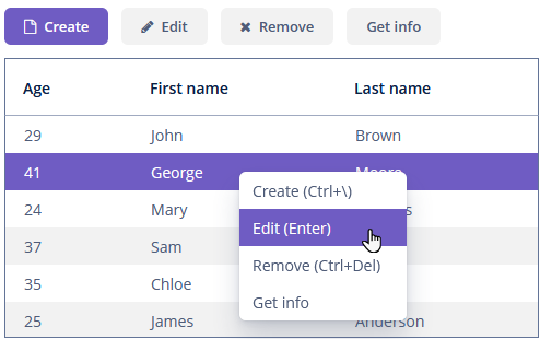
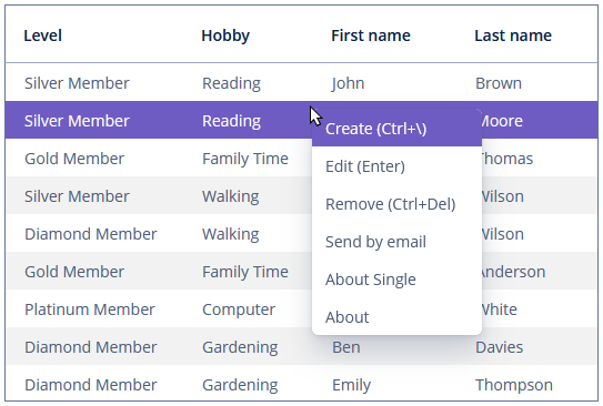
Table Actions
The Table component implements the ActionsHolder interface and can contain custom actions, as well as standard list actions.
Table actions are defined in the nested actions element.
If an action has a caption, it is displayed as an item of the table context menu. Additionally, a table action can be assigned to a button located anywhere on the screen.
<table id="tableWithActions"
       width="100%"
       dataContainer="customersDc">
    <actions>
        <action id="create" type="create"/> (1)
        <action id="edit" type="edit"/>
        <action id="remove" type="remove"/>
        <action id="about" caption="Get info"/> (2)
    </actions>
    <columns>
        <column id="age"/>
        <column id="firstName"/>
        <column id="lastName"/>
    </columns>
    <buttonsPanel id="buttonsActionsPanel" alwaysVisible="true"> (3)
        <button id="create" action="tableWithActions.create"/>
        <button id="edit" action="tableWithActions.edit"/>
        <button id="remove" action="tableWithActions.remove"/>
        <button id="about" action="tableWithActions.about"/>
    </buttonsPanel>
</table>| 1 | Define the create standard action. |
| 2 | Define the about custom action. |
| 3 | Define a ButtonsPanel container inside a table. |
Column Generation
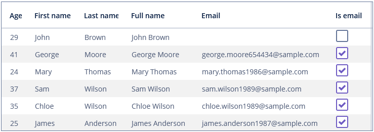
The columnGenerator handler allows you to define a custom representation of data in a column.
The handler is invoked by the framework for each cell when rendering the table. The handler receives an entity instance corresponding to the rendered row and should return a visual component that will be displayed in the cell.
You can create the columnGenerator handler for a table column using Studio (see below) and implement it as follows:
@Install(to = "tableGeneratedColumn.isEmail", subject = "columnGenerator")
private Component tableGeneratedColumnIsEmailColumnGenerator(Customer customer) {
    CheckBox isEmail = uiComponents.create(CheckBox.class);
    isEmail.setValue(customer.getEmail() != null);
    return isEmail;
}
If you want to display just dynamic text, use a special class Table.PlainTextCell instead of the Label component. It will simplify rendering and make the table faster.
@Install(to = "tableGeneratedColumn.fullName", subject = "columnGenerator")
private Component tableGeneratedColumnFullNameColumnGenerator(Customer customer) {
    return new Table.PlainTextCell(customer.getFirstName() + " " + customer.getLastName());
}
<table id="tableGeneratedColumn"
width="100%"
dataContainer="customersDc">
<columns>
<column id="age"/>
<column id="firstName"/>
<column id="lastName"/>
<column id="fullName" caption="Full name"/>
<column id="email"/>
<column id="isEmail" caption="Is email"/>
</columns>
</table>fullName and isEmail are generated columns.
|
Pay attention, when the column Example of column associated with the related entity’s attribute:
The columnGenerator handler:
|
To register the column generator handler programmatically, use the addGeneratedColumn() method of the Table component. It takes two parameters: identifier of the column and implementation of the Table.ColumnGenerator interface. An identifier can match one of the identifiers set for table columns in XML descriptor – in this case, the new column replaces the one defined in XML. If the identifier does not match any columns, a new column is added to the right.
The generateCell() method of the Table.ColumnGenerator interface is an equivalent of the columnGenerator handler explained above: it accepts an entity instance corresponding to the rendered row and should return a visual component that will be displayed in the cell.
Exporting Column Values
To export contents of the Table component as a file in one of the supported formats, use the Grid Export Actions add-on.
After installing the add-on, you can define the excelExport or jsonExport action for the table, or use Table exporters.
If you use custom generated columns, their content is not exported by default. See the example in the Exporting Tables with Generated Columns.
Below is an example of setting a custom presentation of the data within a column when exporting to an XLS file via the excelExport action.
Screen descriptor:
<table id="printableTable"
       width="100%"
       dataContainer="customersDc1">
    <actions>
        <action id="excelExport" type="excelExport"/>
    </actions>
</table>
Screen controller:
@Named("printableTable.excelExport")
protected ExcelExportAction printableTableExcelExport;

@Subscribe
public void onInit(InitEvent event) {
    printableTableExcelExport.addColumnValueProvider("firstName", context -> { (1)
        Customer customer = context.getEntity();
        return "Name: " + customer.getFirstName();
    });
}| 1 | The method accepts the column identifier and a function to get value from the column. |
Editing Values
Table can be configured to allow inline editing.
Use the editable attribute to switch the table to the editing mode.
In this mode, the columns with editable = true attribute show components to edit the attributes of the corresponding entity. Changing this attribute at runtime is not supported.
The component type for each editable column is selected automatically based on the type of the corresponding entity attribute. For example, for string and numeric attributes, the application will use TextField, for Date - DateField, for enumerations - ComboBox, for links to other entities - EntityPicker.
For a Date type editable column, you can additionally define the dateFormat or resolution attributes similar to the ones described for the DateField.
You can define the optionsContainer and captionProperty attributes for an editable column showing a linked entity. If optionsContainer is set, the application will use ComboBox instead of EntityPicker.
Context Menu
The context menu is activated by right-clicking within the table.
The contextMenuEnabled attribute enables the context menu. By default, this attribute is set to true. The context menu shows table actions (if any).
Styling
You can set predefined styles to the Table component using the stylename attribute either in the XML descriptor or in the screen controller:
<table id="tableBorderless"
       caption="Table with borderless style"
       width="100%"
       stylename="borderless"
dataContainer="customersDc1">tableBorderless.setStyleName(ThemeClassNames.TABLE_BORDERLESS);Predefined styles:
-
borderless- removes the outer border of the table; -
no-header- hides the table column headers; -
no-horizontal-lines- removes the horizontal divider lines between the table rows; -
no-vertical-lines- remove the vertical divider lines between the table columns. -
no-stripes- removes the alternating row colors.
The appearance of the Table component can be customized using SCSS variables with the $jmix-table-* prefix. You can change these variables in the visual editor after creating a custom theme.
Methods of Table Interface
-
getSelected(),getSingleSelected()return instances of the entities corresponding to the selected rows of the table. A collection can be obtained by invokinggetSelected(). If nothing is selected, the application returns an empty set. Ifmultiselectis disabled, it is more convenient to usegetSingleSelected()method returning one selected entity ornullif nothing is selected.
-
The
requestFocus()method allows you to set focus on the concrete editable field of a certain row. It takes two parameters: an entity instance that identifies the row and the column identifier. Example of requesting a focus:table.requestFocus(item, "count");
-
The
scrollTo()method allows you to scroll the table to the concrete row. It takes one parameter: an entity instance identifying the row.Example of scrolling:
table.scrollTo(item);
-
The
setItemClickAction()method allows you to define an action performed when a table row is double-clicked. If such action is not defined, the table will attempt to find an appropriate one in the list of its actions in the following order:-
The action assigned to the Enter key by the
shortcutproperty; -
The edit action;
-
The view action;
If such action is found and has
enabled = trueproperty, the action is executed.Example of setting the
ItemClickActionfor theTablecomponent defined in the screen XML with thetableClickid:@Autowired private Table<Customer> tableClick; @Subscribe public void onInit(InitEvent event) { tableClick.setItemClickAction(new BaseAction("itemClickAction") .withHandler(actionPerformedEvent -> { Customer customer = tableClick.getSingleSelected(); if (customer != null) { notifications.create() .withCaption("Item clicked for: " + customer.getFirstName()+ "" + customer.getLastName()) .show(); } })); }
-
-
The
setEnterPressAction()allows you to define an action executed when Enter is pressed. If such action is not defined, the table will attempt to find an appropriate one in the list of its actions in the following order:-
The action defined by the
setItemClickAction()method; -
The action assigned to the Enter key by the
shortcutproperty; -
The edit action;
-
The view action;
If such action is found and has
enabled = trueproperty, the action is executed.Example of setting the
ItemClickActionfor theTablecomponent defined in the screen XML with thetableClickid:@Autowired private Table<Customer> tableClick; @Subscribe public void onInit(InitEvent event) { tableClick.setEnterPressAction(new BaseAction("enterPressAction") .withHandler(actionPerformedEvent -> { Customer customer = tableClick.getSingleSelected(); if (customer != null) { notifications.create() .withCaption("Enter pressed for: " + customer.getFirstName()+ "" + customer.getLastName()) .show(); } })); }
-
-
The
getAggregationResults()method returns a map with aggregation results, where map keys are table column identifiers and values are aggregation values.
Events and Handlers
|
To generate a handler stub in Jmix Studio, select the component in the screen descriptor XML or in the Component Hierarchy panel and use the Handlers tab of the Component Inspector panel. Alternatively, you can use the Generate Handler button in the top panel of the screen controller. |
AggregationDistributionProvider
Defines the rules for distributing the aggregated value between rows in a table according to a custom algorithm. If the user enters a value in an aggregated cell, it is distributed to the constituent cells. It is supported only for the TOP aggregation style. To make aggregated cells editable, use the editable attribute of the aggregation element.
When creating a provider, use the AggregationDistributionContext<E> object, which contains the data needed to distribute the aggregated value:
-
Column columnwhere total or group aggregation was changed; -
Object value− the new aggregation value; -
Collection<E> scope− a collection of entities that will be affected by changed aggregation; -
boolean isTotalAggregation- is it a total or group aggregation.
As an example, consider a table that represents a budget. The user creates budget categories and sets the percentages according to which the amount of income should be distributed. Next, the user sets the total amount of income in the aggregated cell; after that, it distributes by category.
An example of table configuration in an XML descriptor of a screen:
<table id="budgetTable"
       width="100%"
       aggregatable="true"
       dataContainer="budgetItemsDc">
    <columns>
        <column id="category"/>
        <column id="percent"/>
        <column id="amount">
            <aggregation type="SUM"
                         editable="true"/>
        </column>
    </columns>
</table>
An example in a screen controller:
@Install(to = "budgetTable", subject = "aggregationDistributionProvider")
private void budgetTableAggregationDistributionProvider(
        Table.AggregationDistributionContext<BudgetItem> context) {
    Collection<BudgetItem> scope = context.getScope();
    if (scope.isEmpty()) {
        return;
    }

    double value = context.getValue() != null ?
            ((double) context.getValue()) : 0;

    for (BudgetItem budgetItem : scope) {
        budgetItem.setAmount(value / 100 * budgetItem.getPercent());
    }
}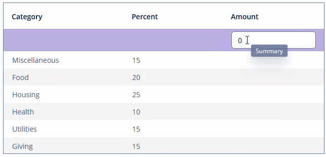
To register the aggregation distribution provider programmatically, use the setAggregationDistributionProvider() component method.
ColumnCollapseEvent
ColumnCollapseEvent is sent whenever the column visibility changes.
Example of subscribing to the event for the table defined in the screen XML with the tableCollapsed id:
@Subscribe("tableCollapsed")
public void onTableCollapsedColumnCollapse(Table.ColumnCollapseEvent<Customer> event) {
    notifications.create()
            .withCaption((event.isCollapsed() ? "Collapsed: " : "Expanded: ") +
                    event.getColumn().getCaption())
            .show();
}
To register the event handler programmatically, use the addColumnCollapseListener() component method.
ColumnReorderEvent
ColumnReorderEvent is fired when the user reorders columns.
Example of subscribing to the event for the Table component defined in the screen XML with the tableReorder id:
@Subscribe("tableReorder")
public void onTableReorderColumnReorder(Table.ColumnReorderEvent<Customer> event) {
    notifications.create()
            .withCaption("Columns were reordered!")
            .show();
}
To register the event handler programmatically, use the addColumnReorderListener() component method.
EmptyStateLinkClickHandler
See EmptyStateClickEvent.
IconProvider
The icon provider allows you to add an icon in the beginning of each table row:
@Install(to = "tableWithIcons", subject = "iconProvider")
private String tableWithIconsIconProvider(Customer customer) {
    return customer.getEmail() != null ?
            JmixIcon.MAIL_FORWARD.source() : JmixIcon.CANCEL.source();
}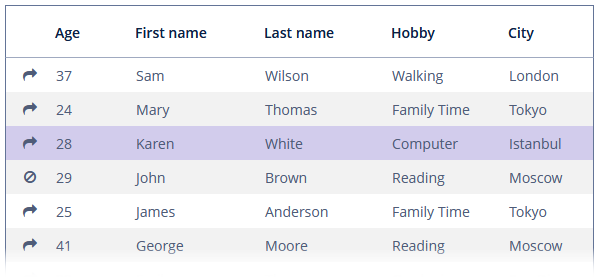
To register the icon provider programmatically, use the setIconProvider() component method.
ItemDescriptionProvider
The item description provider generates tooltip descriptions for items when the user hovers over a cell.
In the example below, we will show an ItemDescriptionProvider usage for the tableWithDescription:
@Install(to = "tableWithDescription", subject = "itemDescriptionProvider")
private String tableWithDescriptionItemDescriptionProvider(
        Customer customer, String property) {
    if (property == null)
        return null;
    else if (property.equals("rewardPoints")) {
        return "Reward points are a part of the loyalty program affecting the rating of the " +
                customer.getFirstName() + " " + customer.getLastName();
    } else if (property.equals("level")) {
        switch (customer.getLevel()) {
            case SILVER:
                return "The customer gets special offers from sellers and birthday congratulations";
            case GOLD:
                return "The customer gets 2 coupons with a rating of $ 1";
            case PLATINUM:
                return "The customer gets a coupons with a par value of $ 3";
            case DIAMOND:
                return "The customer gets a coupon with a par value of $ 5";
        }
    }
    return null;
}
LookupSelectHandler
LookupSelectHandler is a handler invoked when a user presses Enter or double-clicks a table row in the lookup screen. It accepts the collection of selected entities. You can define the handler as follows:
@Install(to = "tableLookupSelect", subject = "lookupSelectHandler")
private void tableLookupSelectLookupSelectHandler(Collection<Customer> collection) {
    checkCustomers(collection);
}
To register the select lookup handler programmatically, use the setLookupSelectHandler() component method.
SelectionEvent
SelectionEvent is sent when the selection changes.
Example of subscribing to the event for the table defined in the screen XML with the tableSelectEvent id:
@Autowired
private Table<Customer> tableSelectEvent;

@Subscribe("tableSelectEvent")
public void onTableSelectEventSelection(Table.SelectionEvent<Customer> event) {
    Customer customer = tableSelectEvent.getSingleSelected();
    notifications.create()
            .withCaption("You selected " + customer.getFirstName() +
                    " " + customer.getLastName() + " customer")
            .show();
}
To register the event handler programmatically, use the addSelectionListener() component method.
StyleProvider
StyleProvider allows setting table cell display style. The provider is invoked by the table for each row and each cell separately. If the method is invoked for a row, the first parameter contains the entity instance displayed by the row, the second parameter is null. If the method is called for a cell, the second parameter contains the name of the attribute displayed by the cell.
Example of setting a style:
@Install(to = "styledTable", subject = "styleProvider")
private String styledTableStyleProvider(Customer entity, String property) {
    if (property == null) {
        if (Boolean.TRUE.equals(entity.getEmail() != null)) {
            return "customer-has-email";
        }
    } else if (property.equals("level")) {
        switch (entity.getLevel()) {
            case SILVER:
                return "level-silver";
            case GOLD:
                return "level-gold";
            case PLATINUM:
                return "level-platinum";
            case DIAMOND:
                return "level-diamond";
        }
    }
    return null;
}
Then you should define the cell and row styles in the application theme. Detailed information on creating a theme is available in Themes. Style names returned by the provider in the screen controller should be used as CSS selectors. For example:
.customer-has-email {
    font-weight: bold;
}

.level-silver {
    background-color: #f2f2f2;
    color: black;
}

.level-gold {
    background-color: #ffda79;
    color: black;
}

.level-platinum {
    background-color: #637497;
    color: white;
}

.level-diamond {
    background-color: #8befff;
    color: black;
}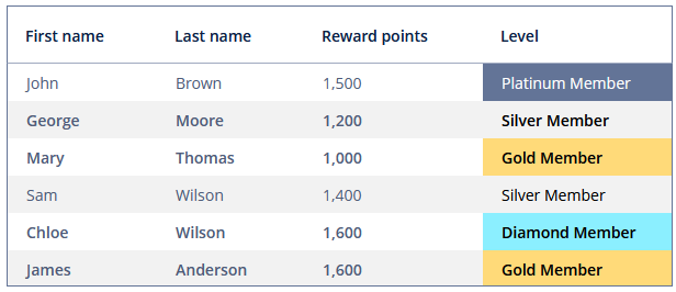
To register the style provider programmatically, use the setStyleProvider() component method.
All XML Attributes
|
You can view and edit attributes applicable to the component using the Component Inspector panel of the Studio’s Screen Designer. |
Table XML Attributes
aggregatable - aggregationStyle - align - caption - captionAsHtml - columnControlVisible - columnHeaderVisible - colspan - contextHelpText - contextHelpTextHtmlEnabled - contextMenuEnabled - css - dataContainer - description - descriptionAsHtml - editable - emptyStateLinkMessage - emptyStateMessage - enable - box.expandRatio - height - htmlSanitizerEnabled - icon - id - metaClass - multiLineCells - multiselect - reorderingAllowed - responsive - rowspan - showSelection - sortable - stylename - tabIndex - textSelectionEnabled - visible - width
Column XML Attributes
align - caption - captionAsHtml - captionProperty - collapsed - dateFormat - description - editable - expandRatio - id - link - linkScreenId - linkScreenOpenMode - maxTextLength - optionsContainer - resolution - required - requiredMessage - sort - sortable - visible - width
