Using Third-Party Icons
Additional icons can be provided in three ways: as an SVG sprite, as standalone SVG files, or as an icon font. These custom icons may be used together with the built‑in icon sets.
Icon Set
An SVG sprite is a collection of SVG images loaded into an application as a single file, providing performance benefits. You can create a sprite manually or using one of many third-party tools.
Follow the steps below to add an icon set:
-
Create a JavaScript file for your icon set in the
/frontend/icons/directory. Use the following code as an example of creating an icon set with three icons:my-icons.jsimport '@vaadin/icon/vaadin-iconset.js'; const template = document.createElement('template'); template.innerHTML = `<vaadin-iconset name="my-icons" size="24"> <svg><defs> <g id="star"><path d="M12 .587l3.668 7.568 8.332 1.207-6 5.848 1.416 8.263L12 18.896l-7.416 3.895L6 14.162l-6-5.848 8.332-1.207z" fill="#FFD700"/></g> <g id="heart"><path d="M12 21.35l-1.45-1.32C5.4 15.36 2 12.28 2 8.5 2 5.42 4.42 3 7.5 3c1.74 0 3.41.81 4.5 2.09C13.09 3.81 14.76 3 16.5 3 19.58 3 22 5.42 22 8.5c0 3.78-3.4 6.86-8.55 11.54L12 21.35z" fill="#FF69B4"/></g> <g id="circle"><circle cx="12" cy="12" r="10" fill="#1E90FF"/></g> </defs></svg> </vaadin-iconset>`; document.head.appendChild(template.content); -
Create a Java enum that implements
IconFactoryand add the@JsModuleannotation referring to the JavaScript file:MyIcons.javapackage com.company.onboarding.icons; import com.vaadin.flow.component.dependency.JsModule; import com.vaadin.flow.component.icon.IconFactory; import java.util.Locale; @JsModule("./icons/my-icons.js") public enum MyIcons implements IconFactory { STAR, HEART, CIRCLE; public Icon create() { return new Icon(this.name().toLowerCase(Locale.ENGLISH).replace('_', '-').replaceAll("^-", "")); } public static final class Icon extends com.vaadin.flow.component.icon.Icon { Icon(String icon) { super("my-icons", icon); } } }
Custom icons can now be used in the same way as the default ones:
<icon icon="my-icons:star"/>
<icon icon="my-icons:heart"/>
<icon icon="my-icons:circle"/>
Or set it to a component in the Java code:
spriteIconButton.setIcon(MyIcons.STAR.create());Standalone SVG Images
SVG files can be added to your static content directory. By default, Spring Boot serves static resources from the following locations in the classpath: /static, /public, /resources, or /META-INF/resources. To organize icons, you can use a subfolder such as META-INF/resources/icons.
To serve SVGs, use the svgIcon component:
<svgIcon resource="/icons/tree.svg"/>To set the icon to a component, use its nested icon element:
<button text="Click!">
    <icon>
        <svgIcon resource="/icons/tree.svg"/>
    </icon>
</button>
If the component supports prefix or suffix, place the icon there to position it relative to content. For example, to put the icon before the button text:
<button text="Click!">
    <prefix>
        <svgIcon resource="/icons/tree.svg"/>
    </prefix>
</button>
You can also set SVG icons programmatically:
StreamResource iconResource = new StreamResource("tree.svg",
        () -> getClass().getResourceAsStream("/META-INF/resources/icons/tree.svg"));
SvgIcon treeIcon = new SvgIcon(iconResource);
standaloneIconButton.setIcon(treeIcon);
Icon Fonts
An icon font provides a collection of icons delivered as a font. You can use a fontIcon component to render icons from a font by specifying the font-family together with either a character code or an icon ligature.
To add your own icon font, you will need the following:
-
A font file – modern browsers use
.woffor.woff2;.ttfor.eotcan be provided as fallbacks for older browsers. -
A
@font-facedeclaration – normally provided in stylesheet that you import into your theme’s master stylesheet (styles.css). -
Optionally, a stylesheet with icon CSS classes — this is often added alongside the
@font-facedeclaration and also imported intostyles.css.
Example: Adding Material Icons
Let’s illustrate by adding material icons to the application theme.
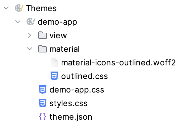
The theme folder includes a new directory that contains:
-
material-icons-outlined.woff2 -
outlined.css– includes the@font-facedeclaration and the CSS class for icons:outlined.css@font-face { font-family: "Material Icons Outlined"; font-style: normal; font-weight: 400; font-display: block; src: url("./material-icons-outlined.woff2") format("woff2"); } .material-icons-outlined { font-family: "Material Icons Outlined"; font-weight: normal; font-style: normal; font-size: 24px; line-height: 1; letter-spacing: normal; text-transform: none; display: inline-block; white-space: nowrap; word-wrap: normal; direction: ltr; -webkit-font-smoothing: antialiased; -moz-osx-font-smoothing: grayscale; text-rendering: optimizeLegibility; font-feature-settings: "liga"; }
The theme’s master stylesheet must include the following line:
@import url('material/outlined.css');
To create an icon, use fontIcon component providing the font family name (matching the @font-face declaration), and either a character code or ligature:
<fontIcon fontFamily="Material Icons Outlined" charCode="e8b6"/>
<fontIcon fontFamily="Material Icons Outlined" ligature="search"/>
The fontIcon component can be nested within the prefix, suffix, or icon elements.
|
Standard icon sets (for example, Lumo icons) use the same mechanism internally and can be served with |
