propertyFilter
propertyFilter defines a filtering condition based on a particular property of an entity.
The component can be used independently or as part of the genericFilter component.
-
XML element:
propertyFilter -
Java class:
PropertyFilter
Basics
At its simplest, propertyFilter consists of an input field preceded by the name of the property being filtered and the operation being used.

<propertyFilter dataLoader="usersDl"
                operation="EQUAL"
property="department"/> (1)| 1 | dataLoader, operation, and property are required attributes. |
This component filters data loaded to a data container. It is commonly used in conjunction with dataGrid or treeDataGrid components, which are bound to the same container. This combination allows for precise control over the rows displayed.
Filtering Operations
The component supports numerous filtering operations. You can limit it to a specific operation or allow users to choose the operation they want at runtime using the operationEditable attribute.
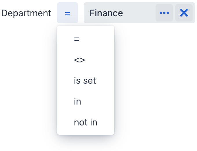
<propertyFilter dataLoader="usersDl"
                operation="EQUAL"
                property="department"
                operationEditable="true"/>
The list of available operations depends on the property type.
Data Binding
Data binding refers to linking a visual component to a data container. Changes in the visual component or corresponding data container can trigger updates to one another. See Using Data Components for more details.
Property filter can filter data loaded to either collection container or key-value container.
Collection Container
The following example demonstrates setting up propertyFilter to work with a collection container:
<data>
    <collection class="com.company.onboarding.entity.User" id="usersDc">
        <fetchPlan extends="_base">
            <property name="department" fetchPlan="_base"/>
        </fetchPlan>
        <loader id="usersDl">
            <query>
                <![CDATA[select e from User e]]>
            </query>
        </loader>
    </collection>
</data>
<layout>
    <propertyFilter dataLoader="usersDl"
                    operation="EQUAL"
                    property="department"/>
</layout>
Key-Value Collection Container
The following example demonstrates setting up propertyFilter to work with a key-value collection container:
<data>
    <keyValueCollection id="statusesDc">
        <loader id="statusesDl">
            <query>
                <![CDATA[select e.username, e.onboardingStatus, COUNT(e.onboardingStatus)
                from User e
                group by e.username, e.onboardingStatus]]>
            </query>
        </loader>
        <properties>
            <property name="username" datatype="string"/>
            <property name="onboardingStatus" datatype="int"/>
            <property name="count" datatype="int"/>
        </properties>
    </keyValueCollection>
</data>
<layout>
    <propertyFilter dataLoader="statusesDl"
                    operation="CONTAINS"
                    property="username"/>
</layout>
Multi-Filtering
Binding multiple propertyFilter components to a single data container allows to apply several conditions simultaneously. For example, use two components to support filtering by department and last name:

<hbox>
<propertyFilter dataLoader="usersDl"
operation="EQUAL"
property="department"/>
<propertyFilter dataLoader="usersDl"
operation="CONTAINS"
property="lastName"/>
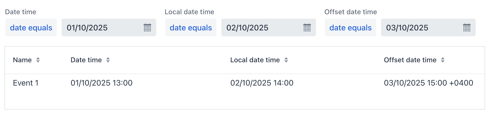
</hbox>Filtering Dates
Omitting Time
An exact match with = may not always fit Date/Time properties. Many situations require filtering by just the date, ignoring the time. In such cases, use date equals instead:
Date Interval
The component provides several options to filter by date intervals. Choose the in interval operator and enter interval values in the dialog.
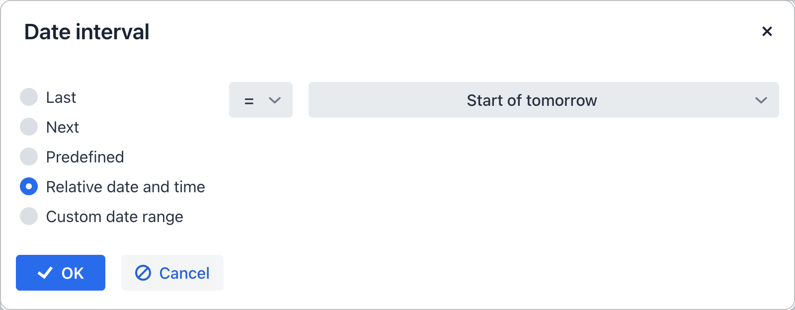
Choose from:
-
Last: intervals like "last 3 months" or "last 12 weeks".
-
Next: intervals such as "next 3 years" or "next 48 hours".
-
Predefined: quick selections including "today", "tomorrow", "this month", or "this year".
-
Relative date and time: for conditions like "by the end of the day", "at the start of the hour", "not the last day of the year".
-
Custom: for any start and end date. The start date is included in the range, the end date is excluded.
Customization
You can explicitly specify the component to use as the input field and set its attributes. This enables to change the default propertyFilter look and feel and enhance it with additional features. For example:

<propertyFilter id="nameFilter"
                dataLoader="usersDl" property="username"
                operation="CONTAINS"
                labelVisible="false"
                width="100%" maxWidth="30em">
    <textField id="nameFilterField"
               placeholder="Find a user..."
               clearButtonVisible="true">
        <prefix>
            <icon icon="SEARCH"/>
        </prefix>
    </textField>
</propertyFilter>
Dynamic Attributes
The component supports filtering by dynamic attributes. This does not require having the dynamicAttributes facet on that view.
To specify a dynamic attribute, begin its name with a + prefix:
<propertyFilter
        property="+passengerNumberOfSeats"
        operation="EQUAL"
dataLoader="carsDl"/>| If the dynamic attribute is an entity, it cannot be filtered through its attributes. |
Attributes
id - alignSelf - ariaLabel - ariaLabelledBy - autoApply - classNames - colspan - css - dataLoader - defaultValue - enabled - errorMessage - focusShortcut - height - helperText - invalid - label - labelPosition - labelVisible - labelWidth - maxHeight - maxWidth - minHeight - minWidth - operation - operationEditable - operationTextVisible - parameterName - property - readOnly - required - requiredMessage - tabIndex - themeNames - visible - width
autoApply
Sets whether the property filter should be automatically applied to the DataLoader when the condition value is changed. The default value is true.
dataLoader
dataLoader is a required attribute. It sets a data loader related to the current propertyFilter.
label
Sets the custom label of the property filter condition. If not specified, it is generated automatically based on the entity property caption and the operation label.
If you set the label attribute, the operation label or selector will not be displayed.
|
labelPosition
The labelPosition attribute defines the filter label position:
-
TOP- label is displayed atop the property filter. -
ASIDE- label is displayed on the side of the property filter.
The default value is ASIDE.
labelVisible
Sets the label visible or not. Default value is true.
labelWidth
Sets the label width. The width should be in a format understood by the browser, for example, "100px" or "2.5em".
operation
Specifies the filtering operation.
Operation |
Description |
Property Types |
EQUAL |
Equal to. Consider DATE_EQUALS for Date/Time properties. |
Numeric, Boolean, String, Date/Time, Time, UUID, URI, Entity, Enum |
NOT_EQUAL |
Not equal to. |
Numeric, Boolean, String, Date/Time, Time, UUID, URI, Entity, Enum |
IS_SET |
Is null or is not null. |
Numeric, Boolean, String, Date/Time, Time, UUID, URI, Entity, Enum |
IN_LIST |
Checks if the value is in the list. |
Numeric, String, Date/Time, Time, UUID, URI, Entity, Enum |
NOT_IN_LIST |
Checks if the value is not in the list. |
Numeric, String, Date/Time, Time, UUID, URI, Entity, Enum |
IS_COLLECTION_EMPTY |
Checks if the collection is empty. |
Entity ( |
MEMBER_OF_COLLECTION |
Belong to the collection. |
Entity ( |
NOT_MEMBER_OF_COLLECTION |
Do not belong to the collection |
Entity ( |
CONTAINS |
Contain the substring. |
String |
NOT_CONTAINS |
Do not contain the substring. |
String |
STARTS_WITH |
Starts with. |
String |
ENDS_WITH |
Ends with. |
String |
GREATER |
Greater than. |
Numeric, Date/Time, Time |
GREATER_OR_EQUAL |
Greater than or equal to. |
Numeric, Date/Time, Time |
LESS |
Less than. |
Numeric, Date/Time, Time |
LESS_OR_EQUAL |
Less than or equal to. |
Numeric, Date/Time, Time |
IN_INTERVAL |
Belongs to the interval that users can specify through the date interval dialog. |
Date/Time, Time |
DATE_EQUALS |
Equals to date. Compares only the date while excluding time. See example. |
Date/Time |
operationEditable
Sets whether an operation selector is visible. Possible values are true and false. The default value is false. If you set operationEditable = true, the operation field enables selecting the condition operator in run-time. The list of available operators depends on the attribute type.
operationTextVisible
The operationTextVisible attribute defines the visibility of the operation label. Possible values are true and false (true by default).
Handlers
AttachEvent - BlurEvent - ComponentValueChangeEvent - DetachEvent - FocusEvent - OperationChangeEvent - validator
|
To generate a handler stub in Jmix Studio, use the Handlers tab of the Jmix UI inspector panel or the Generate Handler action available in the top panel of the view class and through the Code → Generate menu (Alt+Insert / Cmd+N). |
validator
Adds a validator instance to the component. The validator must throw ValidationException if the value is not valid.
If you are not satisfied with the predefined validators, add your own validator instance:
@Install(to = "propertyFilter", subject = "validator")
private void propertyFilterValidator(String value) {
    if (value != null && value.length() != 6)
        throw new ValidationException("Zip must be of 6 digits length");
}