userMenu
The userMenu component displays a button that, when clicked, opens a dropdown menu containing a list of items.
XML Element |
|
|---|---|
Java Class |
|
Attributes |
id - alignSelf - classNames - colspan - css - enabled - focusShortcut - openOnHover - overlayClass - tabIndex - themeNames - title - visible |
Handlers |
AttachEvent - BlurEvent - DetachEvent - FocusEvent - UserChangedEvent - buttonRenderer - headerRenderer |
Elements |
actionItem - componentItem - separator - textItem - viewItem |
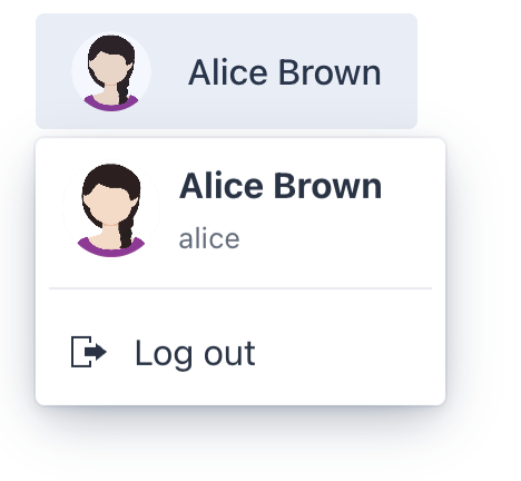
Basics
The main button displays a layout that represents a current user. Users click this button to access the dropdown menu.
The dropdown menu contains a list of actions, each represented by a clickable item or submenu.
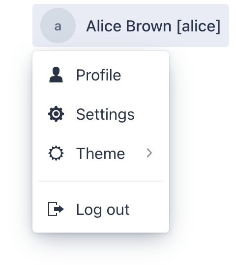
Here’s an example of defining a userMenu with default button renderer and several menu items:
<userMenu>
    <items>
        <viewItem id="profileMenuItem" text="msg://profileMenuItem.text" icon="USER"
                  viewId="ProfileView"
                  themeNames="non-checkable"/>
        <viewItem id="settingsMenuItem" text="msg://settingsMenuItem.text" icon="COG"
                  viewClass="com.company.onboarding.view.settings.SettingsView"
                  themeNames="non-checkable"/>
        <actionItem id="themeMenuItem"
                    themeNames="non-checkable">
            <action id="themeMenuItem" type="userMenu_themeSwitch"/>
        </actionItem>
        <separator/>
        <actionItem id="logoutMenuItem" ref="logoutAction"
                    themeNames="non-checkable"/>
    </items>
</userMenu>
Elements
userMenu defined in the XML descriptor can contain nested elements:
actionItem
The actionItem element creates a link between a user menu item and a specific action that should be executed when that item is clicked.
You can either define an action declaratively or use the ref attribute to point to the id of an already defined action.
<actions>
    <action id="logoutAction" text="msg:///actions.logout.text" type="logout"/>
</actions>
<layout>
    <userMenu id="userMenuActions">
        <items>
            <actionItem id="aboutMenuItem">
                <action id="aboutAction" text="msg://aboutAction.text" icon="INFO_CIRCLE_O"/> (1)
            </actionItem>
            <actionItem id="logoutMenuItem" ref="logoutAction"/> (2)
        </items>
    </userMenu>
</layout>| 1 | Declaratively defined action. |
| 2 | Reference to the existing action. |
When a user clicks on an actionItem in the dropdown, Jmix automatically triggers the action.
You can generate an ActionPerformedEvent handler method for an action to implement its logic:
@Autowired
private Notifications notifications;

@Subscribe("userMenuActions.aboutMenuItem.aboutAction")
public void onUserMenuActionsAboutMenuItemAboutAction(final ActionPerformedEvent event) {
    notifications.show("About");
}
Framework provides predefined User Menu Actions.
componentItem
The componentItem element allows you to define custom inner content for userMenu.
<userMenu id="userMenuComponent">
    <items>
        <componentItem id="emailItMenuItem">
            <hbox padding="false">
                <icon icon="MAILBOX"/>
                <span text="E Mail"/>
            </hbox>
        </componentItem>
    </items>
</userMenu>
You can generate a UserMenuItem.HasClickListener.ClickEvent handler stub for componentItem using Jmix Studio.
@Autowired
private Notifications notifications;

@Subscribe("userMenuComponent.emailItMenuItem")
public void onUserMenuComponentEmailItMenuItemClick(final UserMenuItem.HasClickListener.ClickEvent<ComponentUserMenuItem> event) {
    notifications.show("Email: test@river.net");
}
textItem
The textItem element holds text and icon.
<userMenu id="userMenuText">
    <items>
        <textItem id="contactUsMenuItem" text="msg://contactUsItem.text" icon="PHONE"/>
    </items>
</userMenu>
You can generate a UserMenuItem.HasClickListener.ClickEvent handler stub for textItem using Jmix Studio.
@Autowired
private Notifications notifications;

@Subscribe("userMenuText.contactUsMenuItem")
public void onUserMenuTextContactUsMenuItemClick(final UserMenuItem.HasClickListener.ClickEvent<TextUserMenuItem> event) {
    notifications.show("Phone number: +6(876)5463");
}
viewItem
The viewItem element allows you to open a specific view.
<userMenu id="userMenuView">
    <items>
        <viewItem id="profileMenuItem" text="msg://profileMenuItem.text" icon="USER"
                  viewId="ProfileView"/> (1)
        <viewItem id="settingsMenuItem" text="msg://settingsMenuItem.text" icon="COG"
                  viewClass="com.company.onboarding.view.settings.SettingsView"
                  openMode="DIALOG"/> (2)
    </items>
</userMenu>| 1 | Opens a view with the specified id. |
| 2 | Opens a view with the specified class in the DIALOG mode. |
separator
The separator element is used to visually separate items in the dropdown menu.
Separators automatically hide if they meet the following conditions:
-
Several separators go one by one. In this case only one separator remains visible.
-
Separator is the first child and the header renderer is not defined.
-
Separator is the last child.
Nested Items
The textItem and componentItem elements support nested items, which allows you to define a hierarchical menu.
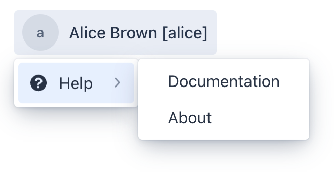
<userMenu>
    <items>
        <textItem id="helpMenuItem"
                  text="msg://helpMenuItem.text" icon="QUESTION_CIRCLE"
                  themeNames="non-checkable">
            <items>
                <textItem id="documentationMenuItem" text="msg://documentationMenuItem.text"/>
                <textItem id="aboutMenuItem" text="msg://aboutMenuItem.text"/>
            </items>
        </textItem>
    </items>
</userMenu>
Theme Variants
The themeNames attribute allows you to assign a specific style from the set of predefined variants.
-
Tertiary - removes button background
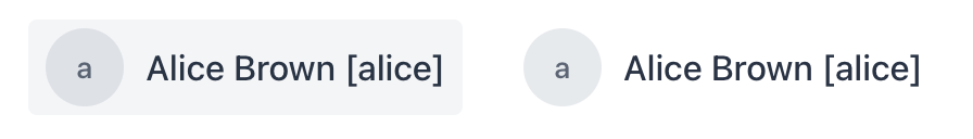
<userMenu> <items> <actionItem id="logoutMenuItem" ref="logoutAction"/> </items> </userMenu> <userMenu themeNames="tertiary"> <items> <actionItem id="logoutMenuItem" ref="logoutAction"/> </items> </userMenu> -
Non-checkable - removes area that displays check mark
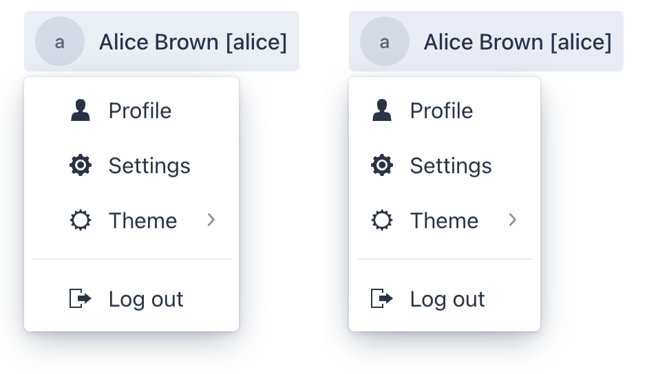
<userMenu>
    <items>
        <viewItem id="profileMenuItem" text="msg://profileMenuItem.text" icon="USER"
                  viewId="ProfileView"/>
        <viewItem id="settingsMenuItem" text="msg://settingsMenuItem.text" icon="COG"
                  viewClass="com.company.onboarding.view.settings.SettingsView"/>
        <actionItem id="themeMenuItem">
            <action id="themeMenuItem" type="userMenu_themeSwitch"/>
        </actionItem>
        <separator/>
        <actionItem id="logoutMenuItem" ref="logoutAction"/>
    </items>
</userMenu>

<userMenu>
    <items>
        <viewItem id="profileMenuItem" text="msg://profileMenuItem.text" icon="USER"
                  viewId="ProfileView"
                  themeNames="non-checkable"/>
        <viewItem id="settingsMenuItem" text="msg://settingsMenuItem.text" icon="COG"
                  viewClass="com.company.onboarding.view.settings.SettingsView"
                  themeNames="non-checkable"/>
        <actionItem id="themeMenuItem"
                    themeNames="non-checkable">
            <action id="themeMenuItem" type="userMenu_themeSwitch"/>
        </actionItem>
        <separator/>
        <actionItem id="logoutMenuItem" ref="logoutAction"
                    themeNames="non-checkable"/>
    </items>
</userMenu>
The non-checkable theme variant can be defined for both the userMenu and its items individually.
If you have a submenu with checkable items, it’s best to define a non-checkable theme variant for each item in the first-level menu individually.
|
Renderers
The framework provides flexibility in customizing the content of the button and the optional menu header.
Button Renderer
You can set a button renderer either using the setButtonRenderer() method or the @Install annotation.

@Autowired
private UiComponents uiComponents;
@Autowired
private FileStorage fileStorage;

@Install(to = "userMenu", subject = "buttonRenderer")
private Component userMenuButtonRenderer(final UserDetails userDetails) {
    if (!(userDetails instanceof User user)) {
        return null;
    }

    String userName = generateUserName(user);
    Avatar avatar = createAvatar(userName, user.getPicture());
    Span name = uiComponents.create(Span.class);
    name.setText(userName);
    name.addClassName(LumoUtility.TextColor.BODY);

    HorizontalLayout content = uiComponents.create(HorizontalLayout.class);
    content.setAlignItems(FlexComponent.Alignment.CENTER);
    content.add(avatar, name);
    content.addClassNames( (1)
            LumoUtility.Padding.Horizontal.MEDIUM,
            LumoUtility.Padding.Vertical.SMALL);

    return content;
}

private String generateUserName(User user) {
    String userName = String.format("%s %s",
                    Strings.nullToEmpty(user.getFirstName()),
                    Strings.nullToEmpty(user.getLastName()))
            .trim();

    return userName.isEmpty() ? user.getUsername() : userName;
}

private Avatar createAvatar(String fullName, @Nullable FileRef fileRef) {
    Avatar avatar = uiComponents.create(Avatar.class);
    avatar.setName(fullName);
    avatar.getElement().setAttribute("tabindex", "-1"); (2)

    if (fileRef != null) {
        StreamResource streamResource = new StreamResource(
                fileRef.getFileName(),
                () -> fileStorage.openStream(fileRef));
        avatar.setImageResource(streamResource); (3)
    }

    return avatar;
}| 1 | Default HorizontalLayout padding is too big, we add padding using styles. |
| 2 | avatar is focusable by default, but it doesn’t provide a Java API to disable focus. Remove the tab index, so only the userMenu component can receive focus. |
| 3 | avatar gets its content from the given StreamResource by the reference stored in the picture attribute of the User entity. |
Header Renderer
Header renderer defines the content displayed at the top of the menu. You can set a header renderer using either the setButtonRenderer() method or the @Install annotation.
@Autowired
private UiComponents uiComponents;
@Autowired
private FileStorage fileStorage;

@Install(to = "userMenu", subject = "headerRenderer")
private Component userMenuHeaderRenderer(final UserDetails userDetails) {
    if (!(userDetails instanceof User user)) {
        return null;
    }

    String name = generateUserName(user);

    Avatar avatar = createAvatar(name, user.getPicture());
    avatar.addThemeVariants(AvatarVariant.LUMO_LARGE);
    avatar.addClassName("user-menu-avatar");

    Span text = uiComponents.create(Span.class);
    text.setText(name);
    text.setClassName("user-menu-text");

    Div content = uiComponents.create(Div.class);
    content.setClassName("user-menu-header-content"); (1)
    content.add(avatar, text);

    if (name.equals(user.getUsername())) {
        text.addClassNames("user-menu-text-subtext");
    } else {
        Span subtext = uiComponents.create(Span.class);
        subtext.setText(user.getUsername());
        subtext.setClassName("user-menu-subtext");

        content.add(subtext);
    }

    return content;
}

private String generateUserName(User user) {
    String userName = String.format("%s %s",
                    Strings.nullToEmpty(user.getFirstName()),
                    Strings.nullToEmpty(user.getLastName()))
            .trim();

    return userName.isEmpty() ? user.getUsername() : userName;
}

private Avatar createAvatar(String fullName, @Nullable FileRef fileRef) {
    Avatar avatar = uiComponents.create(Avatar.class);
    avatar.setName(fullName);
    avatar.getElement().setAttribute("tabindex", "-1"); (2)

    if (fileRef != null) {
        StreamResource streamResource = new StreamResource(
                fileRef.getFileName(),
                () -> fileStorage.openStream(fileRef));
        avatar.setImageResource(streamResource); (3)
    }

    return avatar;
}| 1 | Component positions are defined using styles. |
| 2 | avatar is focusable by default, but it doesn’t provide a Java API to disable focus. Remove the tab index, so only the userMenu component can receive focus. |
| 3 | avatar gets its content from the given StreamResource by the reference stored in the picture attribute of the User entity. |
.user-menu-header-content {
    display: grid;
    grid-template: "avatar text"
                   "avatar subtext";
    grid-template-columns: auto 1fr;
    column-gap: var(--lumo-space-s);

    width: 100%;
    box-sizing: border-box;

    color: var(--lumo-body-text-color);
    padding: var(--lumo-space-xs) var(--lumo-space-l) var(--lumo-space-xs) var(--lumo-space-s);
}

.user-menu-header-content > .user-menu-avatar {
    grid-area: avatar;
    align-self: center;
}

.user-menu-header-content > .user-menu-text {
    grid-area: text;

    color: var(--lumo-body-text-color);
    font-weight: 700;
    font-size: var(--lumo-font-size-m);
}

.user-menu-header-content > .user-menu-text-subtext {
    grid-row: text / subtext;
}

.user-menu-header-content > .user-menu-text {
    align-self: center;
    text-align: start;

    width: 100%;
    overflow: hidden;
    text-overflow: ellipsis;
}

.user-menu-header-content > .user-menu-subtext {
    grid-area: subtext;
    align-self: center;
    text-align: start;

    color: var(--lumo-secondary-text-color);
    font-size: var(--lumo-font-size-xs);

    width: 100%;
    overflow: hidden;
    text-overflow: ellipsis;
}
Attributes
Common attributes serve the same purpose for all components.
The following attributes are specific to userMenu:
Name |
Description |
Default |
|---|---|---|
If the |
|
Handlers
Common handlers are configured in the same way for all components.
The following handlers are specific to userMenu:
|
To generate a handler stub in Jmix Studio, use the Handlers tab of the Jmix UI inspector panel or the Generate Handler action available in the top panel of the view class and through the Code → Generate menu (Alt+Insert / Cmd+N). |
Name |
Description |
|---|---|
|
|
Sets the |
|
Sets the |
