card
The Card component is a versatile container used to display content in a card format, offering customization options for layout and appearance to group related content and actions.
XML Element |
|
|---|---|
Java Class |
|
Attributes |
id - alignSelf - ariaLabel - ariaLabelledBy - classNames - colspan - css - enabled - height - maxHeight - maxWidth - minHeight - minWidth - subtitle - themeNames - title - titleHeadingLevel - visible - width |
Handlers |
|
Elements |
content - footer - header - headerPrefix - headerSuffix - media - subtitle - title |
Basics
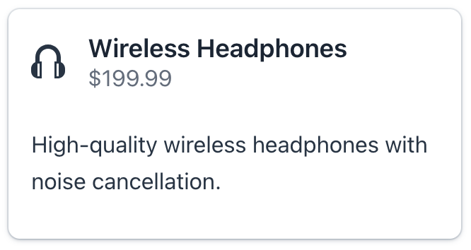
The following example demonstrates how to create a simple card displaying product information.
<card id="productCard"
      width="30em"
      themeNames="elevated"> (1)
    <title>
        <p text="msg://card.title"/> (2)
    </title>
    <subtitle>
        <p text="msg://card.subtitle"/> (3)
    </subtitle>
    <media>
        <image resource="icons/headphones.png"/> (4)
    </media>
    <content>
        <p text="msg://card.content.text"/>(5)
    </content>
    <footer> (6)
        <button id="addButton"
                text="msg://addButton.text"
                icon="EXTERNAL_LINK"
                themeNames="primary"
                iconAfterText="true"/>
        <button id="detailsButton"
                text="msg://detailsButton.text"
                icon="QUESTION"
                iconAfterText="true"/>
    </footer>
</card>| 1 | The elevated theme variant applies a shadow effect. |
| 2 | Defines the primary heading using the title predefined slot. |
| 3 | Defines the secondary heading using the subtitle predefined slot. |
| 4 | The media slot contains the product image. |
| 5 | The content slot holds the main descriptive text. |
| 6 | The footer slot groups action buttons, anchoring them to the bottom of the card. |

The Card component displays content in a structured, card-based layout. Information within the card can be populated either through component attributes or by using its internal elements, known as slots.
The card’s visual appearance - including shadows, borders, and backgrounds - is customizable. This is achieved by applying different theme variants.
Slots
The component provides several predefined slots for flexible content organization. A slot is a nested element within the component.
To add a slot in Jmix Studio, select card in the view XML descriptor or in the Jmix UI structure panel and click Add→[Slot Name] in the Component Inspector panel.
|
Title
Textual content with predefined styling.
You can define the card’s title in either of the following ways:
-
Using the
titleattribute on the component. -
Using a nested
titleelement.
|
Card with the title and subtitle attributes:
<card width="20em"
      themeNames="elevated"
      title="msg://card.title"
      subtitle="msg://card.subtitle">
    <content>
        <p text="msg://card.content.text"/>
    </content>
</card>
Card with a nested title element:
<card width="20em"
      themeNames="elevated">
    <title>
        <div>
            <h2 text="msg://card.title"/>
            <div text="msg://card.subtitle"
                 classNames="uppercase text-xs text-secondary"/>
        </div>
    </title>
    <content>
        <p text="msg://card.content.text"/>
    </content>
</card>
Subtitle
The subtitle provides secondary textual content with predefined styling, displayed directly below the title. It is designed to be used in conjunction with a title.
You can define the card’s subtitle in either of the following ways:
-
Using the
subtitleattribute on the component. -
Using a nested
subtitleelement.
|
Card with the title and subtitle attributes:
<card width="20em"
      themeNames="elevated"
      title="msg://card.title"
      subtitle="msg://card.subtitle">
    <content>
        <p text="msg://card.content.text"/>
    </content>
</card>
Card with a nested subtitle element:
<card width="20em"
      title="msg://card.title"
      themeNames="elevated">
    <subtitle>
        <div text="msg://card.subtitle"/>
    </subtitle>
    <content>
        <p text="msg://card.content.text"/>
    </content>
</card>
Header
Specifies a custom component to be used as the card’s header.
Card with a nested header element:
<card width="20em"
      themeNames="elevated">
    <header>
        <div>
            <h2 text="msg://card.title"/>
            <div text="msg://card.subtitle"/>
        </div>
    </header>
    <content>
        <p text="msg://card.content.text"/>
    </content>
</card>
HeaderPrefix
Specifies a component to be displayed before the main header content.
This slot is typically used for elements like an avatar, icon, or other visual indicator that precedes the title and subtitle.
<card width="20em"
      themeNames="elevated"
      title="msg://card.title"
      subtitle="msg://card.subtitle">
    <content>
        <p text="msg://card.content.text"/>
    </content>
    <headerPrefix>
        <icon icon="vaadin:headphones"/>
    </headerPrefix>
</card>
HeaderSuffix
Specifies a component to be displayed after the main header content.
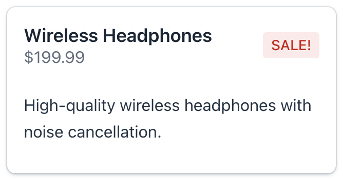
This slot is commonly used for action buttons, decorative icons, or other interactive elements that are relevant to the header.
<card width="20em"
      themeNames="elevated"
      title="msg://card.title"
      subtitle="msg://card.subtitle">
    <content>
        <p text="msg://card.content.text"/>
    </content>
    <headerSuffix>
        <span text="SALE!" themeNames="badge, error"/>
    </headerSuffix>
</card>
Media
Specifies a visual component, such as an image, avatar, or icon, to be displayed as the card’s media.
To control how the media content is sized, apply the stretch-media or cover-media theme variants using the themeNames attribute.
<card width="20em"
      themeNames="elevated, stretch-media"
      title="msg://card.title"
      subtitle="msg://card.subtitle">
    <media>
        <image resource="icons/headphones.png"/>
    </media>
    <content>
        <p text="msg://card.content.text"/>
    </content>
</card>
Content
Contains the main content of the card. This slot can hold any number of elements, providing flexibility for rich and complex layouts.
<card width="20em"
      title="msg://card.title"
      subtitle="msg://card.subtitle"
      themeNames="outlined" titleHeadingLevel="4">
    <content>
        <p text="msg://card.content.text"/>
        <vbox spacing="false" padding="false">
            <p text="Color:"/>
            <radioButtonGroup id="colorRBtn"
                              themeNames="vertical"/>
        </vbox>
    </content>
</card>
Footer
Defines the footer area of the card. This slot supports multiple elements, enabling flexible layouts for actions, status indicators, and supplementary information.
The footer remains positioned at the bottom of the card regardless of the main content’s height.
<card width="20em"
      themeNames="elevated"
      title="msg://card.title"
      subtitle="msg://card.subtitle" titleHeadingLevel="1">
    <content>
        <p text="msg://card.content.text"/>
    </content>
    <footer>
        <span text=" Delivery: 1-2 days"
              themeNames="badge, success"/>
        <button id="buyButton"
                text="Buy Now"
                icon="vaadin:clock"
                iconAfterText="true"/>
    </footer>
</card>
Theme Variants
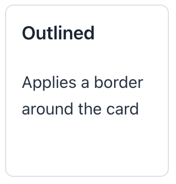
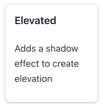
The component’s appearance is customizable with the themeNames attribute, which allows you to select among five different options:
outlined
Applies a border around the card.
elevated
Adds a shadow effect to create elevation.
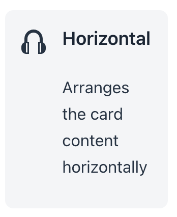
horizontal
Arranges the card content horizontally.
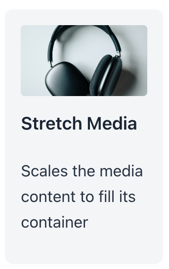
stretch-media
Scales the media content to fill its container.
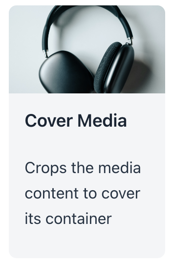
cover-media
Crops the media content to cover its container.
| You can combine all theme variants together. |
Attributes
Common attributes serve the same purpose for all components.
The following attributes are specific to card:
Name |
Description |
Default |
|---|---|---|
Set the secondary textual content with predefined styling. See Subtitle. |
||
Set the textual content with predefined styling. See Title. |
||
Sets the title heading level property for the titles. The value of the attribute is set to the aria-level HTML attribute. The |
2 |
See Also
See Vaadin Docs for more information.
