Validator
Basics
Validator is designed to check values entered into visual components.
|
Validation and input type checking should be differentiated. Suppose a given component (for example, TextField) data type is set to something different than a string (this can happen when binding to an entity attribute or setting datatype). In that case, the component will not allow the user to enter a value that does not comply with this data type. When the component loses focus or when the user presses Enter, the error notification will be shown. On the other hand, validation does not act immediately on data entry or focus loss but rather when the component’s |
The framework contains the set of implementations for the most frequently used validators, which can be used in your project.
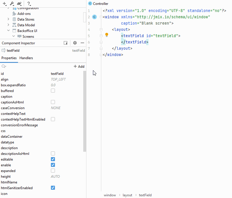
In a screen XML descriptor, such component validators can be defined in a nested validators element. A validator can be added using the Jmix Studio interface. Below is an example of adding a validator to the TextField component:
Some validators use the Groovy string in the error message. It means that it is possible to pass parameters to the error message (for example, ${value}). These parameters take account of the user’s locale.
Each validator is a Prototype Bean, and if you want to use validators from Java code, you need to get them using ApplicationContext:
PositiveValidator validator = applicationContext.getBean(PositiveValidator.class);A validator class can be assigned to a component programmatically by submitting a validator instance into the component’s addValidator() method.
Example of setting a validator programmatically in a screen controller:
textField.addValidator(applicationContext.getBean(PositiveValidator.class));Using Custom Validators
You can use a custom Java class as a validator. It should implement the Validator interface.
Example of creating a validator class for zip codes:
@Component("ui_ZipValidator")
@Scope(BeanDefinition.SCOPE_PROTOTYPE)
public class ZipValidator implements Validator<String> {
    @Override
    public void accept(String value) throws ValidationException {
        if (value != null && value.length() != 6)
            throw new ValidationException("Zip must be of 6 characters length");
    }
}
In a screen XML-descriptor, a custom validator can be defined in a nested custom element.
Example of using a zip code validator for the TextField component:
<textField id="numberField22">
    <validators>
        <custom bean="ui_ZipValidator"/>
    </validators>
</textField>
Example of setting a custom validator programmatically in a screen controller:
zipField.addValidator(value -> {
    if (value != null && value.length() != 6)
        throw new ValidationException("Zip must be of 6 characters length");
});
DecimalMaxValidator
It checks that value is less than or equal to the specified maximum. Supported types: BigDecimal, BigInteger, Long, Integer, and String that represents BigDecimal value with the current locale.
It has the following attributes:
-
value- maximum value (required); -
inclusive- when set totrue, the value should be less than or equal to the specified maximum value. When set tofalse, the value should be less than the specified maximum value. The default value istrue; -
message- a custom message displayed to a user when validation fails. This message can contain$valueand$maxkeys for the formatted output.
Default message keys:
-
validation.constraints.decimalMaxInclusive; -
validation.constraints.decimalMax.
Layout descriptor usage:
<textField id="numberField">
    <validators>
        <decimalMax value="1000"
                    inclusive="true"
                    message="Value ${value} cannot be greater than ${max}"/>
    </validators>
</textField>
Java code usage:
@Autowired
protected TextField numberField;

@Autowired
protected ApplicationContext applicationContext;

@Subscribe("addValidBtn1")
protected void onAddValidBtn1Click(Button.ClickEvent event) {
    DecimalMaxValidator maxValidator = applicationContext
            .getBean(DecimalMaxValidator.class, new BigDecimal(1000));
    numberField.addValidator(maxValidator);
}
DecimalMinValidator
It checks that value is greater than or equal to the specified minimum. Supported types: BigDecimal, BigInteger, Long, Integer, and String that represents BigDecimal value with the current locale.
It has the following attributes:
-
value- minimum value (required); -
inclusive- when set totrue, the value should be greater than or equal to the specified maximum value. When set tofalse, the value should be greater than the specified maximum value. The default value istrue; -
message- a custom message displayed to a user when validation fails. This message can contain$valueand$maxkeys for the formatted output.
Default message keys:
-
validation.constraints.decimalMinInclusive; -
validation.constraints.decimalMin.
Layout descriptor usage:
<textField id="numberField2">
    <validators>
        <decimalMin value="100"
                    inclusive="false"
                    message="Value ${value} cannot be less than ${min}"/>
    </validators>
</textField>
Java code usage:
@Autowired
protected TextField numberField2;

@Autowired
protected ApplicationContext applicationContext;

@Subscribe("addValidBtn2")
protected void onAddValidBtn2Click(Button.ClickEvent event) {
    DecimalMinValidator minValidator = applicationContext
            .getBean(DecimalMinValidator.class, new BigDecimal(100));
    numberField2.addValidator(minValidator);
}
DigitsValidator
It checks that value is a number within the accepted range. Supported types: BigDecimal, BigInteger, Long, Integer, and String that represents BigDecimal value with the current locale.
It has the following attributes:
-
integer- count of numbers in the integer part (required); -
fraction- count of numbers in the fraction part (required); -
message- a custom message displayed to a user when validation fails. This message can contain$value,$integer, and$fractionkeys for the formatted output.
Default message key:
-
validation.constraints.digits.
Layout descriptor usage:
<textField id="numberField3">
    <validators>
        <digits fraction="2"
                integer="3"
                message="Value ${value} is out of bounds (${integer}
                digits are expected in integer part and ${fraction}
                in fractional part)"/>
    </validators>
</textField>
Java code usage:
@Autowired
protected TextField numberField3;

@Autowired
protected ApplicationContext applicationContext;

@Subscribe("addValidBtn3")
protected void onAddValidBtn3Click(Button.ClickEvent event) {
    DigitsValidator digitsValidator = applicationContext
            .getBean(DigitsValidator.class, 3, 2);
    numberField3.addValidator(digitsValidator);
}
DoubleMaxValidator
It checks that value is less than or equal to the specified maximum. Supported types: Double, and String that represents Double value with the current locale.
It has the following attributes:
-
value- maximum value (required); -
inclusive- when set totrue, the value should be less than or equal to the specified maximum value. When set tofalse, the value should be less than the specified maximum value. The default value istrue; -
message- a custom message displayed to a user when validation fails. This message can contain$valueand$maxkeys for the formatted output.
Default message keys:
-
validation.constraints.decimalMaxInclusive; -
validation.constraints.decimalMax.
Layout descriptor usage:
<textField id="numberField4">
    <validators>
        <doubleMax value="1000"
                   inclusive="false"
                   message="Value ${value} cannot be greater than ${max}"/>
    </validators>
</textField>
Java code usage:
@Autowired
protected TextField numberField4;

@Autowired
protected ApplicationContext applicationContext;

@Subscribe("addValidBtn4")
protected void onAddValidBtn4Click(Button.ClickEvent event) {
    DoubleMaxValidator maxValidator = applicationContext
            .getBean(DoubleMaxValidator.class, Double.valueOf(1000));
    numberField4.addValidator(maxValidator);
}
DoubleMinValidator
It checks that value is greater than or equal to the specified minimum. Supported types: Double, and String that represents Double value with the current locale.
It has the following attributes:
-
value- minimum value (required); -
inclusive- when set totrue, the value should be greater than or equal to the specified minimum value. When set tofalse, the value should be greater than the specified maximum value. The default value istrue; -
message- a custom message displayed to a user when validation fails. This message can contain$valueand$minkeys for formatted output.
Default message keys:
-
validation.constraints.decimalMinInclusive; -
validation.constraints.decimalMin.
Layout descriptor usage:
<textField id="numberField5">
    <validators>
        <doubleMin value="100"
                   inclusive="false"
                   message="Value ${value} cannot be less than ${max}"/>
    </validators>
</textField>
Java code usage:
@Autowired
protected TextField numberField5;

@Autowired
protected ApplicationContext applicationContext;

@Subscribe("addValidBtn5")
protected void onAddValidBtn5Click(Button.ClickEvent event) {
    DoubleMinValidator minValidator = applicationContext
            .getBean(DoubleMinValidator.class, Double.valueOf(100));
    numberField5.addValidator(minValidator);
}
EmailValidator
Email validator checks that String value is email or contains multiple emails separated by a semicolon or comma. Supported type: String.
It has the following attribute:
-
message- a custom message displayed to a user when validation fails.
Default message key:
-
validation.invalidEmail.
Layout descriptor usage:
<textField id="numberField23">
    <validators>
        <email message="Invalid email address"/>
    </validators>
</textField>
Java code usage:
@Autowired
protected TextField numberField23;

@Autowired
protected ApplicationContext applicationContext;

@Subscribe("addValidBtn23")
protected void onAddValidBtn23Click(Button.ClickEvent event) {
    EmailValidator emailValidator = applicationContext
            .getBean(EmailValidator.class);
    numberField23.addValidator(emailValidator);
}
FutureOrPresentValidator
It validates that the date or time is in the future or present. It doesn’t use Groovy string, so there are no parameters you can pass to the error message. Supported types: java.util.Date, LocalDate, LocalDateTime, LocalTime, OffsetDateTime, OffsetTime.
It has the following attributes:
-
checkSeconds- when set totrue, the validator should compare date or time with seconds and nanos. The default value isfalse; -
message- a custom message displayed to a user when validation fails.
Default message key:
-
validation.constraints.futureOrPresent.
Layout descriptor usage:
<dateField id="dateTimeField">
    <validators>
        <futureOrPresent checkSeconds="true"/>
    </validators>
</dateField>
Java code usage:
@Autowired
protected DateField dateTimeField;

@Autowired
protected ApplicationContext applicationContext;

@Subscribe("addValidBtn6")
protected void onAddValidBtn6Click(Button.ClickEvent event) {
    FutureOrPresentValidator futureOrPresentValidator = applicationContext
            .getBean(FutureOrPresentValidator.class);
    dateTimeField.addValidator(futureOrPresentValidator);
}
FutureValidator
It validates that the date or time is in the future. It doesn’t use Groovy string, so there are no parameters you can pass to the error message. Supported types: java.util.Date, LocalDate, LocalDateTime, LocalTime, OffsetDateTime, OffsetTime.
It has the following attributes:
-
checkSeconds- when set totrue, the validator should compare date or time with seconds and nanos. The default value isfalse; -
message- a custom message displayed to a user when validation fails.
Default message key:
-
validation.constraints.future.
Layout descriptor usage:
<timeField id="localTimeField">
    <validators>
        <future checkSeconds="true"/>
    </validators>
</timeField>
Java code usage:
@Autowired
protected TimeField localTimeField;

@Autowired
protected ApplicationContext applicationContext;

@Subscribe("addValidBtn7")
protected void onAddValidBtn7Click(Button.ClickEvent event) {
    FutureValidator futureValidator = applicationContext
            .getBean(FutureValidator.class);
    localTimeField.addValidator(futureValidator);
}
MaxValidator
It checks that value is less than or equal to the specified maximum. Supported types: BigDecimal, BigInteger, Long, Integer.
It has the following attributes:
-
value- maximum value (required); -
message- a custom message displayed to a user when validation fails. This message can contain the$valueand$maxkeys for the formatted output.
Default message key:
-
validation.constraints.max.
Layout descriptor usage:
<textField id="numberField8">
    <validators>
        <max value="20500"
             message="Value ${value} must be less than or equal to ${max}"/>
    </validators>
</textField>
Java code usage:
@Autowired
protected TextField numberField8;

@Autowired
protected ApplicationContext applicationContext;

@Subscribe("addValidBtn8")
protected void onAddValidBtn8Click(Button.ClickEvent event) {
    MaxValidator maxValidator = applicationContext
            .getBean(MaxValidator.class, 20500);
    numberField8.addValidator(maxValidator);
}
MinValidator
It checks that value is greater than or equal to the specified minimum. Supported types: BigDecimal, BigInteger, Long, Integer.
It has the following attributes:
-
value- minimum value (required); -
message- a custom message displayed to a user when validation fails. This message can contain the$value, and$minkeys for the formatted output.
Default message key:
-
validation.constraints.min.
Layout descriptor usage:
<textField id="numberField9">
    <validators>
        <min value="30"
             message="Value ${value} must be greater than or equal to ${min}"/>
    </validators>
</textField>
Java code usage:
@Autowired
protected TextField numberField9;

@Autowired
protected ApplicationContext applicationContext;

@Subscribe("addValidBtn9")
protected void onAddValidBtn9Click(Button.ClickEvent event) {
    MinValidator minValidator = applicationContext
            .getBean(MinValidator.class, 30);
    numberField9.addValidator(minValidator);
}
NegativeOrZeroValidator
It checks that value is less than or equal 0. Supported types: BigDecimal, BigInteger, Long, Integer, Double, Float.
It has the following attribute:
-
message- a custom message displayed to a user when validation fails. This message can contain the$valuekey for the formatted output. Note thatFloatdoesn’t have its own datatype and won’t be formatted with the user’s locale.
Default message key:
-
validation.constraints.negativeOrZero.
Layout descriptor usage:
<textField id="numberField10">
    <validators>
        <negativeOrZero message="Value ${value} must be less than or equal to 0"/>
    </validators>
</textField>
Java code usage:
@Autowired
protected TextField numberField10;

@Autowired
protected ApplicationContext applicationContext;

@Subscribe("addValidBtn10")
protected void onAddValidBtn10Click(Button.ClickEvent event) {
    NegativeOrZeroValidator negativeOrZeroValidator = applicationContext
            .getBean(NegativeOrZeroValidator.class);
    numberField10.addValidator(negativeOrZeroValidator);
}
NegativeValidator
It checks that value is strictly less than 0. Supported types: BigDecimal, BigInteger, Long, Integer, Double, Float.
It has the following attribute:
-
message- a custom message displayed to a user when validation fails. This message can contain the$valuekey for the formatted output. Note thatFloatdoesn’t have its own datatype and won’t be formatted with the user’s locale.
Default message key:
-
validation.constraints.negative.
Layout descriptor usage:
<textField id="numberField11">
    <validators>
        <negativeOrZero message="Value ${value} must be less than 0"/>
    </validators>
</textField>
Java code usage:
@Autowired
protected TextField numberField11;

@Autowired
protected ApplicationContext applicationContext;

@Subscribe("addValidBtn11")
protected void onAddValidBtn11Click(Button.ClickEvent event) {
    NegativeValidator negativeValidator = applicationContext
            .getBean(NegativeValidator.class);
    numberField11.addValidator(negativeValidator);
}
NotBlankValidator
It checks that value contains at least one non-whitespace character. It doesn’t use Groovy string, so there are no parameters you can pass to the error message. Supported type: String.
It has the following attribute:
-
message- a custom message displayed to a user when validation fails.
Default message key:
-
validation.constraints.notBlank.
Layout descriptor usage:
<textField id="numberField12">
    <validators>
        <notBlank message="Value must contain at least one non-whitespace character"/>
    </validators>
</textField>
Java code usage:
@Autowired
protected TextField numberField12;

@Autowired
protected ApplicationContext applicationContext;

@Subscribe("addValidBtn12")
protected void onAddValidBtn12Click(Button.ClickEvent event) {
    NotBlankValidator notBlankValidator = applicationContext
            .getBean(NotBlankValidator.class);
    numberField11.addValidator(notBlankValidator);
}
NotEmptyValidator
It checks that value is not null and not empty. Supported types: Collection and String.
It has the following attribute:
-
message- a custom message displayed to a user when validation fails. This message can contain the$valuekey for the formatted output, only for theStringtype.
Default message key:
-
validation.constraints.notEmpty.
Layout descriptor usage:
<textField id="numberField13">
    <validators>
        <notEmpty/>
    </validators>
</textField>
Java code usage:
@Autowired
protected TextField numberField13;

@Autowired
protected ApplicationContext applicationContext;

@Subscribe("addValidBtn13")
protected void onAddValidBtn13Click(Button.ClickEvent event) {
    NotEmptyValidator notEmptyValidator = applicationContext
            .getBean(NotEmptyValidator.class);
    numberField13.addValidator(notEmptyValidator);
}
NotNullValidator
It checks that value is not null. It doesn’t use Groovy string, so there are no parameters you can pass to the error message.
It has the following attribute:
-
message- a custom message displayed to a user when validation fails.
Default message key:
-
validation.constraints.notNull.
Layout descriptor usage:
<textField id="numberField14">
    <validators>
        <notNull/>
    </validators>
</textField>
Java code usage:
@Autowired
protected TextField numberField14;

@Autowired
protected ApplicationContext applicationContext;

@Subscribe("addValidBtn14")
protected void onAddValidBtn14Click(Button.ClickEvent event) {
    NotNullValidator notNullValidator = applicationContext
            .getBean(NotNullValidator.class);
    numberField14.addValidator(notNullValidator);
}
PastOrPresentValidator
It validates that the date or time is in the past or present. It doesn’t use Groovy string, so there are no parameters you can pass to the error message. Supported types: java.util.Date, LocalDate, LocalDateTime, LocalTime, OffsetDateTime, OffsetTime.
It has the following attributes:
-
checkSeconds- when setting totrue, the validator should compare date or time with seconds and nanos. The default value isfalse; -
message- a custom message displayed to a user when validation fails.
Default message key:
-
validation.constraints.pastOrPresent.
Layout descriptor usage:
<dateField id="dateField">
    <validators>
        <pastOrPresent/>
    </validators>
</dateField>
Java code usage:
@Autowired
protected DateField dateField;

@Autowired
protected ApplicationContext applicationContext;

@Subscribe("addValidBtn15")
protected void onAddValidBtn15Click(Button.ClickEvent event) {
    PastOrPresentValidator pastOrPresentValidator = applicationContext
            .getBean(PastOrPresentValidator.class);
    dateField.addValidator(pastOrPresentValidator);
}
PastValidator
It validates that the date or time is in the past. It doesn’t use Groovy string, so there are no parameters you can pass to the error message. Supported types: java.util.Date, LocalDate, LocalDateTime, LocalTime, OffsetDateTime, OffsetTime.
It has the following attributes:
-
checkSeconds- when set totrue, the validator should compare date or time with seconds and nanos. The default value isfalse; -
message- a custom message displayed to a user when validation fails.
Default message key:
-
validation.constraints.past.
Layout descriptor usage:
<dateField id="dateField16">
    <validators>
        <past/>
    </validators>
</dateField>
Java code usage:
@Autowired
protected DateField dateField16;

@Autowired
protected ApplicationContext applicationContext;

@Subscribe("addValidBtn16")
protected void onAddValidBtn16Click(Button.ClickEvent event) {
    PastValidator pastValidator = applicationContext
            .getBean(PastValidator.class);
    dateField16.addValidator(pastValidator);
}
PositiveOrZeroValidator
It checks that value is greater than or equal to 0. Supported types: BigDecimal, BigInteger, Long, Integer, Double, Float.
It has the following attribute:
-
message- a custom message displayed to a user when validation fails. This message can contain the$valuekey for the formatted output. Note thatFloatdoesn’t have its own datatype and won’t be formatted with the user’s locale.
Default message key:
-
validation.constraints.positiveOrZero.
Layout descriptor usage:
<textField id="numberField17">
    <validators>
        <positiveOrZero message="Value ${value} should be greater than or equal to '0'"/>
    </validators>
</textField>
Java code usage:
@Autowired
protected TextField numberField17;

@Autowired
protected ApplicationContext applicationContext;

@Subscribe("addValidBtn17")
protected void onAddValidBtn17Click(Button.ClickEvent event) {
    PositiveOrZeroValidator positiveOrZeroValidator = applicationContext
            .getBean(PositiveOrZeroValidator.class);
    numberField17.addValidator(positiveOrZeroValidator);
}
PositiveValidator
It checks that value is strictly greater than 0. Supported types: BigDecimal, BigInteger, Long, Integer, Double, Float.
It has the following attribute:
-
message- a custom message displayed to a user when validation fails. This message can contain the$valuekey for the formatted output. Note thatFloatdoesn’t have its own datatype and won’t be formatted with the user’s locale.
Default message key:
-
validation.constraints.positive.
Layout descriptor usage:
<textField id="numberField18">
    <validators>
        <positive message="Value ${value} should be greater than '0'"/>
    </validators>
</textField>
Java code usage:
@Autowired
protected TextField numberField18;

@Autowired
protected ApplicationContext applicationContext;

@Subscribe("addValidBtn18")
protected void onAddValidBtn18Click(Button.ClickEvent event) {
    PositiveValidator positiveValidator = applicationContext
            .getBean(PositiveValidator.class);
    numberField18.addValidator(positiveValidator);
}
RegexpValidator
It checks that the String value matches the specified regular expression. Supported type: String.
It has the following attributes:
-
regexp- a regular expression to match (required); -
message- a custom message displayed to a user when validation fails. This message can contain the$valuekey for the formatted output.
Default message key:
-
validation.constraints.regexp.
Layout descriptor usage:
<textField id="numberField19">
    <validators>
        <regexp regexp="[a-z]*"/>
    </validators>
</textField>
Java code usage:
@Autowired
protected TextField numberField18;

@Autowired
protected ApplicationContext applicationContext;

@Subscribe("addValidBtn19")
protected void onAddValidBtn19Click(Button.ClickEvent event) {
    RegexpValidator regexpValidator = applicationContext
            .getBean(RegexpValidator.class);
    numberField19.addValidator(regexpValidator);
}
SizeValidator
It checks that value is in a specific range. Supported types: Collection and String.
It has the following attributes:
-
min - a minimum value (with inclusive), cannot be less than
0. The default value is0; -
max - a maximum value (with inclusive), cannot be less than
0. The default value isInteger.MAX_VALUE; -
message - a custom message displayed to a user when validation fails. This message can contain the
$value(only for theStringtype),$min,$maxkeys for the formatted output.
Default message keys:
-
validation.constraints.collectionSizeRange; -
validation.constraints.sizeRange.
Layout descriptor usage:
<textField id="numberField20">
    <validators>
        <size max="10"
              min="2"
              message="Value ${value} should be between ${min} and ${max}"/>
    </validators>
</textField>
<twinColumn id="twinColumn" rows="4">
    <validators>
        <size max="4"
              min="2"
              message="Collection size must be between ${min} and ${max}"/>
    </validators>
</twinColumn>
Java code usage:
@Autowired
protected TextField numberField20;

@Autowired
protected ApplicationContext applicationContext;

@Subscribe("addValidBtn20")
protected void onAddValidBtn20Click(Button.ClickEvent event) {
    SizeValidator sizeValidator = applicationContext
            .getBean(SizeValidator.class);
    numberField20.addValidator(sizeValidator);
}