7. Creating UI from Scratch
At this stage, the application has everything in place for Administrators and HR Managers: they can set up departments and onboarding steps, manage users, generate and track onboarding steps for each user.
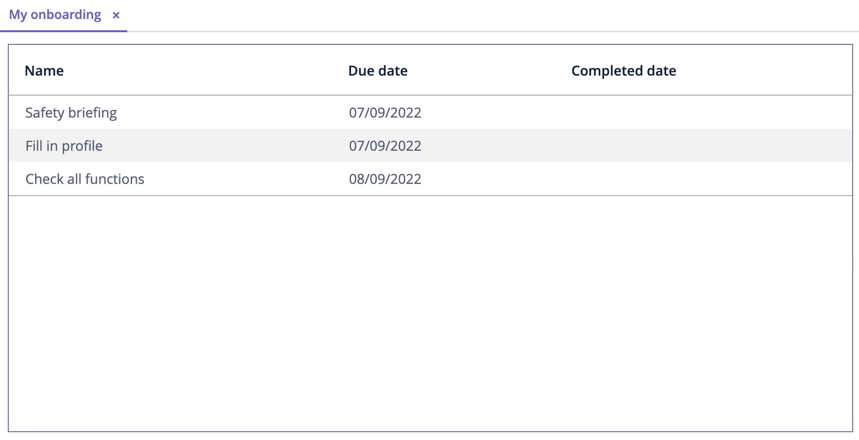
Now you need to create UI for users to manage their own onboarding process. A user should be able to enter the system and open the My Onboarding screen which shows their onboarding steps. Each step can be marked as done by selecting a checkbox. Overdue steps should be highlighted.
Below is a mockup of the My Onboarding screen:

Previously, you created UI by generating and modifying CRUD screens for entities. In this chapter, you will create the My Onboarding screen from scratch.
Creating Blank Screen
If your application is running, stop it using the Stop button ( ) in the main toolbar.
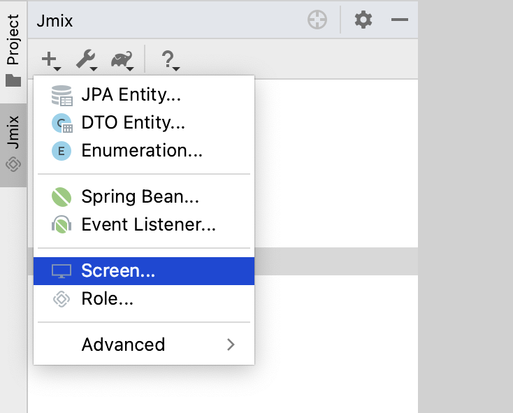
In the Jmix tool window, click New ( ) → Screen:
In the Create Jmix Screen window, select the Blank screen template:
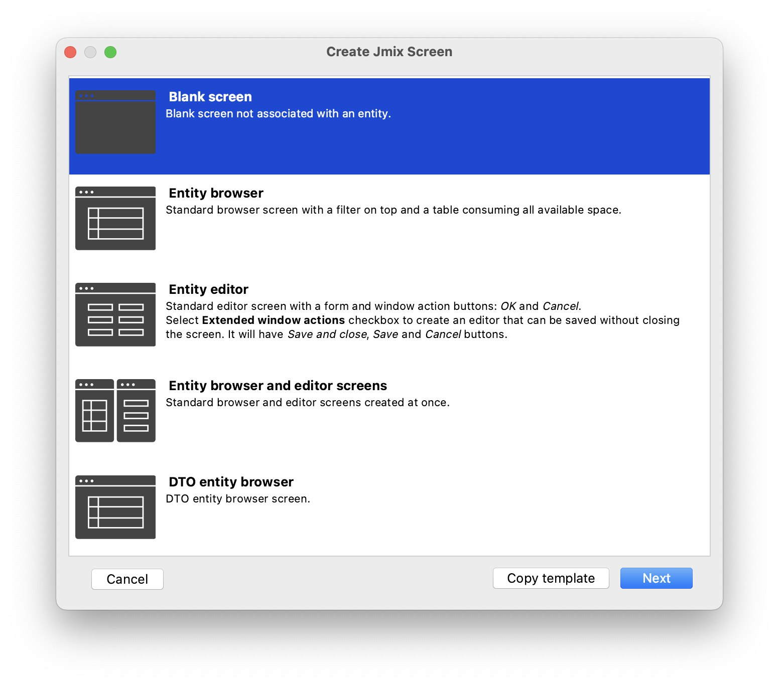
Click Next.
On the next step of the wizard, enter:
-
Package name:
com.company.onboarding.screen.myonboarding -
Descriptor name:
my-onboarding-screen -
Controller name:
MyOnboardingScreen
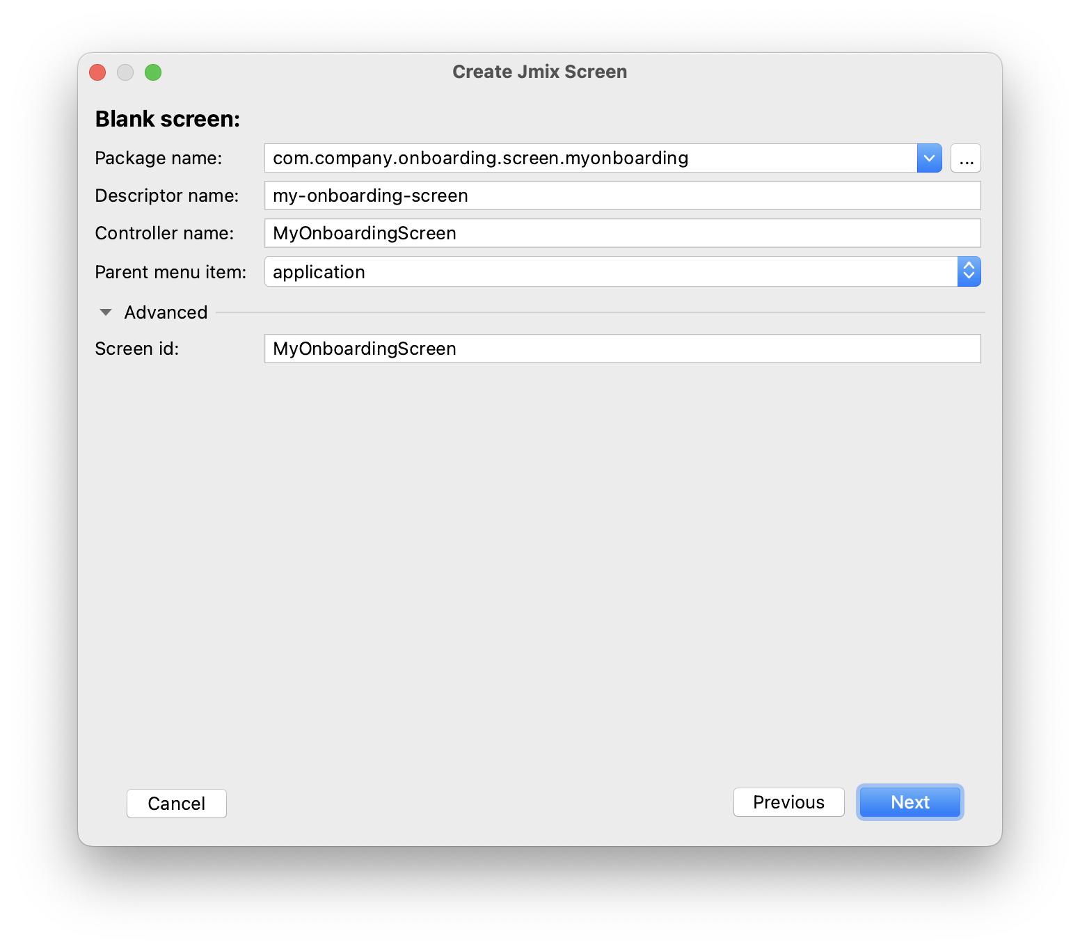
Click Next.
On the next step of the wizard, change the screen caption to My onboarding:
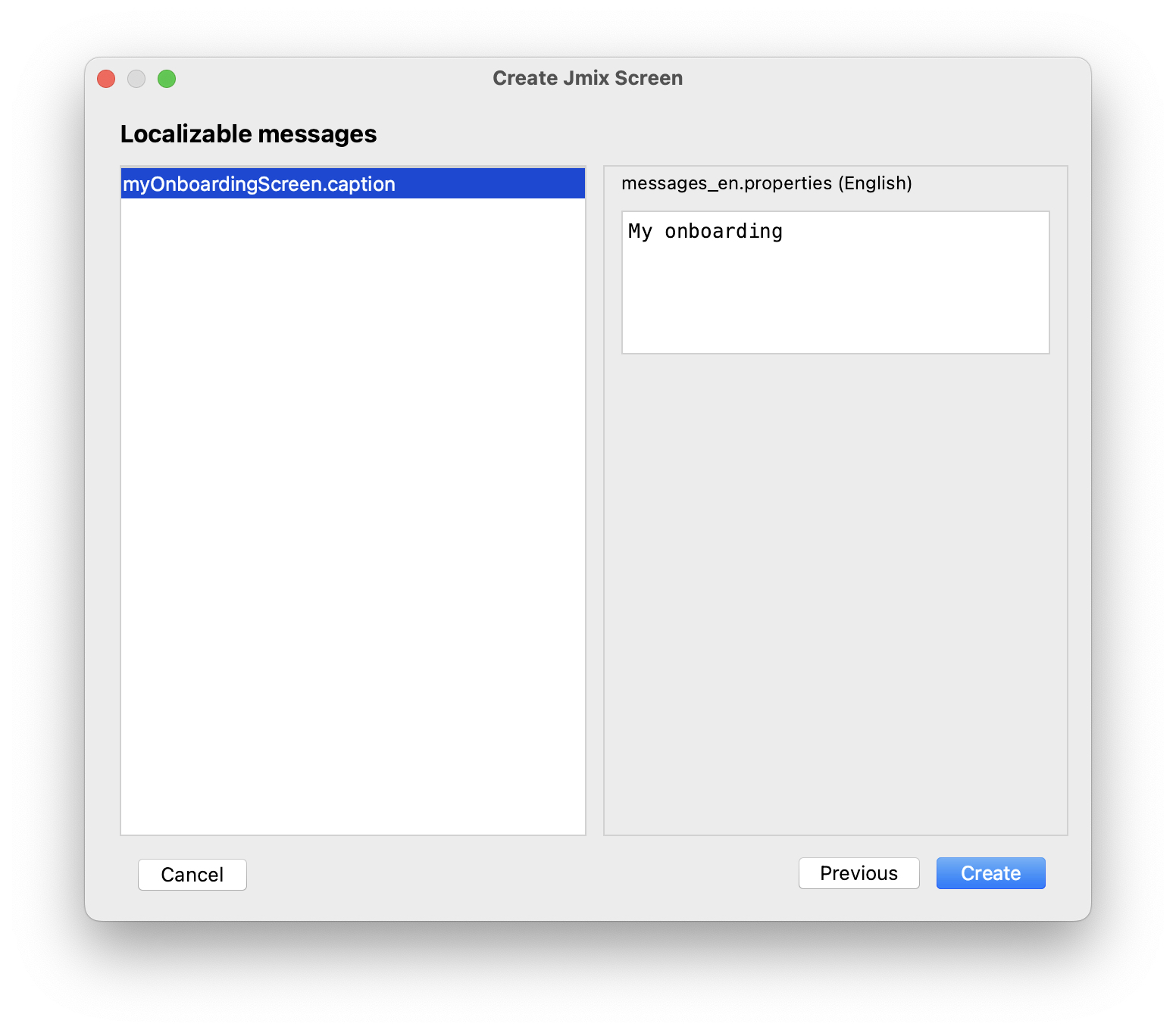
Click Create.
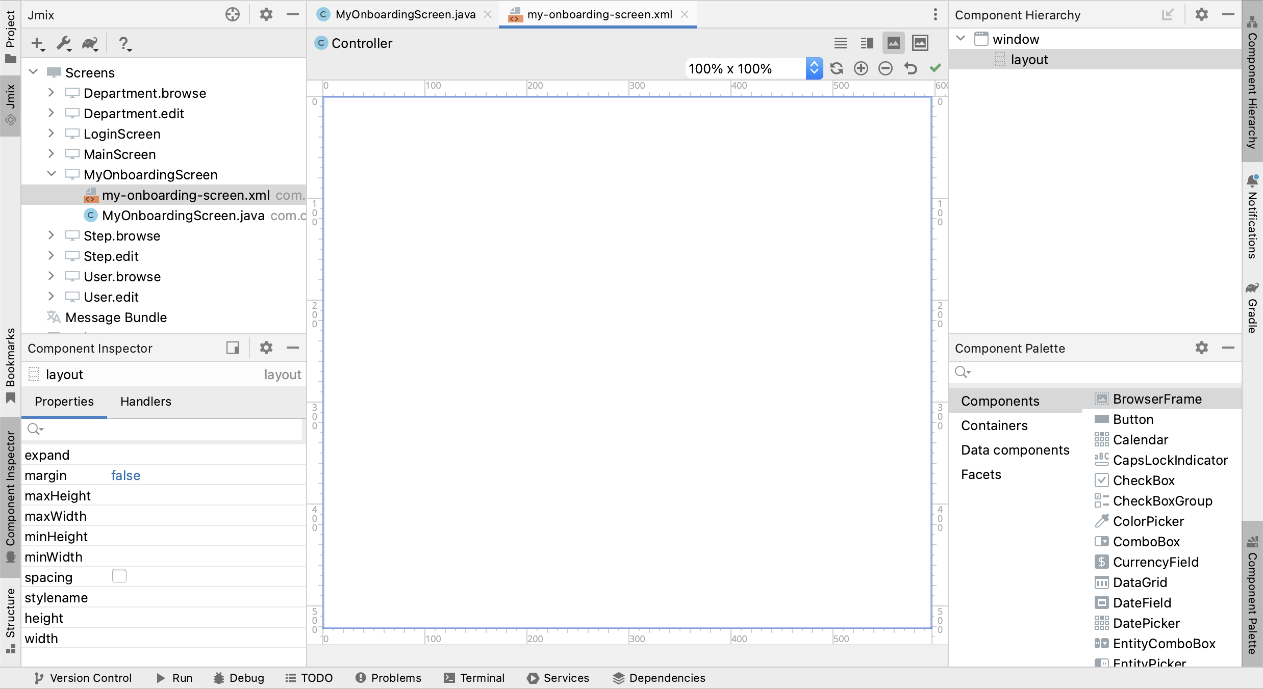
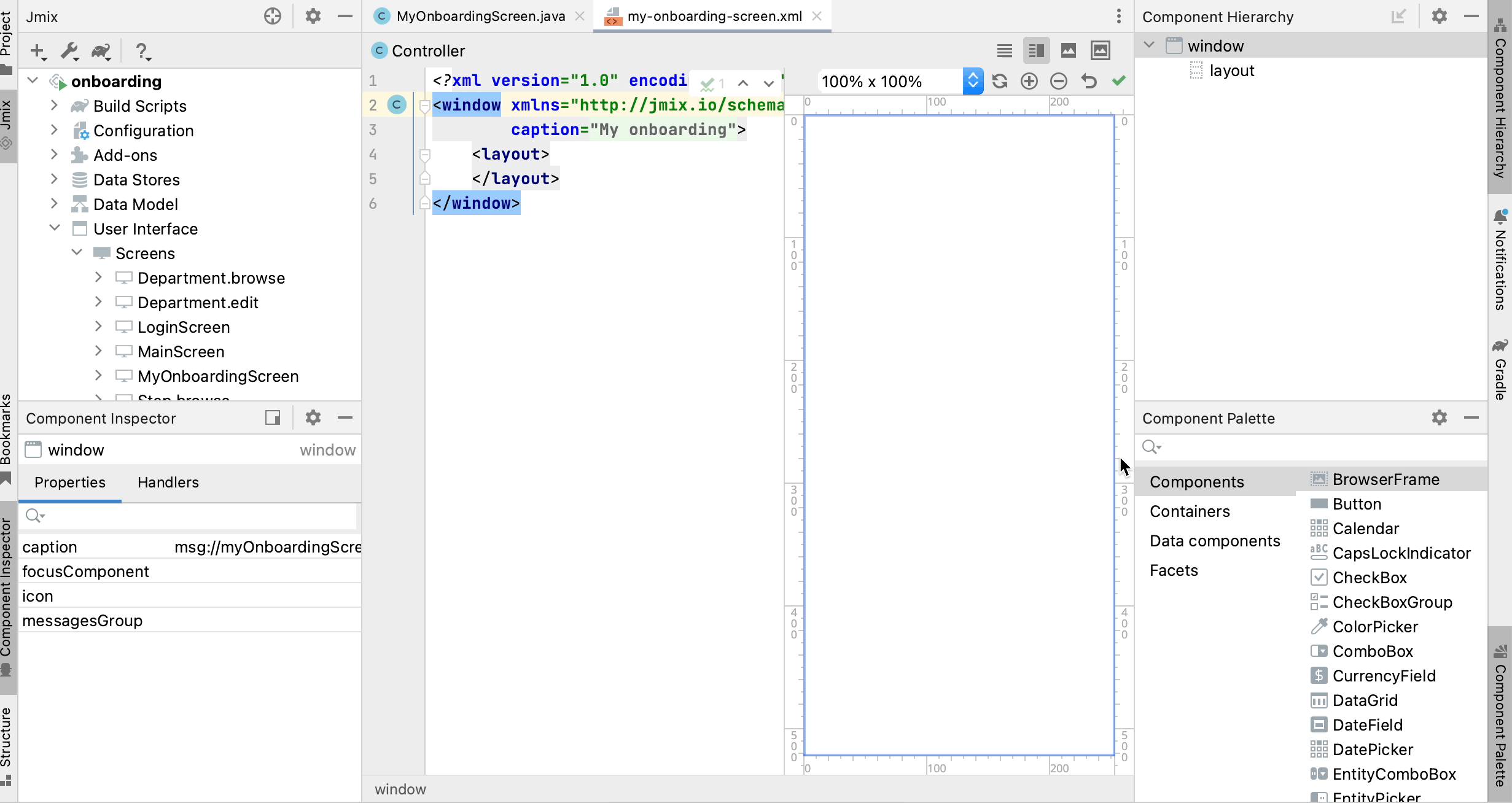
Studio will create an empty screen and open it in the designer:
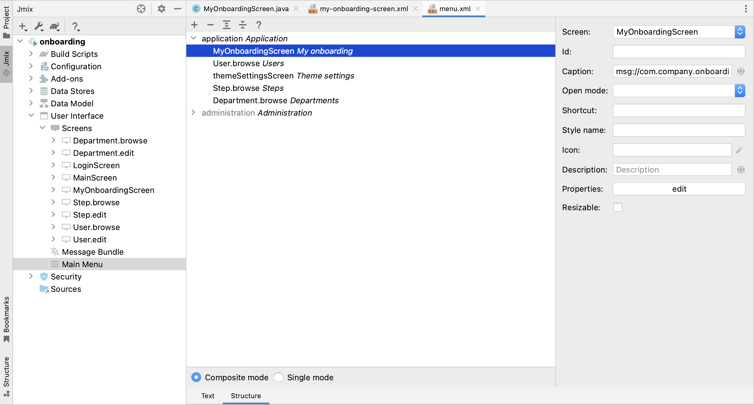
The new screen will also be added to the main menu. Double-click on the User Interface → Main Menu item in the Jmix tool window and switch to the Structure tab. Drag and drop MyOnboardingScreen to the top:
Run the application by clicking the Debug button ( ) in the main toolbar. Open
 http://localhost:8080 in your web browser and log in to the application.
Click on the My onboarding item in the Application menu and make sure your empty screen is opened.
Adding Table
Let’s begin with adding to the screen a table displaying onboarding steps of the current user.
Defining Data Container
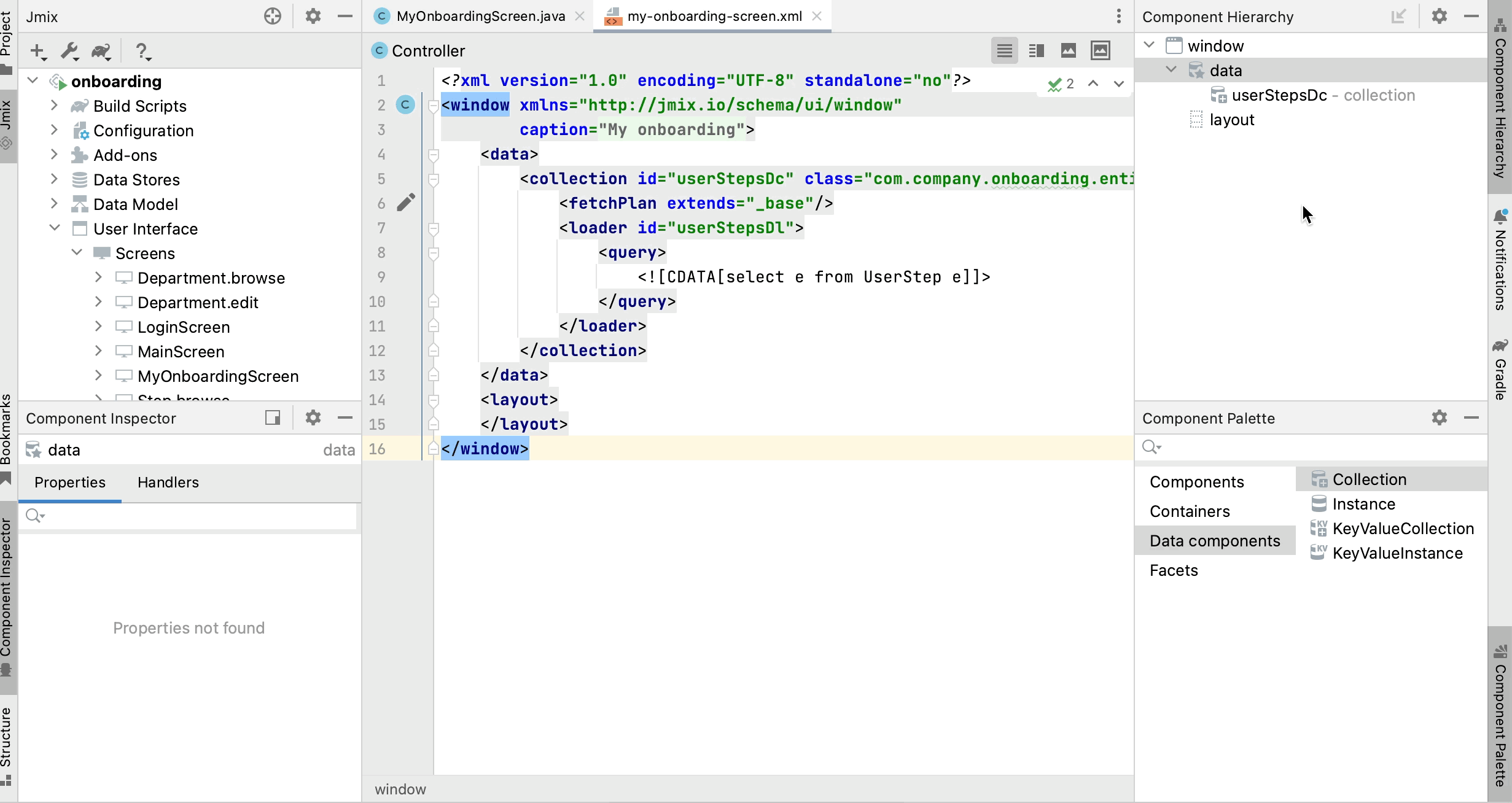
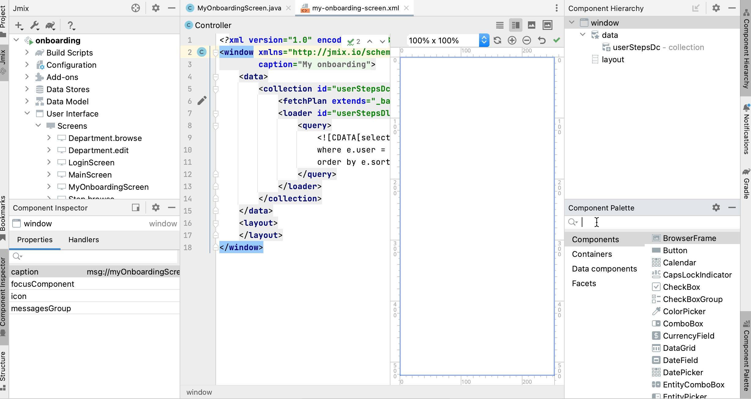
First, add a data container which will provide a collection of UserStep entities for the UI table. Drag Data components → Collection item from Component Palette onto the window element of Component Hierarchy, select UserStep in the dialog and click OK:
Studio will create the collection container:
<data>
    <collection id="userStepsDc"
                class="com.company.onboarding.entity.UserStep">
        <fetchPlan extends="_base"/>
        <loader id="userStepsDl">
            <query>
                <![CDATA[select e from UserStep e]]>
            </query>
        </loader>
    </collection>
</data>
Loading Data
The default query will load all UserStep instances, but you need to select only steps of the current user and in a particular order. Let’s modify the query using the JPQL designer. Select userStepsDc container in Component Hierarchy and click the value of the query attribute. Then add a where clause with the :user parameter and an order by clause:
The resulting query should be as below:
<query>
    <![CDATA[select e from UserStep e
    where e.user = :user
    order by e.sortValue asc]]>
</query>
The next task is to provide a value for the :user parameter. You can do it in the BeforeShowEvent handler. Switch to the MyOnboardingScreen controller class, click Generate Handler button in the top actions panel and select Controller handlers → BeforeShowEvent:
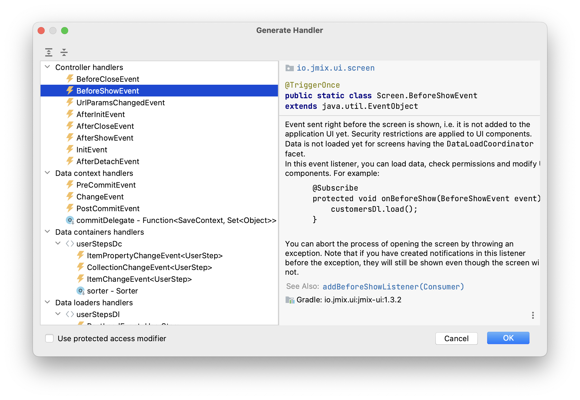
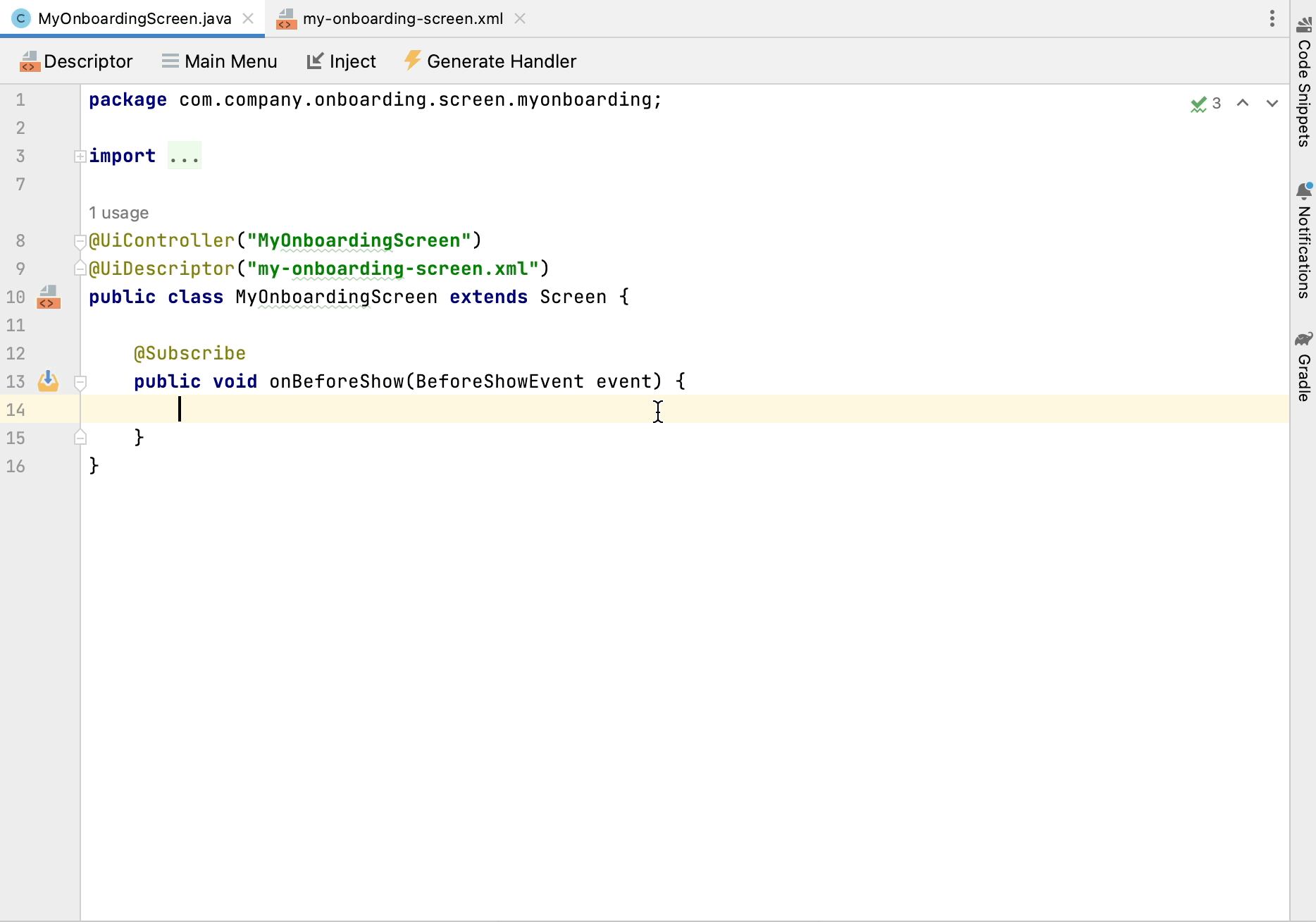
Click OK. Studio will generate a handler method stub:
@UiController("MyOnboardingScreen")
@UiDescriptor("my-onboarding-screen.xml")
public class MyOnboardingScreen extends Screen {

    @Subscribe
    public void onBeforeShow(BeforeShowEvent event) {

    }
}
Now you need to get the currently logged-in user and set it to the loader’s query parameter.
Use Code Snippets tool window to generate code for obtaining the current user:
Then inject the loader, set the :user parameter to the current user and invoke its load() method to execute the query and load data into the collection container:
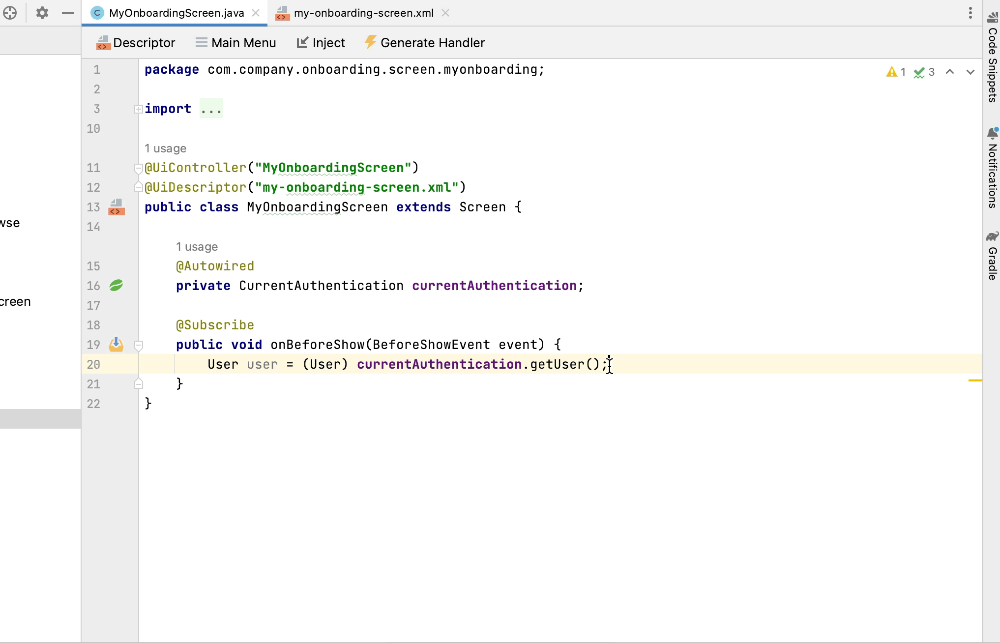
The resulting code for loading data into the collection container:
@Autowired
private CurrentAuthentication currentAuthentication;

@Autowired
private CollectionLoader<UserStep> userStepsDl;

@Subscribe
public void onBeforeShow(BeforeShowEvent event) {
    User user = (User) currentAuthentication.getUser();
    userStepsDl.setParameter("user", user);
    userStepsDl.load();
}|
In an entity browser or editor screen generated by Studio, data loading is by default triggered by the That’s why you didn’t invoke |
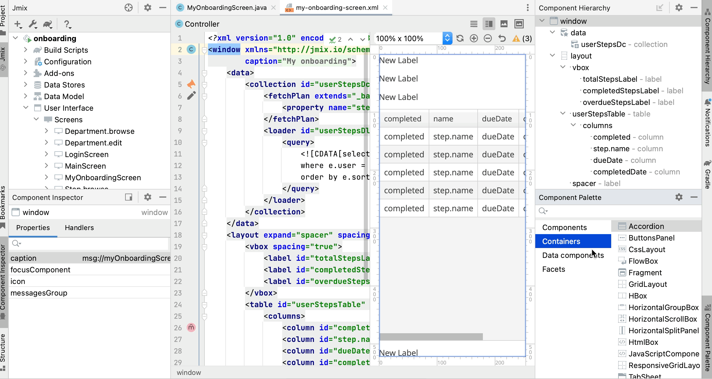
Setting up Table
Drag and drop Table from Component Palette onto the layout element of Component Hierarchy. Select userStepsDc data container in the Table Properties Editor dialog, then set width of the table to 100% and height to 400px in Component Inspector:
As you can see, the table doesn’t have a column for displaying the Step name:
<table id="userStepsTable" height="400px" width="100%"
       dataContainer="userStepsDc">
    <columns>
        <column id="dueDate"/>
        <column id="completedDate"/>
        <column id="sortValue"/>
    </columns>
</table>
Step is a reference attribute and is not included in fetch plan and table by default. You already saw this situation in the previous chapter when displayed a table of UserSteps in the User edit screen.
Add the step attribute to fetch plan, then add a column for it to the table and remove the unneeded sortValue column:
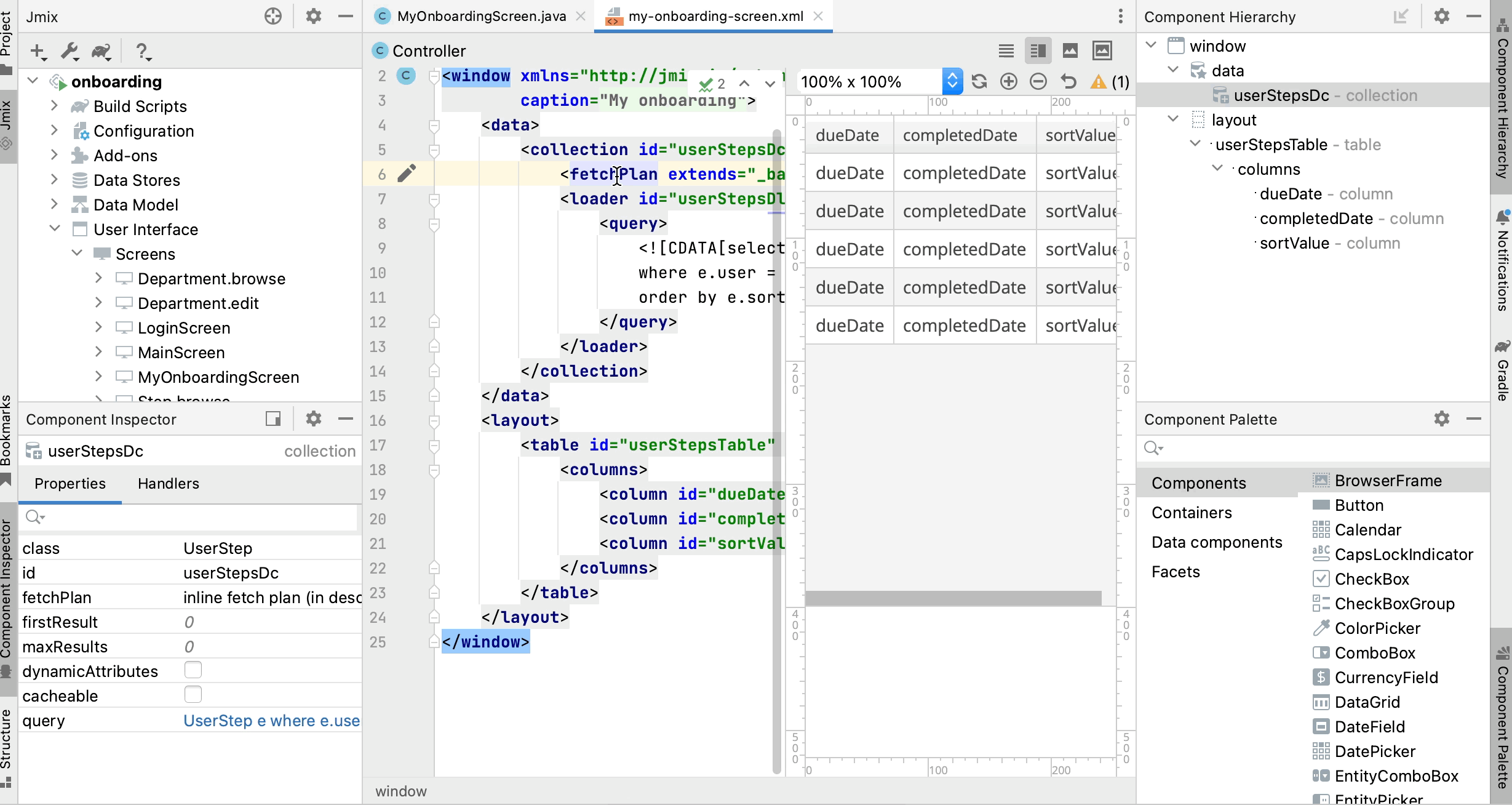
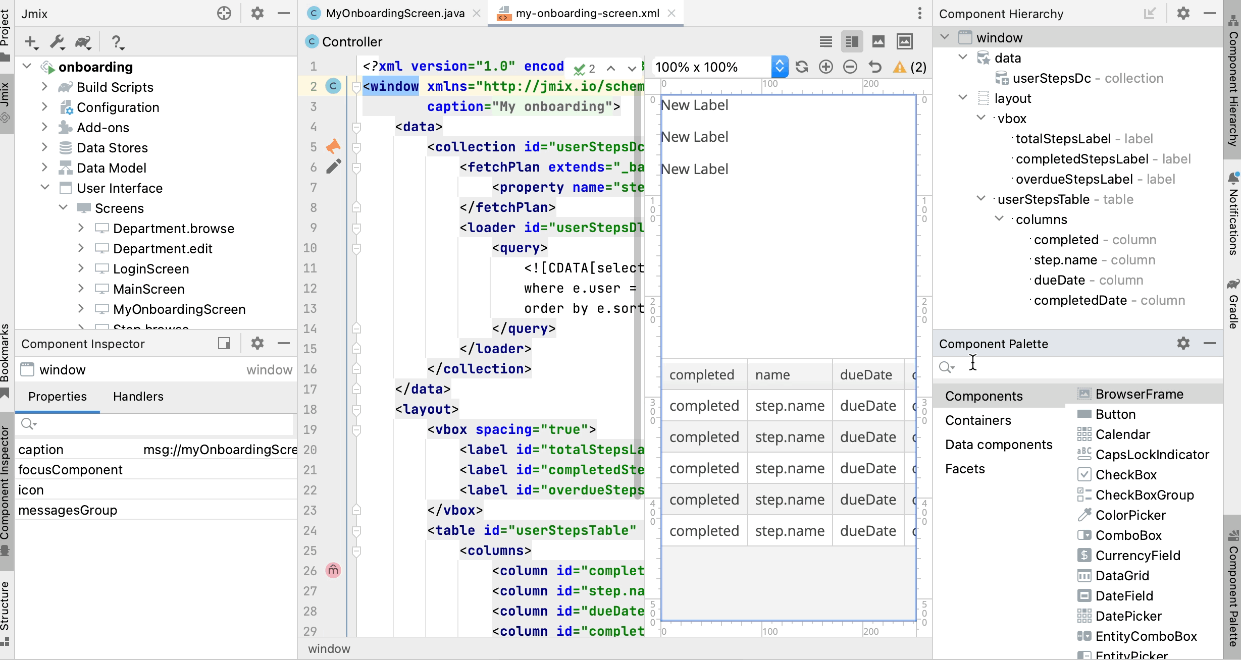
At this stage, the screen XML should be as below:
<?xml version="1.0" encoding="UTF-8" standalone="no"?>
<window xmlns="http://jmix.io/schema/ui/window"
        caption="msg://myOnboardingScreen.caption">
    <data>
        <collection id="userStepsDc" class="com.company.onboarding.entity.UserStep">
            <fetchPlan extends="_base">
                <property name="step" fetchPlan="_base"/>
            </fetchPlan>
            <loader id="userStepsDl">
                <query>
                    <![CDATA[select e from UserStep e
                    where e.user = :user
                    order by e.sortValue asc]]>
                </query>
            </loader>
        </collection>
    </data>
    <layout>
        <table id="userStepsTable" height="400px" width="100%"
               dataContainer="userStepsDc">
            <columns>
                <column id="step.name"/>
                <column id="dueDate"/>
                <column id="completedDate"/>
            </columns>
        </table>
    </layout>
</window>
Press Ctrl/Cmd+S and switch to the running application. Make sure your current user (perhaps it’s admin) has a few UserSteps generated in the User edit screen. Reopen My onboarding screen and see your onboarding steps:
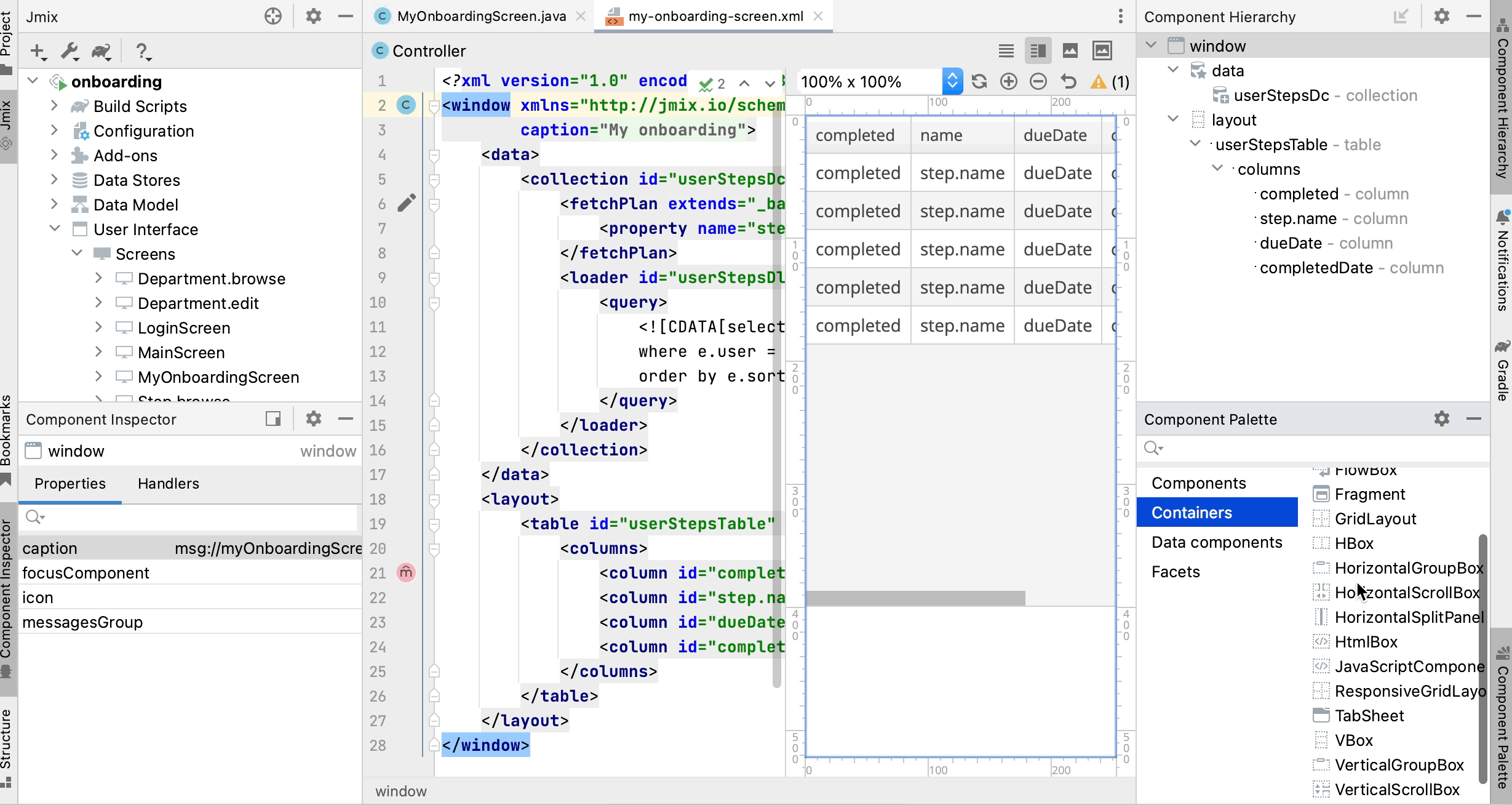
Adding Generated Column
In this section, you will add a generated column with checkboxes to mark onboarding steps done. You already did this before for the UserSteps table in the User edit screen.
In the XML descriptor, add the completed column declaration:
<table id="userStepsTable" height="400px" width="100%"
       dataContainer="userStepsDc">
    <columns>
        <column id="completed" caption="" width="50px"/>
        <column id="step.name"/>
        <column id="dueDate"/>
        <column id="completedDate"/>
    </columns>
</table>
In the controller, inject the UiComponents factory and implement the columnGenerator handler:
@Autowired
private UiComponents uiComponents;

@Install(to = "userStepsTable.completed", subject = "columnGenerator")
private Component userStepsTableCompletedColumnGenerator(UserStep userStep) {
    CheckBox checkBox = uiComponents.create(CheckBox.class);
    checkBox.setValue(userStep.getCompletedDate() != null);
    checkBox.addValueChangeListener(e -> {
        if (userStep.getCompletedDate() == null) {
            userStep.setCompletedDate(LocalDate.now());
        } else {
            userStep.setCompletedDate(null);
        }
    });
    return checkBox;
}
Press Ctrl/Cmd+S and switch to the running application. Reopen My onboarding screen and test your latest changes:
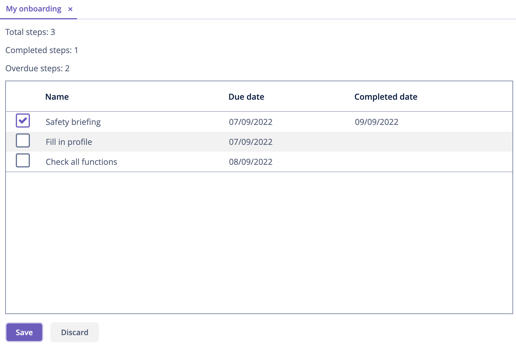
Adding Labels
The table is almost ready, now let’s add the labels displaying counters of total, completed and overdue steps.
Drag and drop Containers → VBox (vertical box) from Component Palette to the layout element of Component Hierarchy before userStepsTable. Then add three Label components into vbox:
Set the label identifiers as below:
<layout>
    <vbox spacing="true">
        <label id="totalStepsLabel"/>
        <label id="completedStepsLabel"/>
        <label id="overdueStepsLabel"/>
    </vbox>
Now you need to calculate and set their values programmatically in the controller. Switch to the MyOnboardingScreen controller, inject the labels and userStepsDc collection container:
@Autowired
private Label totalStepsLabel;

@Autowired
private Label completedStepsLabel;

@Autowired
private Label overdueStepsLabel;

@Autowired
private CollectionContainer<UserStep> userStepsDc;
Then add a couple of methods for calculating and assigning counters:
private void updateLabels() {
    totalStepsLabel.setValue("Total steps: " + userStepsDc.getItems().size());

    long completedCount = userStepsDc.getItems().stream()
            .filter(us -> us.getCompletedDate() != null)
            .count();
    completedStepsLabel.setValue("Completed steps: " + completedCount);

    long overdueCount = userStepsDc.getItems().stream()
            .filter(us -> isOverdue(us))
            .count();
    overdueStepsLabel.setValue("Overdue steps: " + overdueCount);
}

private boolean isOverdue(UserStep us) {
    return us.getCompletedDate() == null
            && us.getDueDate() != null
            && us.getDueDate().isBefore(LocalDate.now());
}
Finally, invoke the updateLabels() method from two event handlers:
-
Existing
BeforeShowEventhandler:@Subscribe public void onBeforeShow(BeforeShowEvent event) { // ... updateLabels(); }So the labels will be updated on screen opening.
-
Click Generate Handler and select
Data container handlers→userStepsDc→ItemPropertyChangeEvent: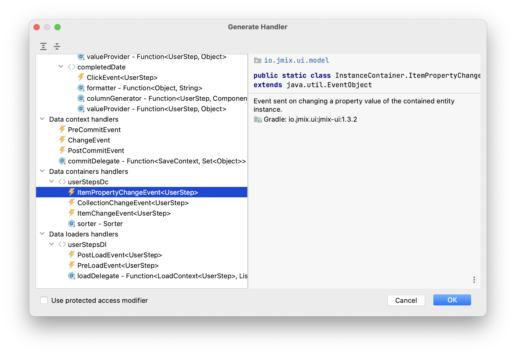
@Subscribe(id = "userStepsDc", target = Target.DATA_CONTAINER)
public void onUserStepsDcItemPropertyChange(InstanceContainer.ItemPropertyChangeEvent<UserStep> event) {
    updateLabels();
}
With the help of the
ItemPropertyChangeEventhandler, the labels will be updated when you change theircompletedDateattribute using the checkboxes in the table.
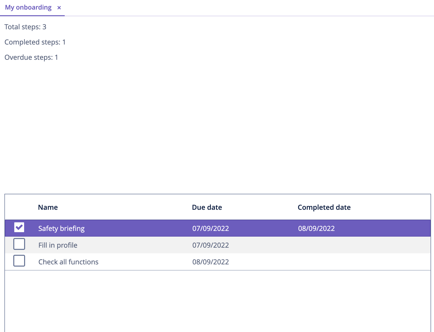
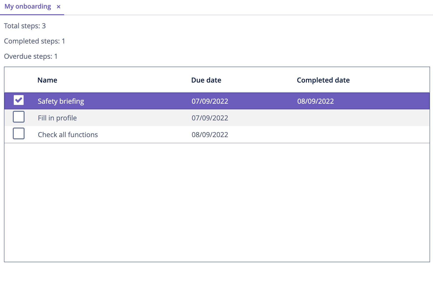
Press Ctrl/Cmd+S and switch to the running application. Reopen My onboarding screen and test the label values:
Expanding Items in Containers
As you can see in the screenshot above, the screen layout needs to be improved to eliminate the empty space between the labels and the table.
Currently, the vertical space available to the root layout element is split into two equal parts between its nested components: vbox and table. So table starts from the middle of the screen.
In general, to fill in the empty space, some component inside a container (layout in this case) should be expanded. You can expand the table itself, or add a third invisible component and expand it to keep the table size fixed.
Let’s take the second option: add a label without a value and expand it.
Drag and drop Label onto layout element, set the label id and use it in the expand attribute of the layout element:
The resulting XML should be as follows:
    <layout expand="spacer" spacing="true">
        <vbox spacing="true">
            ...
        </vbox>
        <table id="userStepsTable" ...>
            ...
        </table>
        <label id="spacer"/>
    </layout>
Now layout will expand the spacer label instead of distribute the space evenly between all nested components.
The spacing="true" attribute tells the container to add a small offset between the components.
Press Ctrl/Cmd+S and switch to the running application. Reopen My onboarding screen and see the fixed layout:
Saving Changes and Closing Screen
Now you can change the state of the onboarding steps but the changes are lost if you reopen the screen. Let’s add the Save button to save and close the screen and the Discard button to close without saving.
First, drag Containers → HBox (horizontal box) from Component Palette and drop it between userStepstable and spacer. Then add two buttons into it:
Set the button names and captions. For the Save button, add primary="true" attribute:
<hbox spacing="true">
    <button id="saveButton" caption="Save" primary="true"/>
    <button id="discardButton" caption="Discard"/>
</hbox>
Generate button click handlers using the Component Inspector → Handlers tab:
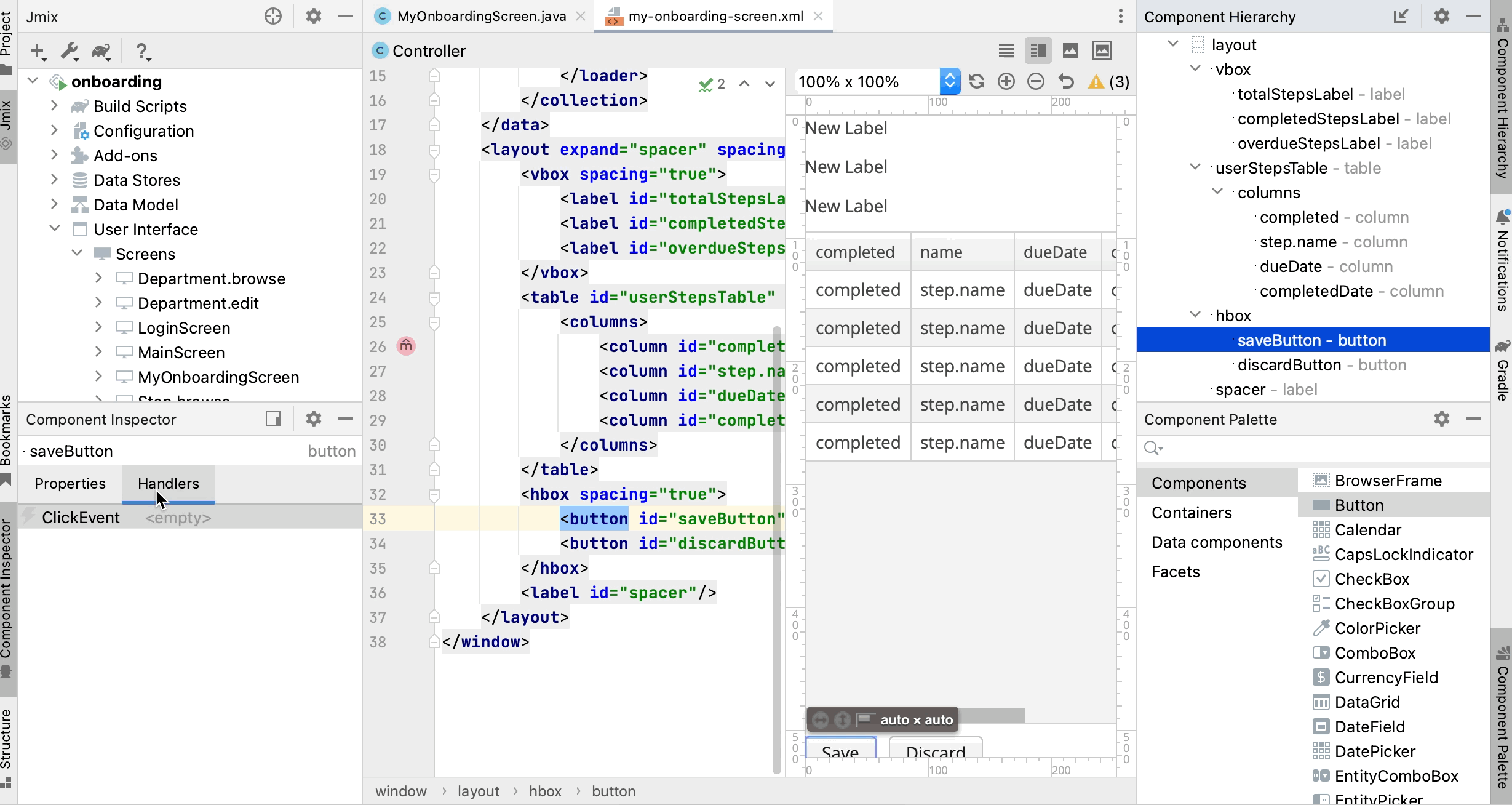
Inject DataContext into controller class and implement click handlers:
@Autowired
private DataContext dataContext;

@Subscribe("saveButton")
public void onSaveButtonClick(Button.ClickEvent event) {
    dataContext.commit(); (1)
    close(StandardOutcome.COMMIT); (2)
}

@Subscribe("discardButton")
public void onDiscardButtonClick(Button.ClickEvent event) {
    close(StandardOutcome.DISCARD); (2)
}| 1 | DataContext tracks changes in entities loaded into data containers. When you invoke its commit() method, all changed instances are saved to the database. |
| 2 | The close() method closes the screen. It accepts an "outcome" object that can be analysed by the calling code. |
Press Ctrl/Cmd+S and switch to the running application. Reopen My onboarding screen and see the buttons in action:
Working with Styles
The last requirement for My onboarding screen is to highlight overdue steps by changing font color of the Due date cells. You will do it by creating a CSS class and using it in the table.
Extending Default Theme
By default, your application uses the Helium theme which defines styles of all UI components. To add your own styles, you need to create a custom theme based on the default one.
If your application is running, stop it using the Stop button () in the main toolbar.
In the Jmix tool window, click New () → Advanced → Custom Theme:
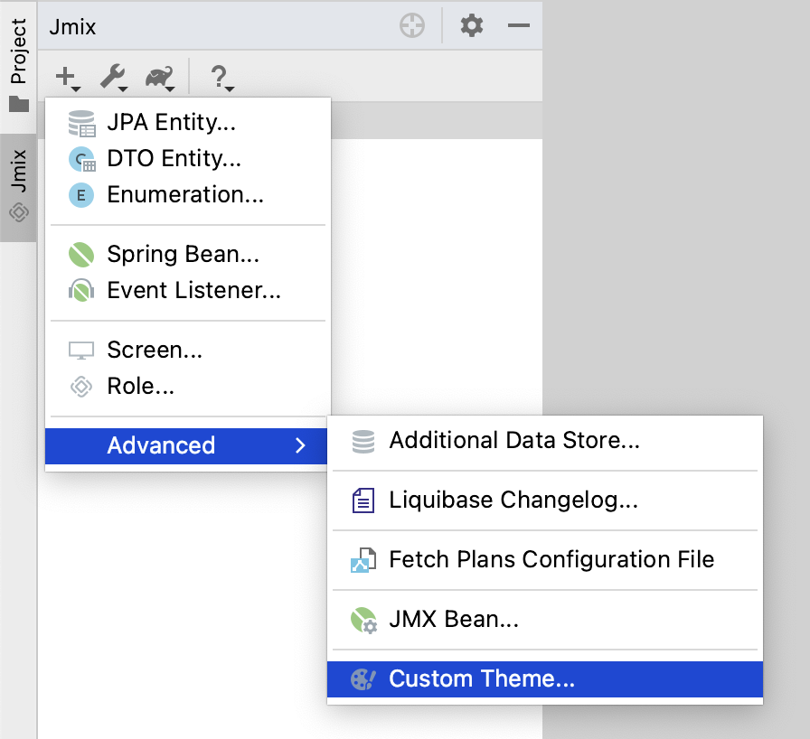
In the Create Custom Theme dialog, enter helium-ext to the Theme name field and select helium in the Base theme dropdown:
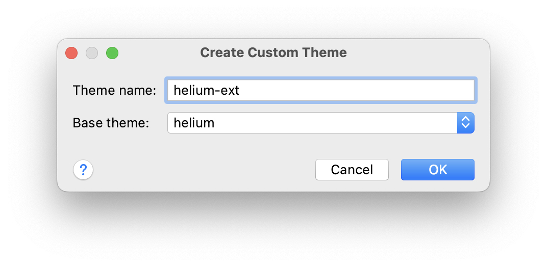
Click OK.
Studio will create a file structure for the new theme:
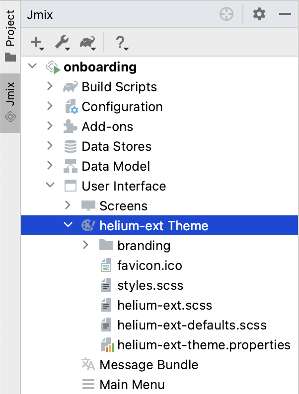
It will also reconfigure dependencies in build.gradle and add a couple of properties to the application.properties file:
jmix.ui.theme.name=helium-ext
jmix.ui.theme-config=com/company/onboarding/theme/helium-ext-theme.properties
Open styles.css file and add the overdue-step class as shown below:
@import "helium-ext-defaults";
@import "addons";
@import "helium-ext";

.helium-ext {
    @include addons;
    @include helium-ext;

    .overdue-step {
      color: red;
    }
}
Now you can use overdue-step in the stylename attributes of UI components.
Adding Table Style Provider
To apply a custom style to the table cells, you need to define a Style Provider for the table component.
Open MyOnboardingScreen controller class and click the Generate Handler button of the top actions panel. Select Component handlers → userStepsTable → styleProvider element:
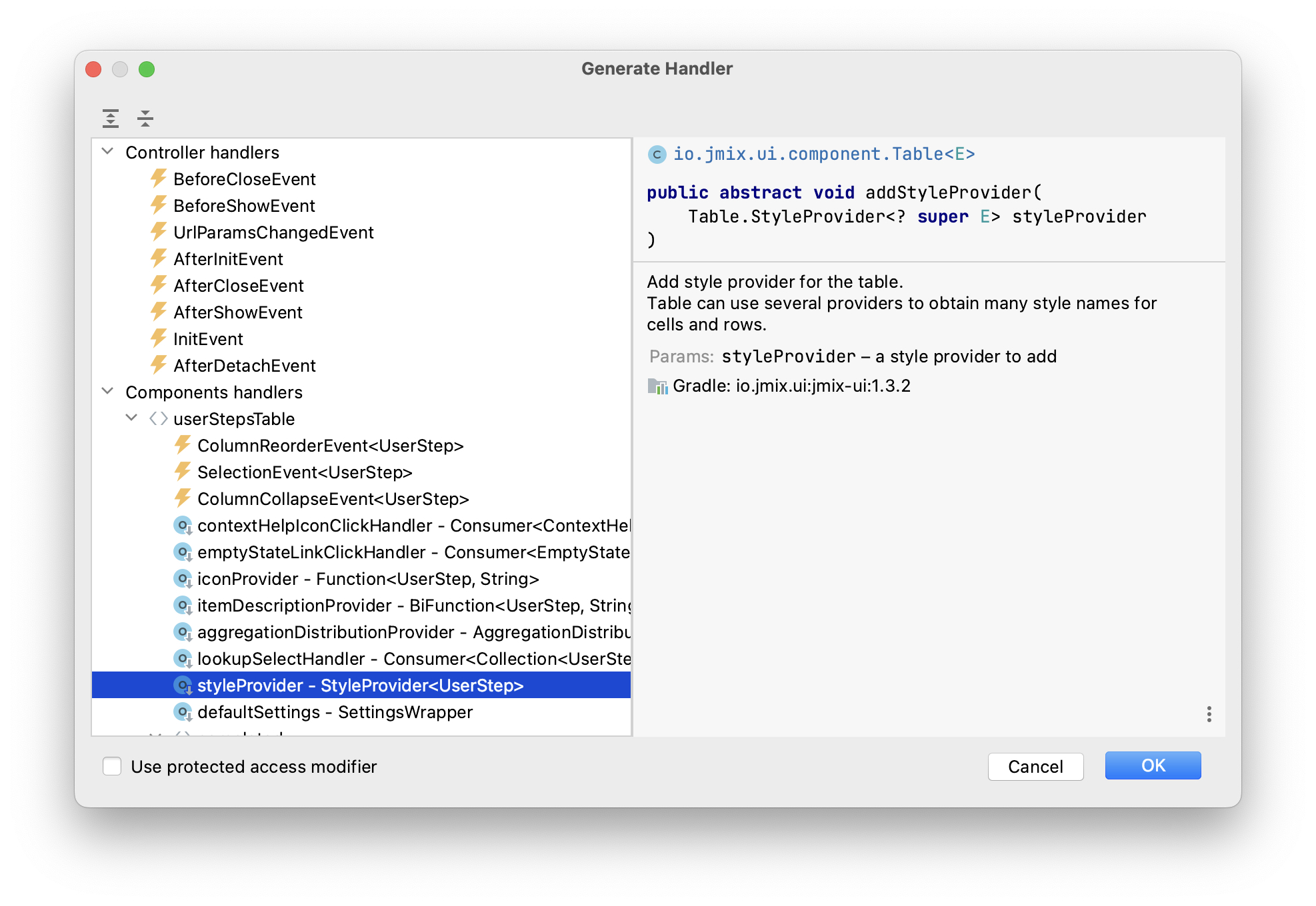
Click OK.
| You can also generate a handler through the Handlers tab of the Component Inspector tool window. |
Implement the styleProvider handler as below:
@Install(to = "userStepsTable", subject = "styleProvider") (1)
private String userStepsTableStyleProvider(
        UserStep entity, String property) { (2)
    if ("dueDate".equals(property) && isOverdue(entity)) {
        return "overdue-step"; (3)
    }
    return null; (4)
}| 1 | The @Install annotation indicates that the method is a delegate: a UI component (table in this case) invokes it on some stage of its lifecycle. |
| 2 | This specific delegate (style provider) receives an entity instance and the name of a property which is shown in the table cell as arguments. |
| 3 | If the handler is called for the dueDate property and this step is overdue, the handler returns the custom style name. |
| 4 | Otherwise, the cell will be rendered with a default style. |
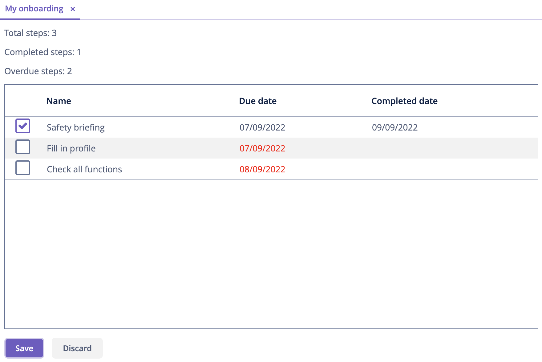
Press Ctrl/Cmd+S and switch to the running application. Reopen My onboarding screen and test the style for overdue steps:
|
When you work on CSS for a custom theme, you can quickly test changes in the running application. Open terminal and execute: Then switch to the application and force-reload the page (in Google Chrome you can do it by pressing |
Summary
In this section, you have developed from scratch an entire screen working with data.
You have learned that:
-
Query of a data loader can contain parameters. Parameter values can be set in a BeforeShowEvent handler or any other screen or UI component event handler.
-
To trigger data loading, you should either invoke the
load()method of the data loader in an event handler, or add the DataLoadCoordinator facet to the screen. -
VBox and HBox containers are used to place UI components vertically or horizontally. The root
layoutcontainer is itself a vertical box. -
The expand attribute of UI containers specifies a nested component that should take all available space inside the container. If it is not used, containers split the space equally between nested components.
-
The
commit()method of DataContext saves all changed entities to the database. -
A screen can be closed programmatically by the
close()method provided by the base Screen class. -
A custom theme can define additional styles to be used by UI components.
-
A style provider handler should be used to change the style of a table cell.
-
The Code Snippets tool window can be used to quickly find and generate code working with the framework API.
| See detailed information about positioning of UI components and containers in the Screen Layout Rules section. |
