tabSheet
A layout that creates several tabs with content. Only the content of the selected tab is visible at a time.
XML Element |
|
|---|---|
Java Class |
|
Attributes |
id - alignSelf - classNames - colspan - css - height - maxHeight - maxWidth - minHeight - minWidth - themeNames - visible - width |
Handlers |
|
Elements |
Basics
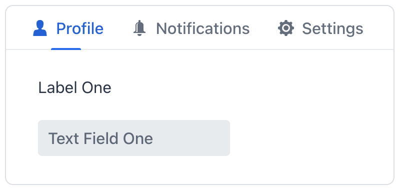
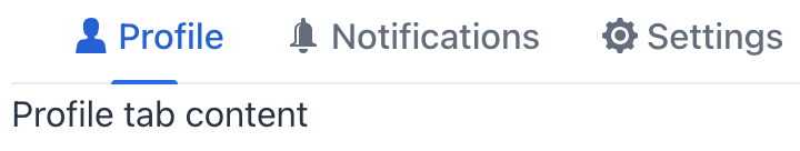
To create the component, use tabSheet XML element and add several tab elements. Each tab can only have one child component. If you need to include multiple components within a tab, you must wrap them with a layout component, such as vbox.
The following example demonstrates how a basic tabSheet is created:
<tabSheet>
    <tab id="tab1" label="Tab One">
        <vbox>
            <label text="Label One"/>
            <textField placeholder="Text Field One"/>
        </vbox>
    </tab>
    <tab id="tab2" label="Tab Two">
        <label text="Label Two"/>
    </tab>
    <tab id="tab3" label="Tab Three">
        <label text="Label Three"/>
    </tab>
</tabSheet>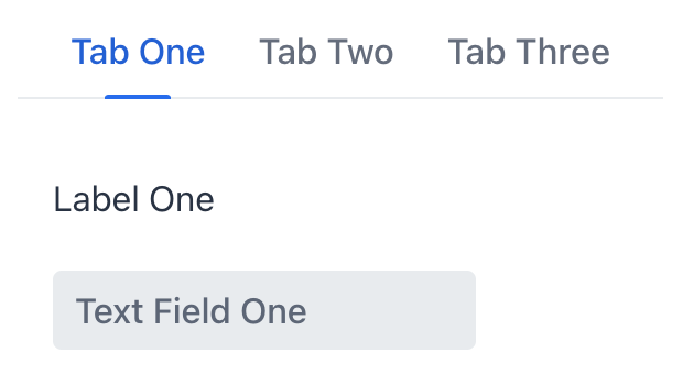
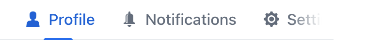
Tab Element
The contents of an individual tab is described by the tab element.
To add tab in Jmix Studio, select the component in the view descriptor XML or in the Jmix UI structure panel and click on the Add→Tab button in the Component Inspector panel.
|
XML Element |
|
|---|---|
Java Class |
|
Attributes |
id - ariaLabel - ariaLabelledBy - classNames - colspan - css - enabled - flexGrow - label - lazy - themeNames - visible |
Handlers |
|
Elements |
Number of Tabs
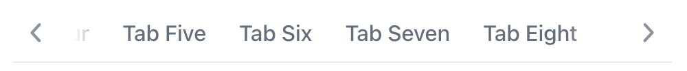
The tabSheet component can have any practical number of tabs. To adapt to the available space the component will add scroll buttons, ensuring that all tabs remain accessible to users.
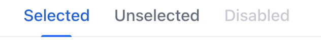
States
Tab state allows users to easily determine which tab is currently active and which tabs may be temporarily unavailable or disabled. A tab can be selected, unselected, or disabled.
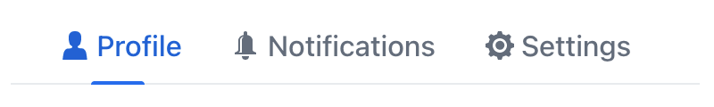
Custom Labels
Tab labels are not limited to just text. You can include almost any components through programmatic definition.
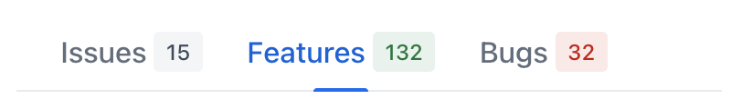
Badges
One particularly useful case is adding dynamic badges to tab labels. Such badges can provide an indication of the quantity of items, notifications, or other information related to the tab’s contents.
Detect Tab Switch
Whenever the user switches between tabs, the io.jmix.flowui.component.tabsheet.JmixTabSheet.SelectedChangeEvent is fired. Create an event handler to execute custom code in response to the tab switch.
The following code will send a notification on every tab switch:
@Subscribe("tabSheet")
public void onTabSheetSelectedChange(final JmixTabSheet.SelectedChangeEvent event) {
    notifications.create(event.getSelectedTab() + " is now selected").show();
}
Lazy Tabs
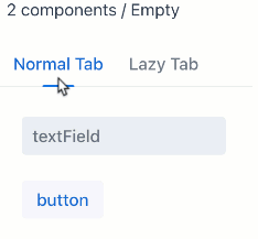
A tab can be configured to load its content lazily, meaning the content is only loaded when a user selects that specific tab. This reduces the number of components in memory.
To enable lazy loading, set the lazy attribute of the tab element to true:
<tabSheet id="tabSheet">
    <tab id="normalTab" label="Normal Tab">
        <vbox>
            <textField placeholder="textField"/>
            <button text="button"/>
        </vbox>
    </tab>
    <tab id="lazyTab" label="Lazy Tab" lazy="true">
        <vbox>
            <button text="button"/>
            <textField placeholder="textField"/>
        </vbox>
    </tab>
</tabSheet>
Components inside a lazy tab do not exist when the view is opened, so they cannot be injected into a controller or obtained in the view lifecycle event handlers. You can access these components only after the user opens the tab. The SelectedChangeEvent handler allows you to detect which tab has been selected and access the components using the UiComponentUtils.getComponent() method.
In the following example the second tab is set to lazy loading, and its content is loaded only when the user selects it. The current number of components in each tab is displayed using a supplementary span element.
@ViewComponent
private Span contentInfo;
@ViewComponent
private JmixTabSheet tabSheet;
@Autowired
private Notifications notifications;

@Subscribe
public void onInit(final InitEvent event) {
    checkTabsContent();
}
@Subscribe("tabSheet")
public void onTabSheetSelectedChange(final JmixTabSheet.SelectedChangeEvent event) {
    checkTabsContent();
}

protected void checkTabsContent () {
    StringBuilder sb = new StringBuilder();
    List<Component> tab1Content = tabSheet.getContentByTab(tabSheet.getTabAt(0)).getChildren().toList();
    sb.append(tab1Content.isEmpty() ? "Empty" :  tab1Content.size() + " components");

    sb.append(" / ");
    List<Component> tab2Content = tabSheet.getContentByTab(tabSheet.getTabAt(1)).getChildren().toList();
    sb.append(tab2Content.isEmpty() ? "Empty" : tab2Content.size() + " components");

    contentInfo.setText(sb.toString());
}
Theme Variants
The component’s appearance is customizable with the themeNames attribute, which allows you to select among seven different options:
centered
Positions the tabs at the center of the container or view, instead of their default left-aligned position:

small
Makes the tabs smaller:

minimal
Reduces visual style to only show tab labels without any additional visual elements:

hide-scroll-buttons
Hides the scroll buttons that assist in navigating overflown tabs:
equal-width-tabs
Allocates an equal amount of space to each tab and disables the ability to scroll:

bordered
Adds a border around the tabs themselves, as well as the content area.
no-padding
Removes the default padding from the content area.
See Also
See Vaadin Docs for more information.
