formLayout
A responsive layout that arranges components into columns. The number of columns changes depending on the layout width.
-
XML element:
formLayout -
Java class:
FormLayout
Basics
By default, components are arranged into two columns.
<formLayout>
    <textField placeholder="City" label="Where from?"/>
    <textField placeholder="City" label="Where to?"/>
    <datePicker label="Depart"/>
    <datePicker label="Return"/>
    <button text="Search tickets"/>
</formLayout>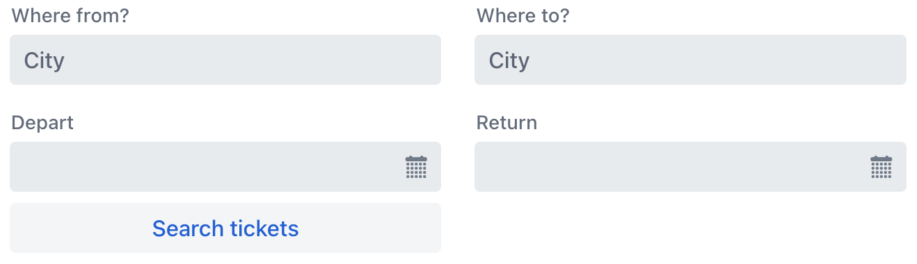
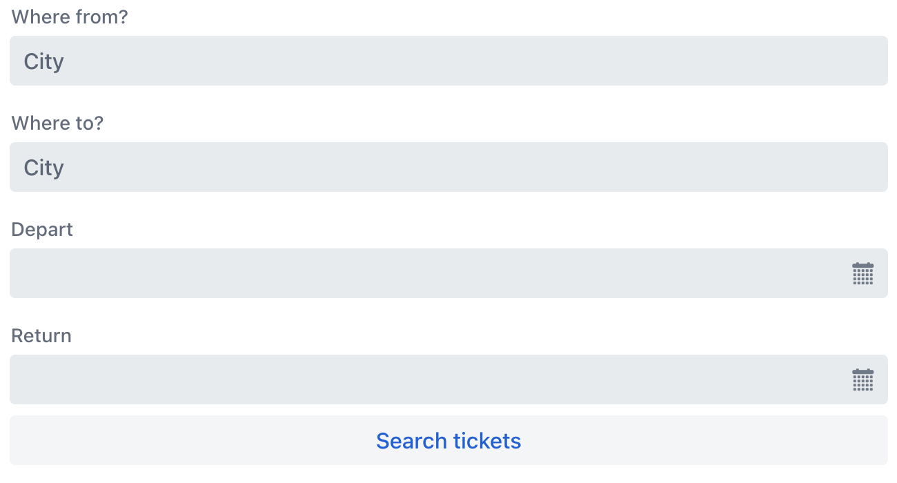
When the layout width is smaller, it automatically adjusts to a single column.
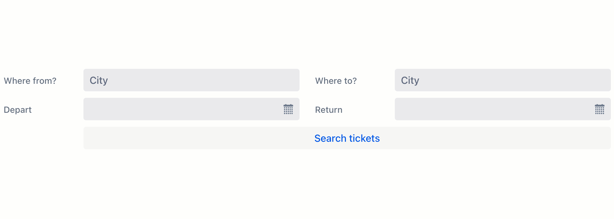
Responsive Steps
The responsiveSteps element provides a way to determine a number of columns based on the available space.
<formLayout>
    <responsiveSteps>
        <responsiveStep minWidth="0" columns="1"/>
        <responsiveStep minWidth="30em" columns="2"/>
        <responsiveStep minWidth="40em" columns="3"/>
        <responsiveStep minWidth="50em" columns="4"/>
        <responsiveStep minWidth="60em" columns="5"/>
    </responsiveSteps>
    <textField placeholder="City" label="Where from?"/>
    <textField placeholder="City" label="Where to?"/>
    <datePicker label="Depart"/>
    <datePicker label="Return"/>
    <button text="Search tickets"/>
</formLayout>
When the width is large enough, the layout above will automatically adjust to use all five columns:

Label Position
The layout enables side-positioned labels for nested components. Wrap a component with a formItem element, specifying its label, and set the desired position with labelsPosition attribute:
formItem can only wrap a single component.
|
<formLayout labelsPosition="ASIDE">
    <formItem label="Where from?">
        <textField placeholder="City"/>
    </formItem>
    <formItem label="Where to?">
        <textField placeholder="City"/>
    </formItem>
    <formItem label="Depart">
        <datePicker/>
    </formItem>
    <formItem label="Return">
        <datePicker/>
    </formItem>
    <formItem>
        <button text="Search tickets"/>
    </formItem>
</formLayout>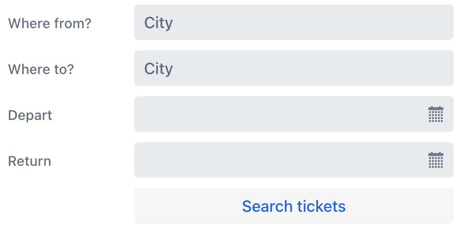
Responsive Label Position
Layouts that display labels on the side require more space than those with the default label position on top of the components. Similar to columns, the label position can be adjusted to fit the available space. Instead of adding the labelsPosition attribute to the layout, add it to its individual responsiveSteps elements:
<formLayout>
    <responsiveSteps>
        <responsiveStep minWidth="0" columns="1" labelsPosition="TOP"/>
        <responsiveStep minWidth="30em" columns="1" labelsPosition="ASIDE"/>
        <responsiveStep minWidth="40em" columns="2" labelsPosition="TOP"/>
        <responsiveStep minWidth="50em" columns="2" labelsPosition="ASIDE"/>
    </responsiveSteps>
    <formItem label="Where from?">
        <textField placeholder="City"/>
    </formItem>
    <formItem label="Where to?">
        <textField placeholder="City"/>
    </formItem>
    <formItem label="Depart">
        <datePicker/>
    </formItem>
    <formItem label="Return">
        <datePicker/>
    </formItem>
    <formItem colspan="2">
        <button text="Search tickets"/>
    </formItem>
</formLayout>
Changing the layout width will affect both the number of columns and the positioning of labels:
Column Span
Use the colspan attribute to control the number of columns a nested component should span.
For example, you can make a button to always span across two columns even when other components do not:
<formLayout id="abc">
    <textField placeholder="City" label="Where from?"/>
    <textField placeholder="City" label="Where to?"/>
    <datePicker label="Depart"/>
    <datePicker label="Return"/>
    <button text="Search tickets" colspan="2"/>
</formLayout>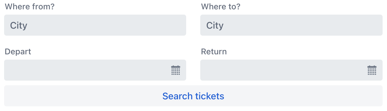
Attributes
id - alignSelf - classNames - colspan - css - dataContainer - enabled - height - labelsPosition - maxHeight - maxWidth - minHeight - minWidth - visible - width
labelsPosition
Sets the label position for components within the layout.
-
ASIDE— labels are positioned to the side of the components. -
TOP— labels are positioned above the components.
Handlers
|
To generate a handler stub in Jmix Studio, use the Handlers tab of the Jmix UI inspector panel or the Generate Handler action available in the top panel of the view class and through the Code → Generate menu (Alt+Insert / Cmd+N). |
ClickEvent
The com.vaadin.flow.component.ClickEvent is fired when the component is clicked. This handler must specify one of the following three subjects to detect the number of clicks related to the event.
-
click – fires the event whenever the component is clicked.
-
singleClick – fires the event after a timeout to ensure it is not a double click.
-
doubleClick – fires the event when the component is double-clicked.
See Also
See Vaadin Docs for more information.
