View Designer
View Designer represents a number of panels and tool windows that allow you to develop the view layout and set UI components properties in WYSIWYG style. The view XML editor is integrated with the View Designer, so you can edit the XML file directly or use the designer’s panels to generate code.
|
This feature requires a RAD or Enterprise subscription. If you don’t have the subscription, see how to get the trial version. |
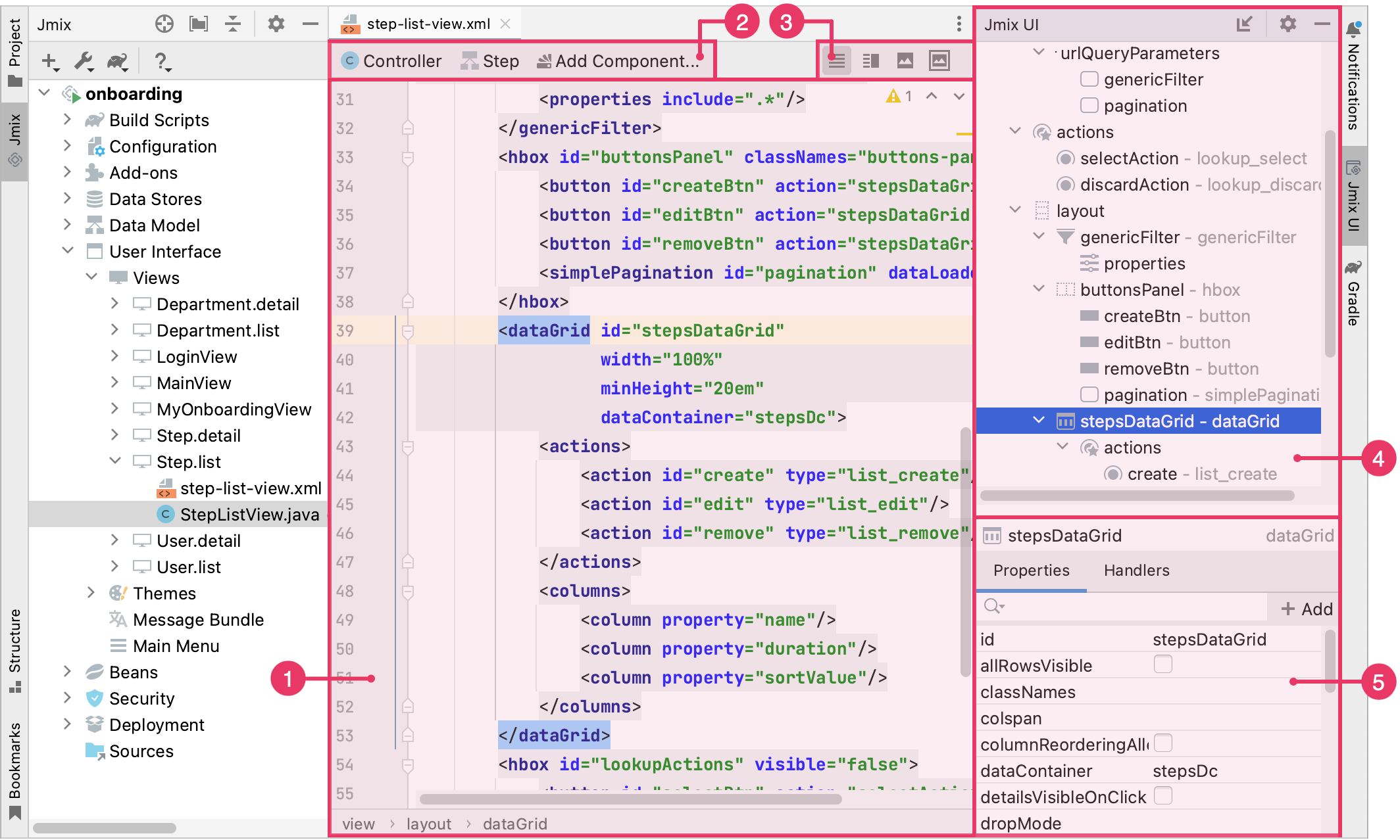
The Jmix UI panel is implemented as independent IDE tool windows and appears automatically when you open a view descriptor.
The Jmix UI panel consists of the hierarchy and inspector panels.
-
Source Code Editor
-
Top Actions Panel
-
Layout Preview Panel
-
Jmix UI Hierarchy Panel
-
Jmix UI Inspector Panel
Layout Preview Panel
The Layout Preview panel is used to display an interactive schematic presentation of the view layout. It shares editor space with the source code of the view descriptor.
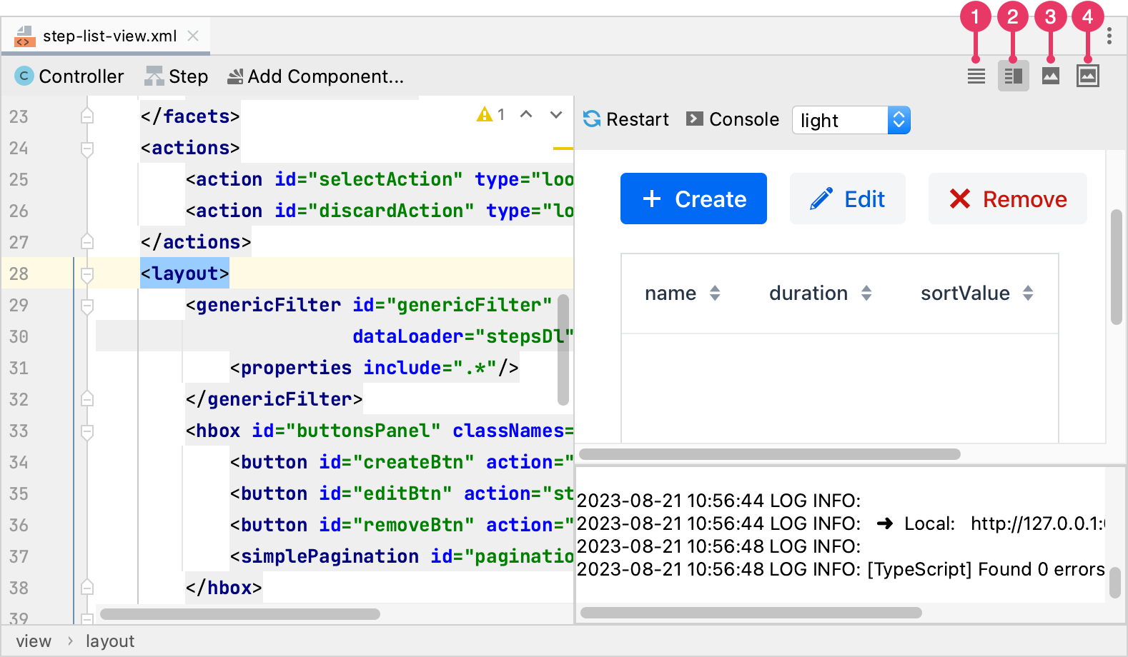
Use the buttons in the top right corner of the view layout editor.
-
Editor only - only source code is displayed in the editor.
-
Editor and Preview - editor space is split to contain both source code and preview.
-
Preview only - only preview is displayed in the editor.
-
Preview in Window - source code is displayed in the editor while preview is displayed in the separate window.
The panel has several controls located in the top right corner:
-
The Restart → Just Restart button reloads the content of the preview page.
-
The Restart → Clean and Restart button cleans all the frontend files and starts the frontend development build.
-
The Console button opens or closes the console showing the frontend build output, which can be helpful in diagnosing problems.
-
The Theme dropdown allows you to select one of the predefined themes: light or dark.
Component Palette
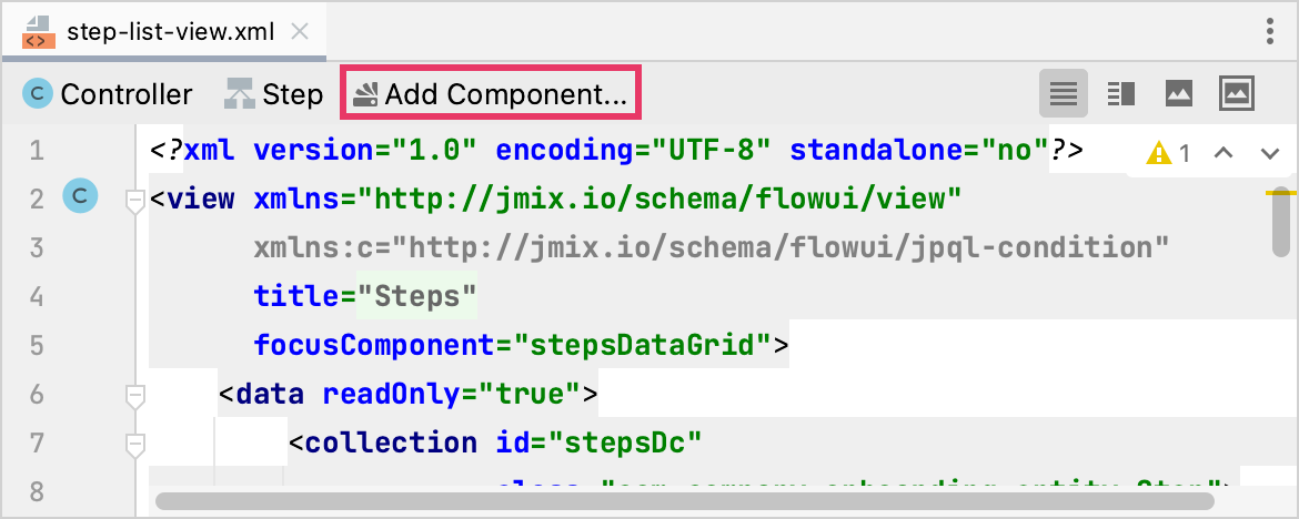
You can open the component palette using the following methods:
-
Click Add Component in the top actions panel:
-
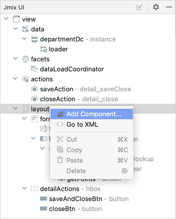
Right-click Add Component in the Jmix UI hierarchy context menu:
-
Using
⌘Non MacOS orAlt+Inserton Windows and Linux, open the Generate menu: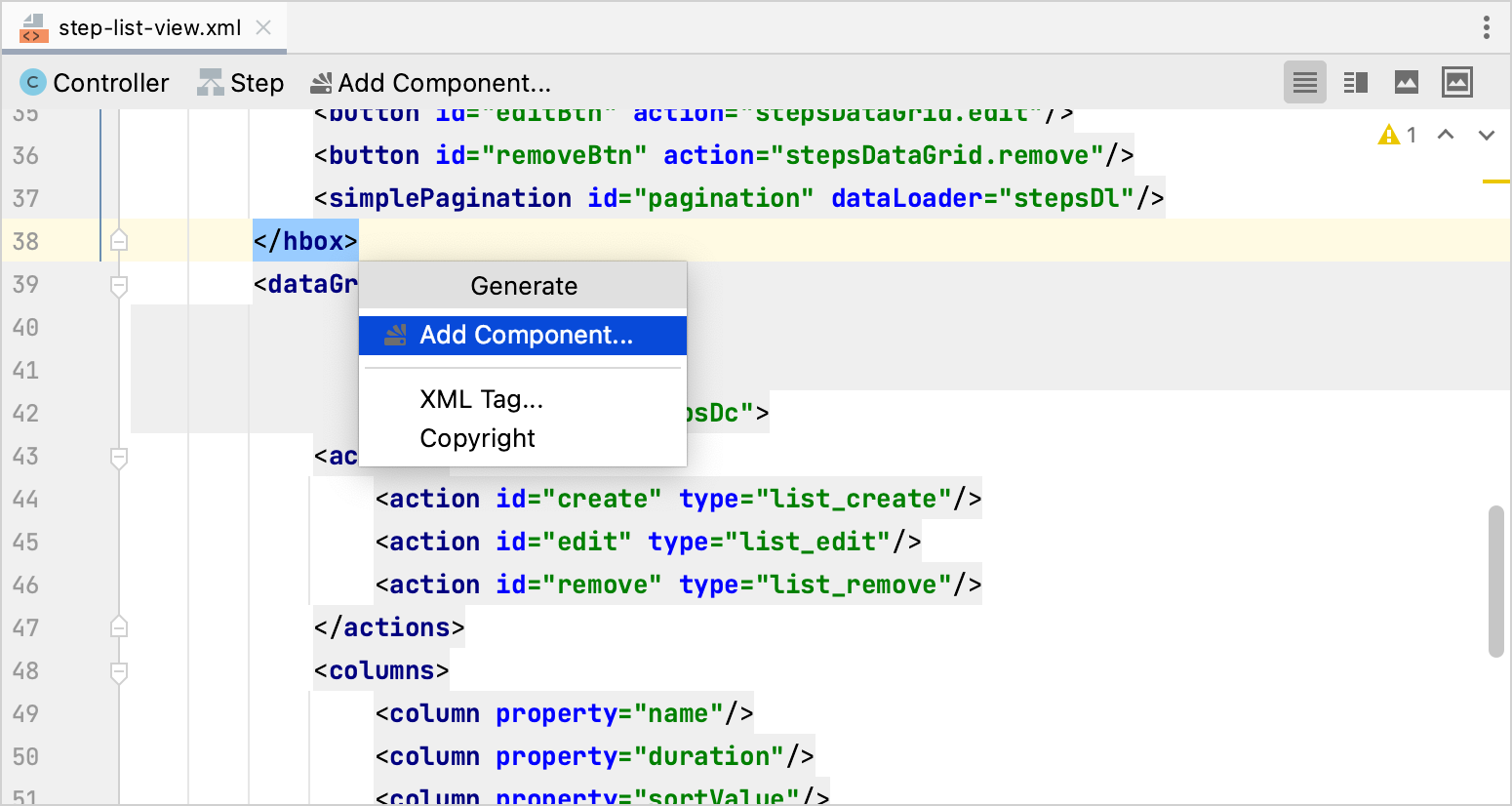
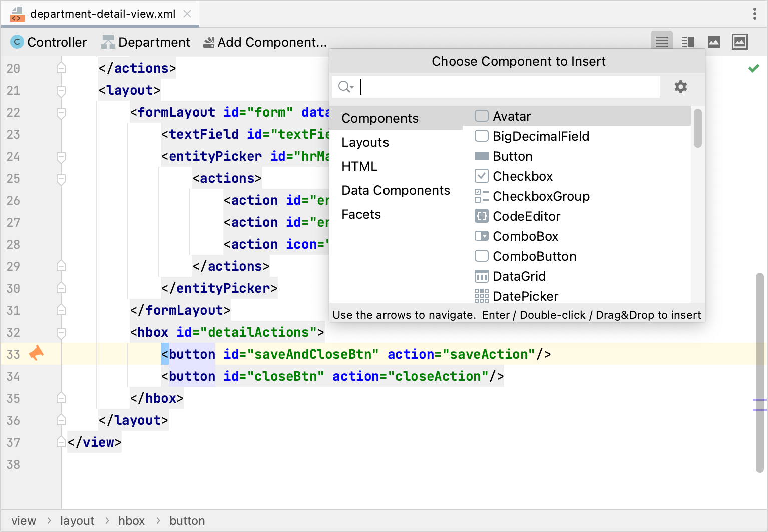
The component palette displays a set of available view elements: components, layouts, HTML components, data components - containers and loaders, facets that include actions and dialog mode settings.
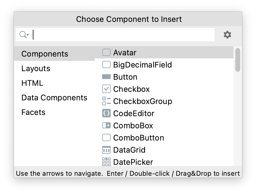
Use the search box to find the component you need.
In order to add a component to the layout, drag it from the palette to the appropriate place in the XML source code or into the Jmix UI hierarchy panel.
Right-click the component in the palette to open the context menu with the following actions:
-
Add to Design - adds the selected component to the view inside the selected element in the hierarchy.
-
Jmix Documentation - opens the component’s documentation page.
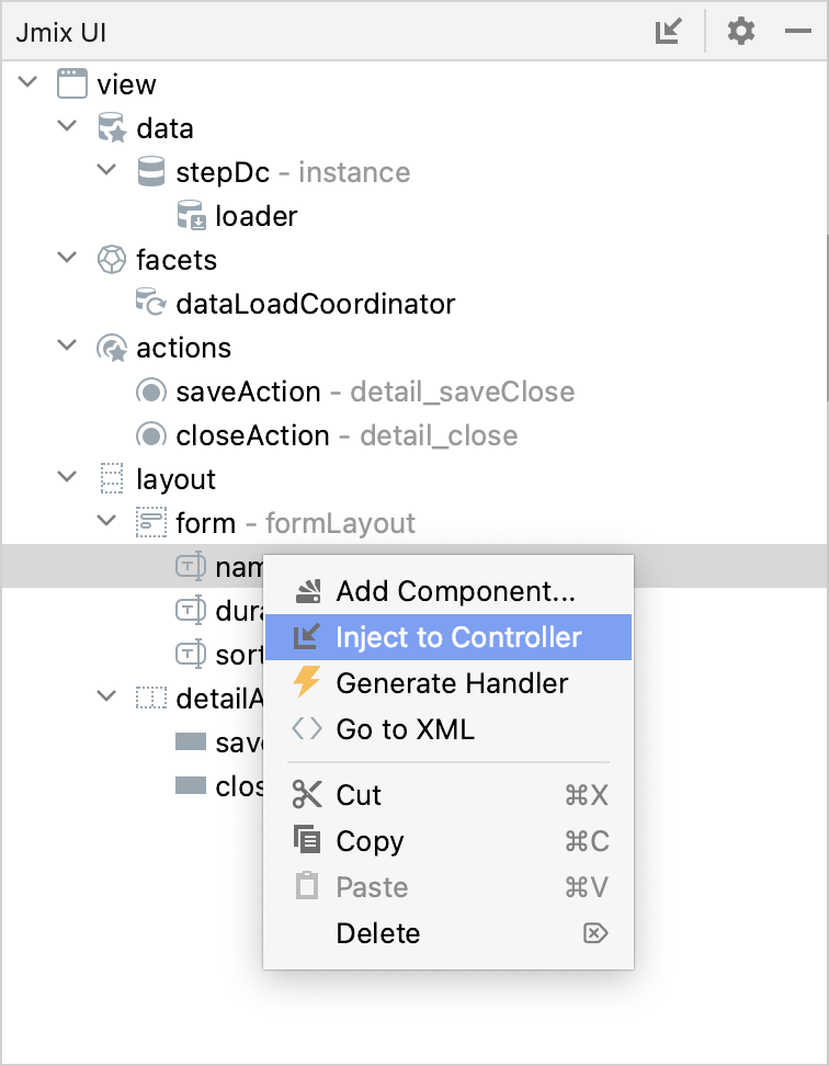
Jmix UI Hierarchy
The Jmix UI hierarchy panel displays a tree of the components added to the layout.
You can move elements from the component palette or rearrange the elements in the tree. When the element is selected, the Jmix UI inspector panel displays its properties.
Right-click the element to open its context menu with the following actions:
-
Add Component opens the component palette.
-
Inject to Controller injects the component to the view controller or navigate to the existing injection declaration.
-
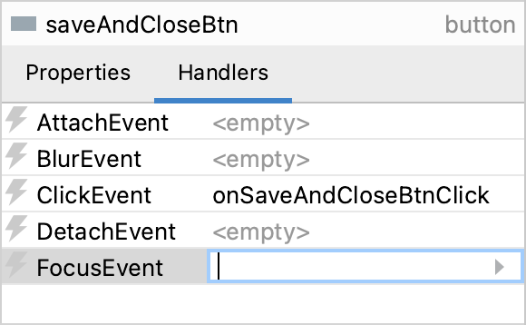
Generate Handler is used to generate the handler method of the component.
-
Go to XML navigates to the XML tag in the source code.
-
Delete, Copy, Cut or Paste are used to perform the appropriate actions with the component.
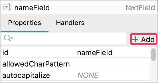
Jmix UI Inspector
The Jmix UI inspector panel displays the Properties and Handlers tabs.
-
To add an entity picker or value picker action, select the appropriate component in the view descriptor XML or in the Jmix UI hierarchy panel and click Add → Action in the Jmix UI inspector panel. The Add Action dialog appears:
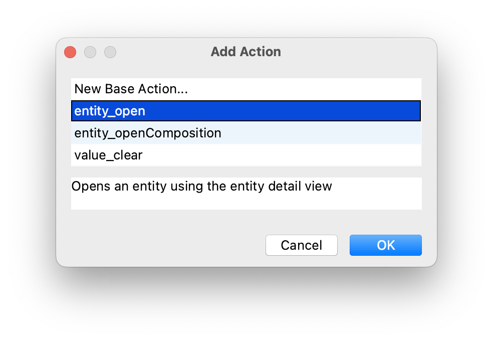
Select some standard action from the list.
To add a custom declarative action, select New Base Action and click OK. The BaseAction Required Properties dialog appears:
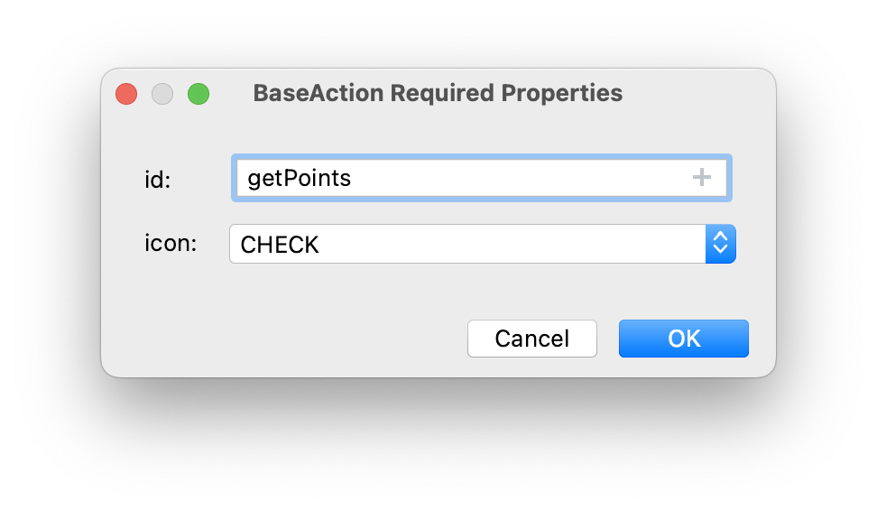
Then implement custom logic in the view controller by subscribing to
ActionPerformedEvent.
-
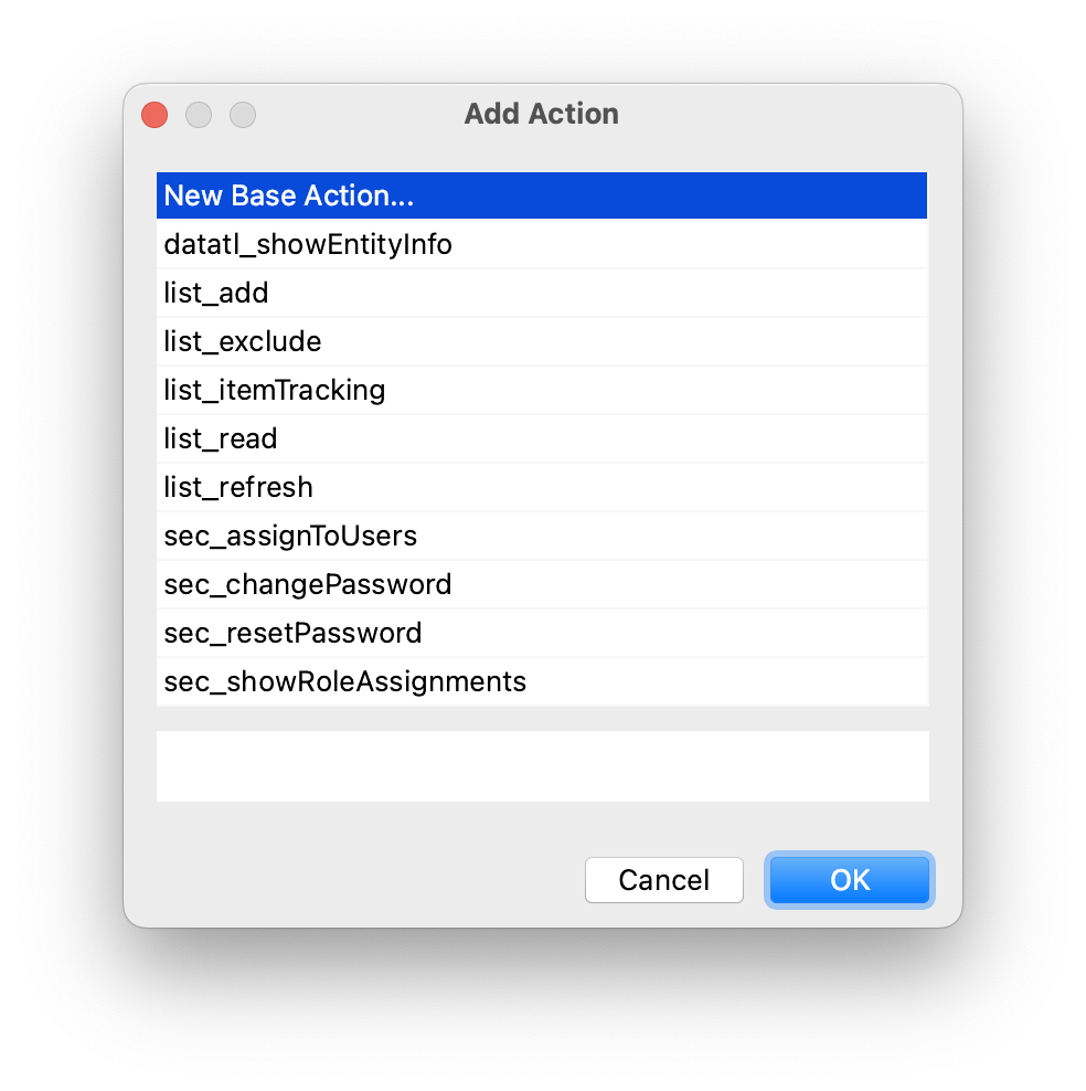
To add a list action, select the dataGrid or treeDataGrid component in the view descriptor XML or in the Jmix UI hierarchy panel and click Add → Action in the Jmix UI inspector panel. The Add Action dialog appears:
-
To add a
column, select thedataGridortreeDataGridcomponent in the view descriptor XML or in the Jmix UI hierarchy panel and click Add → Columns → Column in the Jmix UI inspector panel. The Add Column dialog appears: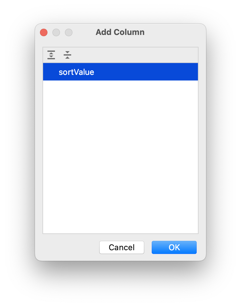
This list contains the properties that are contained in the fetchPlan, but are not yet displayed by the
dataGridcomponent.
Properties Tab
The Properties tab shows attributes of the selected view element and allows you to edit them.
Some properties have default values that are grayed out.
Use the search field to find the necessary attribute.
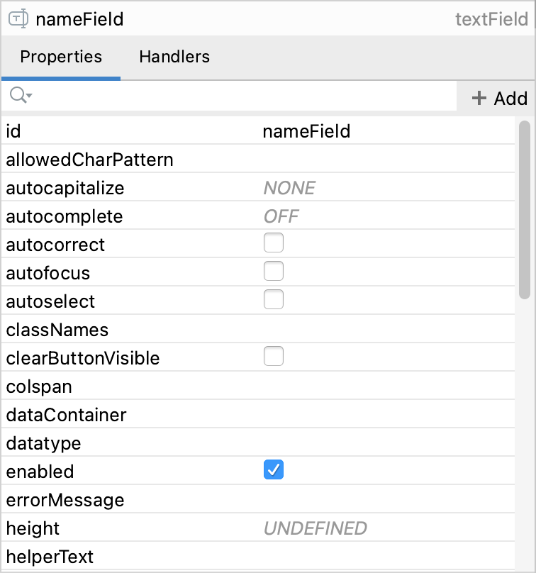
Attributes come by default arranged by name. The first column lists the names of the attributes for the selected component. The second column on the Properties tab displays the property values as follows:
-
When the property is selected, the value changes to an edit field where you can type a new value.
-
If the value is a list, a drop-down button appears when the property is selected.
-
If the value is boolean, you can change it using the checkbox:
-
Such properties as title, label, helperText, have the ability to set localized names. Click the
 button to display a dialog where you can set the localized message for the attribute.
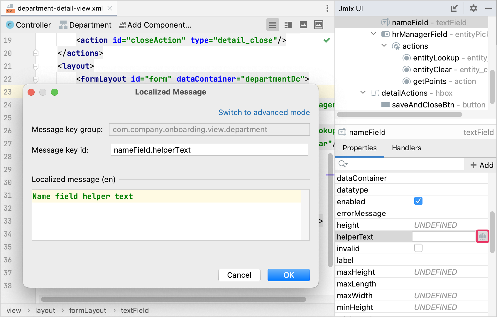
-
Click the
 button for the themeNames property to open the ThemeNames Property Editor dialog:
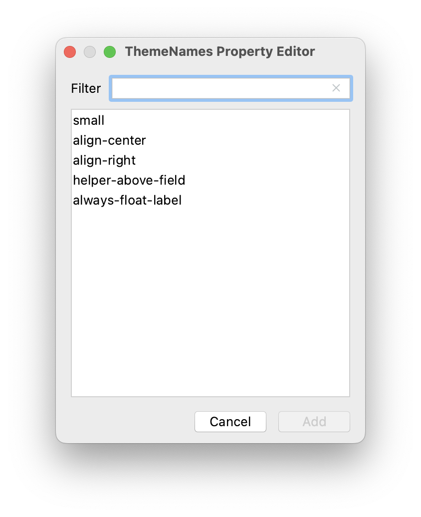
Top Actions Panel
The actions panel is located on the top of the source code editor. It provides access to the following actions:
-
Controller - navigates to the view controller.
-
<entity class name>- displayed if the view represents an entity list view or detail view and allows you to navigate to the entity associated with the current view. -
Add Component - opens the component palette:
Also, you can switch between the view descriptor and controller using the marker on the gutter.
