ColorPicker
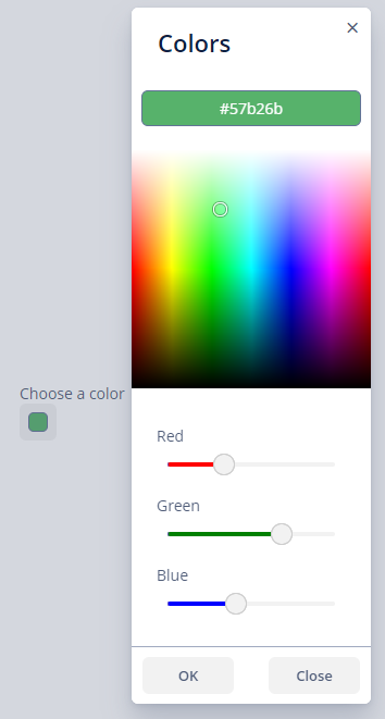
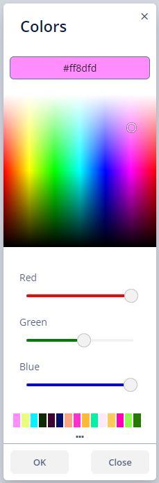
ColorPicker allows a user to preview and select a color. The component is a button that opens the color panel when clicked. The button is painted in the color selected by the user. ColorPicker returns a hexadecimal (HEX) value of the color as a String.
Data-aware ColorPicker
To create a color picker connected to data, use dataContainer and property attributes.
@JmixEntity
@Table(name = "UIEX1_CAR")
@Entity(name = "uiex1_Car")
public class Car {
    @JmixGeneratedValue
    @Column(name = "ID", nullable = false)
    @Id
    private UUID id;

    @Column(name = "BRAND")
    private String brand;

    @Column(name = "MODEL")
    private String model;

    @Column(name = "COLOR_HEX")
    private String colorHex;
}
<data>
<instance id="carDc"
class="ui.ex1.entity.Car">
<fetchPlan extends="_base"/>
<loader/>
</instance>
</data>
<layout>
<colorPicker caption="Color of the car"
dataContainer="carDc"
property="colorHex"/>
</layout>Attributes
Tabs Visibility
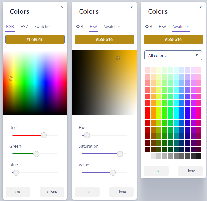
By default, only the RGB tab is visible. You can also determine the visibility of the HSV and swatches tabs.
<colorPicker caption="Choose a color"
             hsvVisible="true"
             rgbVisible="true"
swatchesVisible="true"/>|
You can open only one tab at a time. |
Captions
There are the following attributes to define corresponding captions:
-
blueSliderCaption -
buttonCaption -
cancelButtonCaption -
confirmButtonCaption -
greenSliderCaption -
hueSliderCaption -
lookupAllCaption -
lookupBlueCaption -
lookupGreenCaption -
lookupRedCaption -
popupCaption -
redSliderCaption -
saturationSliderCaption -
swatchesTabCaption -
valueSliderCaption
Events and Handlers
|
To generate a handler stub in Jmix Studio, select the component in the screen descriptor XML or in the Jmix UI hierarchy panel and use the Handlers tab of the Jmix UI inspector panel. Alternatively, you can use the Generate Handler button in the top panel of the screen controller. |
ValueChangeEvent
See ValueChangeEvent.
Validator
Adds a validator instance to the component. The validator must throw ValidationException if the value is not valid.
All XML Attributes
|
You can view and edit attributes applicable to the component using the Jmix UI inspector panel of the Studio’s Screen Designer. |
align - blueSliderCaption - box.expandRatio - buttonCaption - cancelButtonCaption - caption - captionAsHtml - colspan - confirmButtonCaption - contextHelpText - contextHelpTextHtmlEnabled - css - dataContainer - defaultCaptionEnabled - description - descriptionAsHtml - editable - enable - greenSliderCaption - height - historyVisible hsvVisible - htmlSanitizerEnabled - hueSliderCaption - icon - id - lookupAllCaption - lookupBlueCaption - lookupGreenCaption - lookupRedCaption - rgbVisible - popupCaption - property - redSliderCaption - required - requiredMessage - responsive - rowspan - saturationSliderCaption - stylename - swatchesTabCaption - swatchesVisible - tabIndex - valueSliderCaption - visible - width
