passwordField
Basics
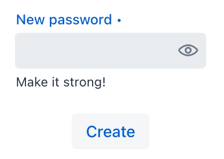
The following example demonstrates basic passwordField functionality:
<passwordField id="passwordField"
               label="New password"
               required="true"
               clearButtonVisible="true"
               helperText="Make it strong!">
</passwordField>
<button id="createPasswordButton"
        text="Create"/>
@ViewComponent
protected JmixPasswordField passwordField;
@Autowired
protected Notifications notifications;
@Subscribe("createPasswordButton")
protected void onButtonClick(ClickEvent<Button> event) {
if (!passwordField.getValue().isEmpty())
notifications.create("Password created")
.show();
}
The set of attributes for the passwordField component is similar to the attributes available for the textField component. However, there is no datatype attribute – the input for a passwordField can only be of type String.
Attributes
id - alignSelf - allowedCharPattern - ariaLabel - ariaLabelledBy autocapitalize - autocomplete - autocorrect - autofocus - autoselect - classNames - css - clearButtonVisible - colspan - dataContainer - enabled - errorMessage - focusShortcut - height - helperText - label - maxHeight - maxWidth - minHeight - minWidth - pattern - placeholder - property - readOnly - required - requiredMessage - tabIndex - themeNames - title - value - valueChangeMode - valueChangeTimeout - visible - width
Handlers
AttachEvent - BlurEvent - ComponentValueChangeEvent - CompositionEndEvent - CompositionStartEvent - CompositionUpdateEvent - DetachEvent - FocusEvent - InputEvent - KeyDownEvent - KeyPressEvent - KeyUpEvent - validator - statusChangeHandler
|
To generate a handler stub in Jmix Studio, use the Handlers tab of the Jmix UI inspector panel or the Generate Handler action available in the top panel of the view class and through the Code → Generate menu (Alt+Insert / Cmd+N). |
validator
Adds a validator instance to the component. The validator must throw ValidationException if the value is not valid.
@Install(to = "passwordField", subject = "validator")
private void passwordFieldValidator(String value) {
    if (value != null && value.length() < 8)
        throw new ValidationException("Password must be at least 8 characters long");
}
Elements


See Also
See Vaadin Docs for more information.
